Branding
Brown Sugar
An identity built to be poured into everything.
Brown Sugar is a growing Palestinian beverage brand serving coffee, bubble tea, boba, sodas, mojitos and smoothies inside a warm, social cafe. It speaks to a broad room at once: Gen Z, families and children, without becoming childish or chasing a trend it will have to drop next year.
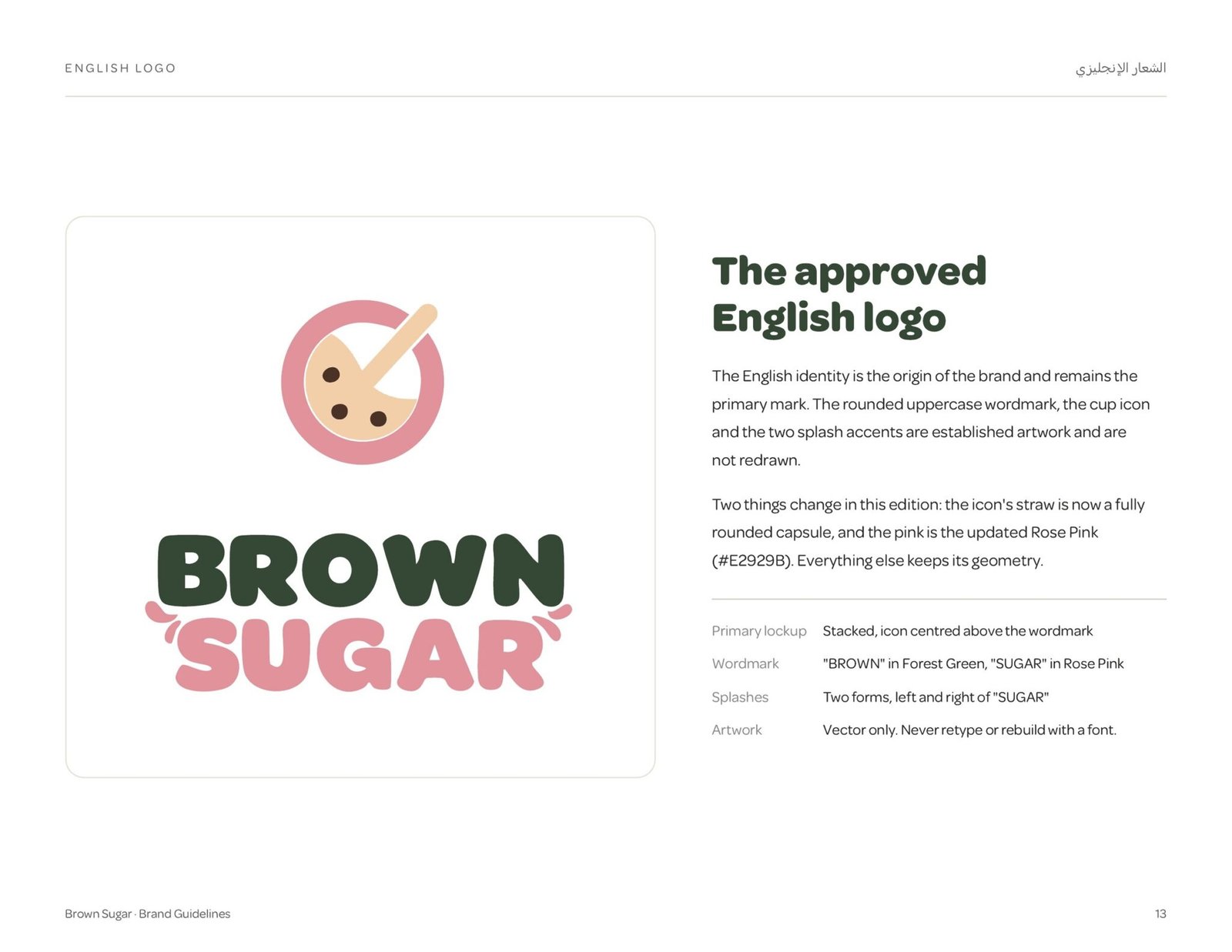
We built the visual identity around that balance. The work covers the bilingual logo system in English and Arabic, the colour palette, typography, a custom icon set, the splash element, the pattern system, and the rules for packaging, shopfronts and interiors. Three years of trading had already made the cup mark and the rounded uppercase wordmark recognisable in Ramallah, so the expansion extends that system rather than replacing it.
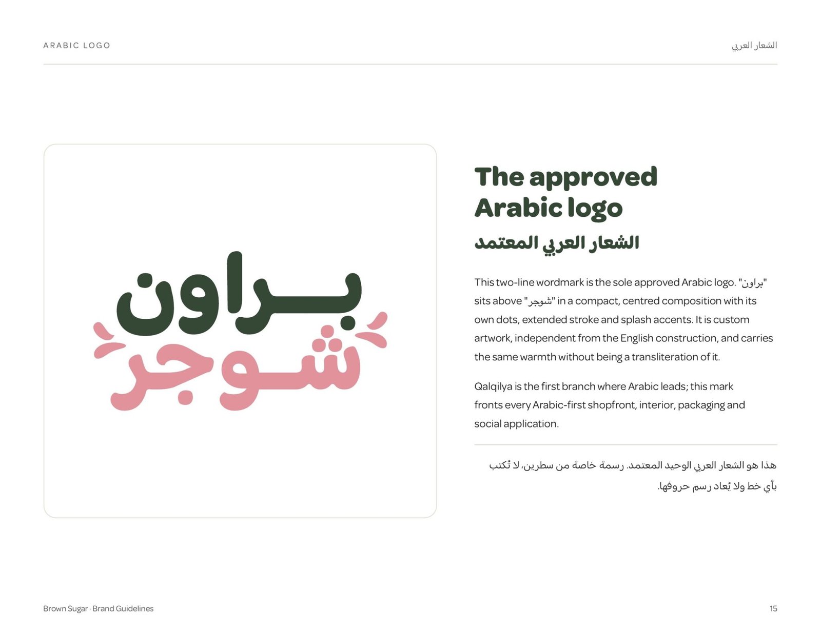
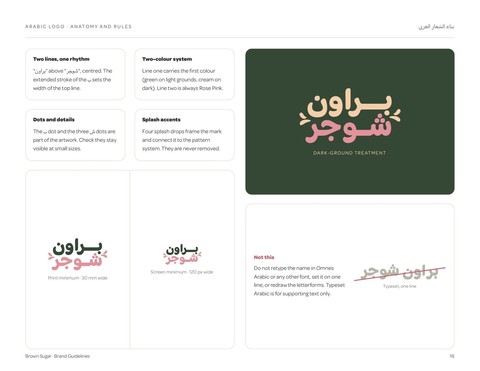
The Arabic mark was drawn to carry the same warmth as the English rather than sit beside it as a translation. It shares the two-line rhythm, the two-colour split, the rounded letterforms and the splash accents, so neither language reads as the afterthought.
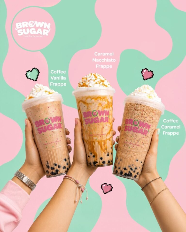
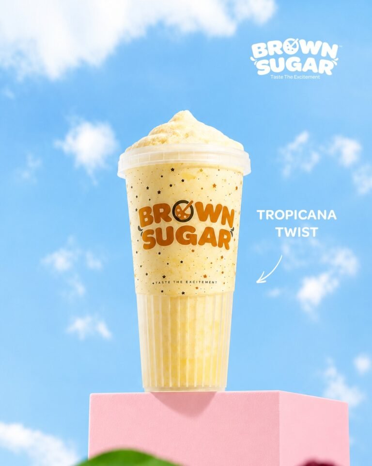
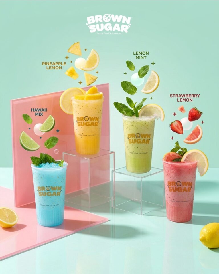
We then turned the identity into a working social media system and campaign kit: product promotions, seasonal content, branch communication, community posts and short form motion. The result is one recognisable presence across the shopfront, the cup and the feed.
- Client
- Brown Sugar
- Year
- 2026
- Disciplines
- Branding, Motion, Social
Branding
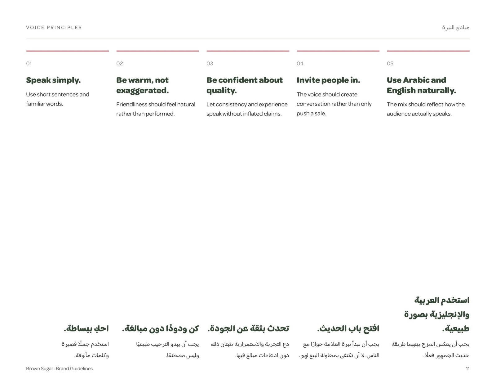
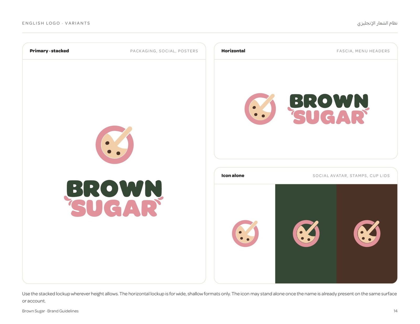
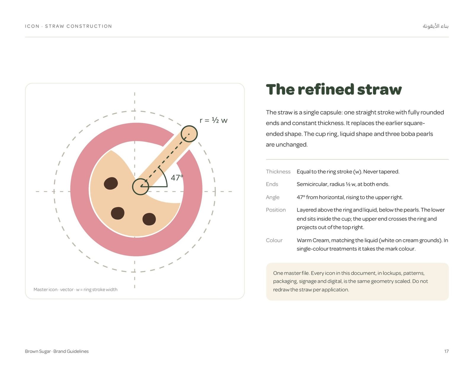
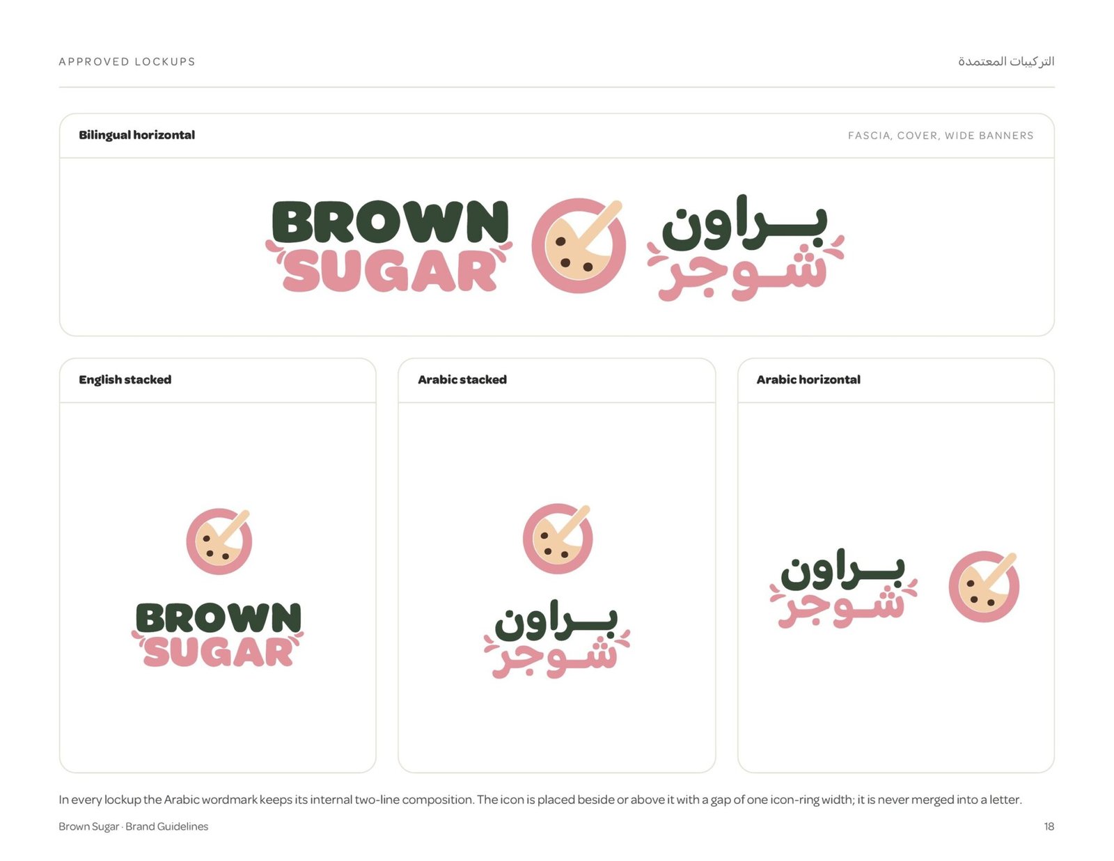
The bilingual brand guidelines: brand essence, personality and tone of voice, the approved English and Arabic logos with their lockups, clear space, backgrounds and misuse, the refined straw mark, the Forest Green and Rose Pink palette with contrast rules, the Omnes type system in both scripts, and the icon, doodle and pattern library.
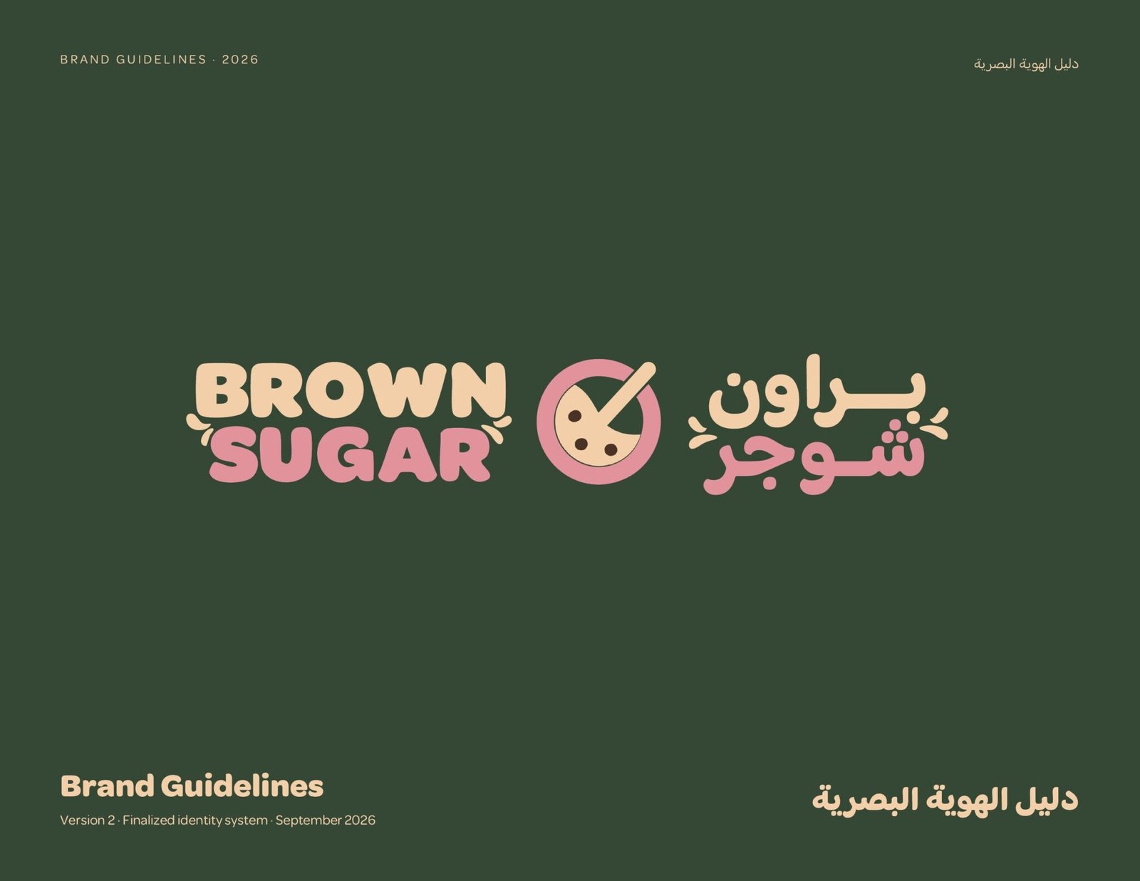
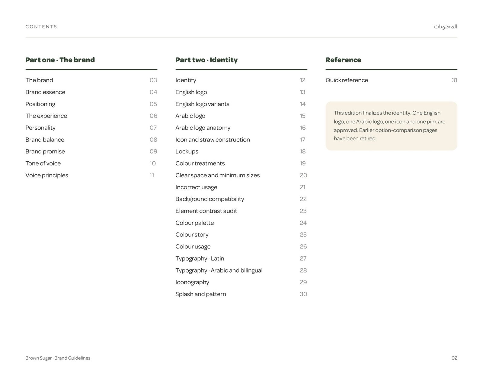
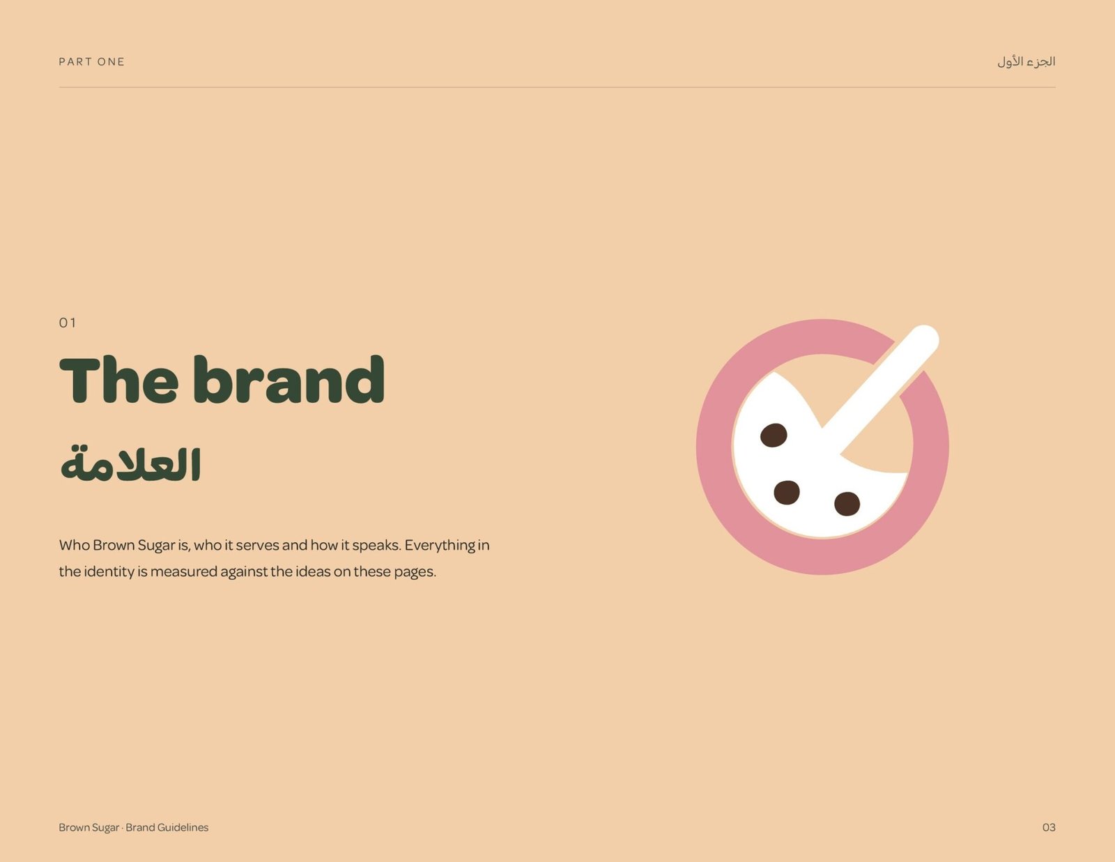
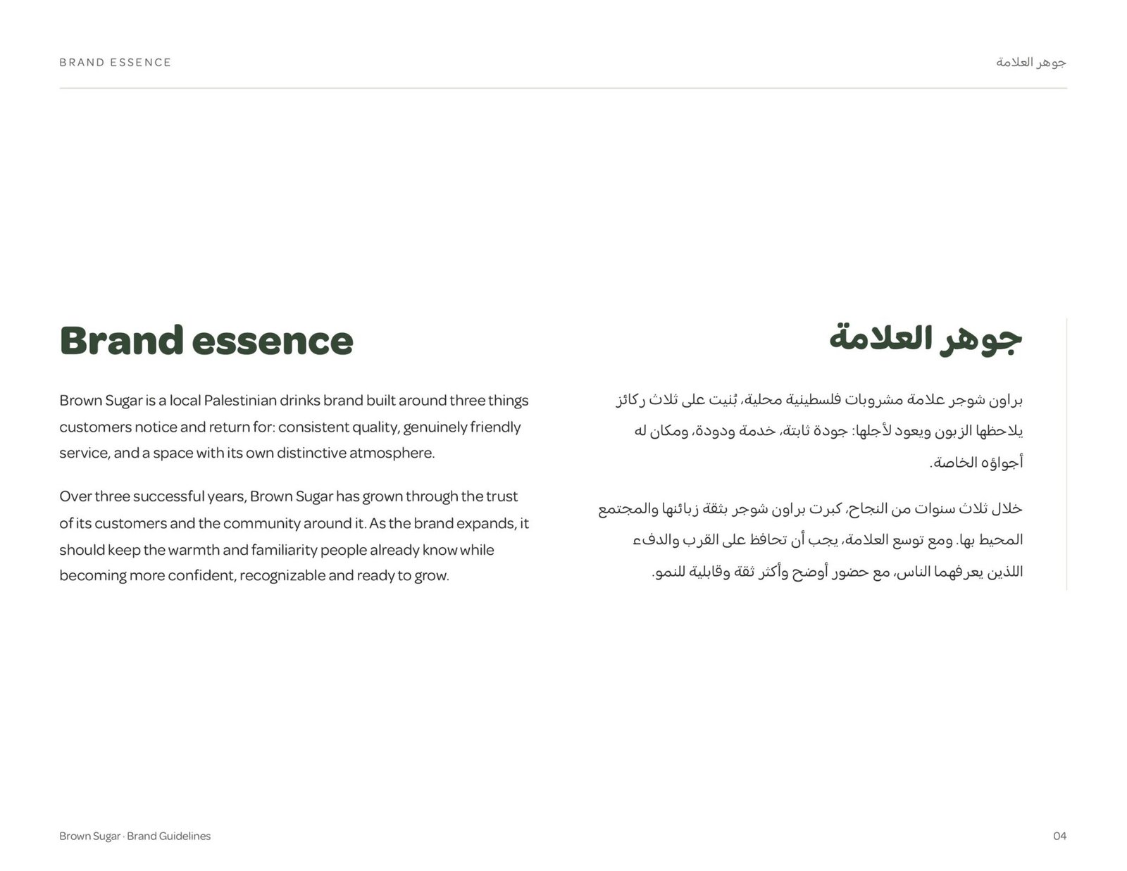
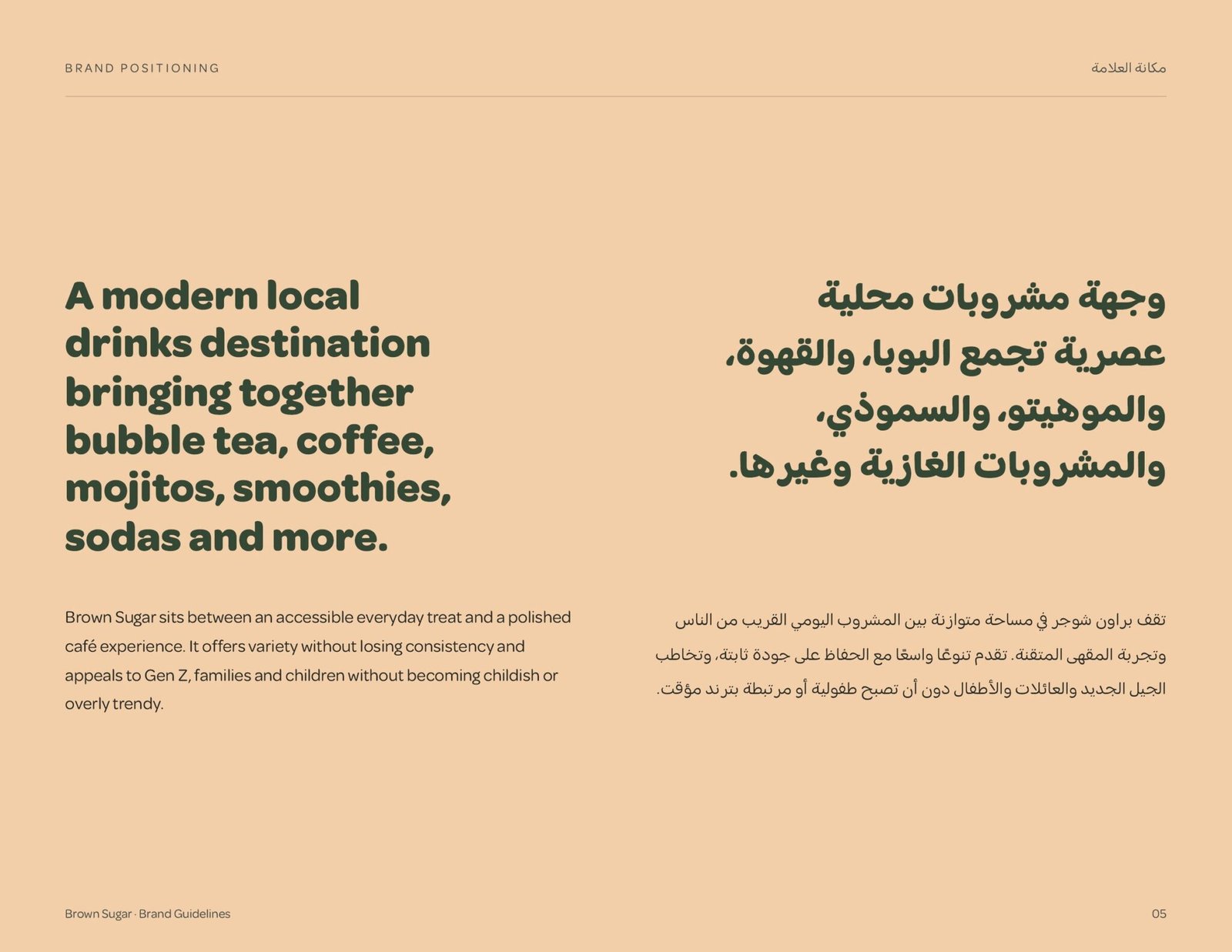
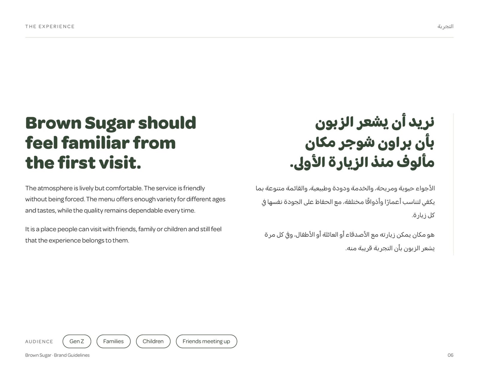
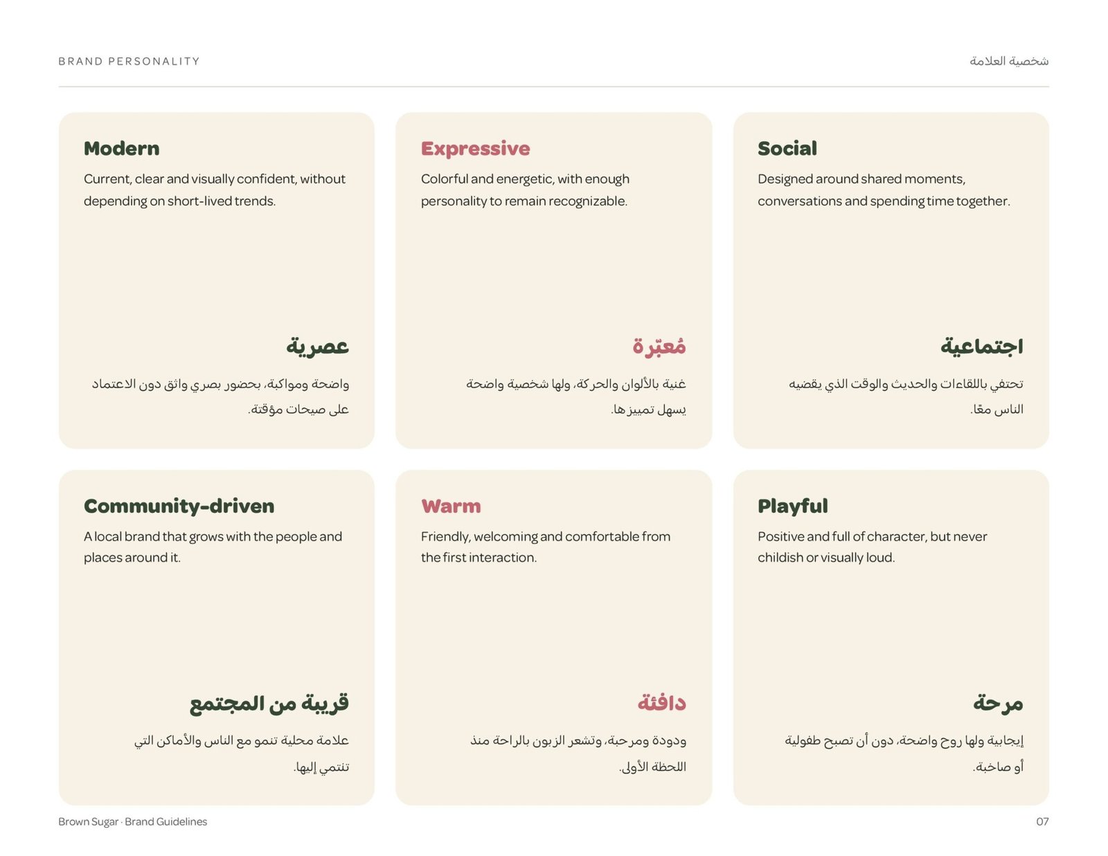
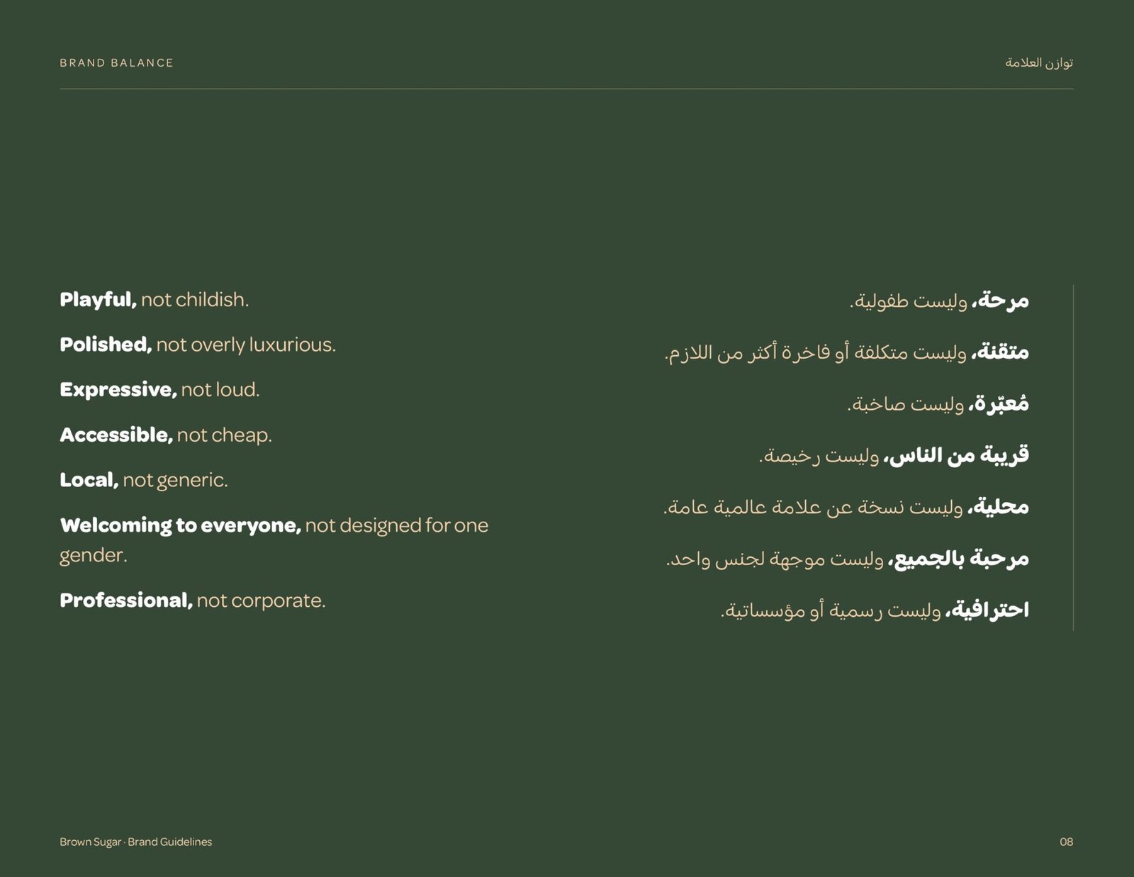
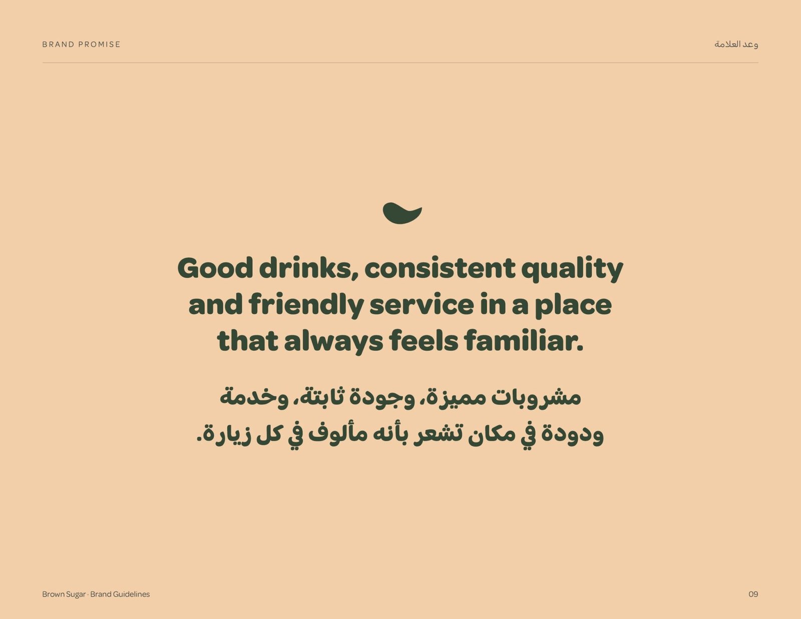
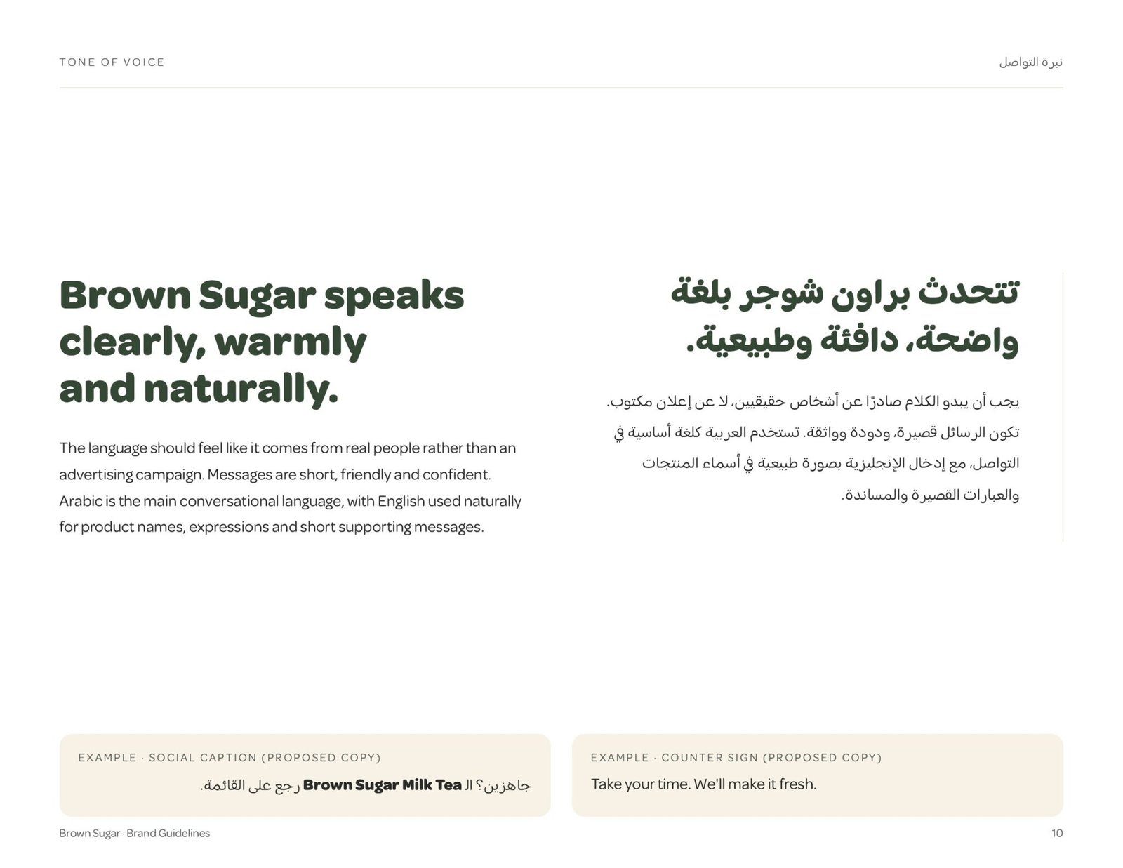
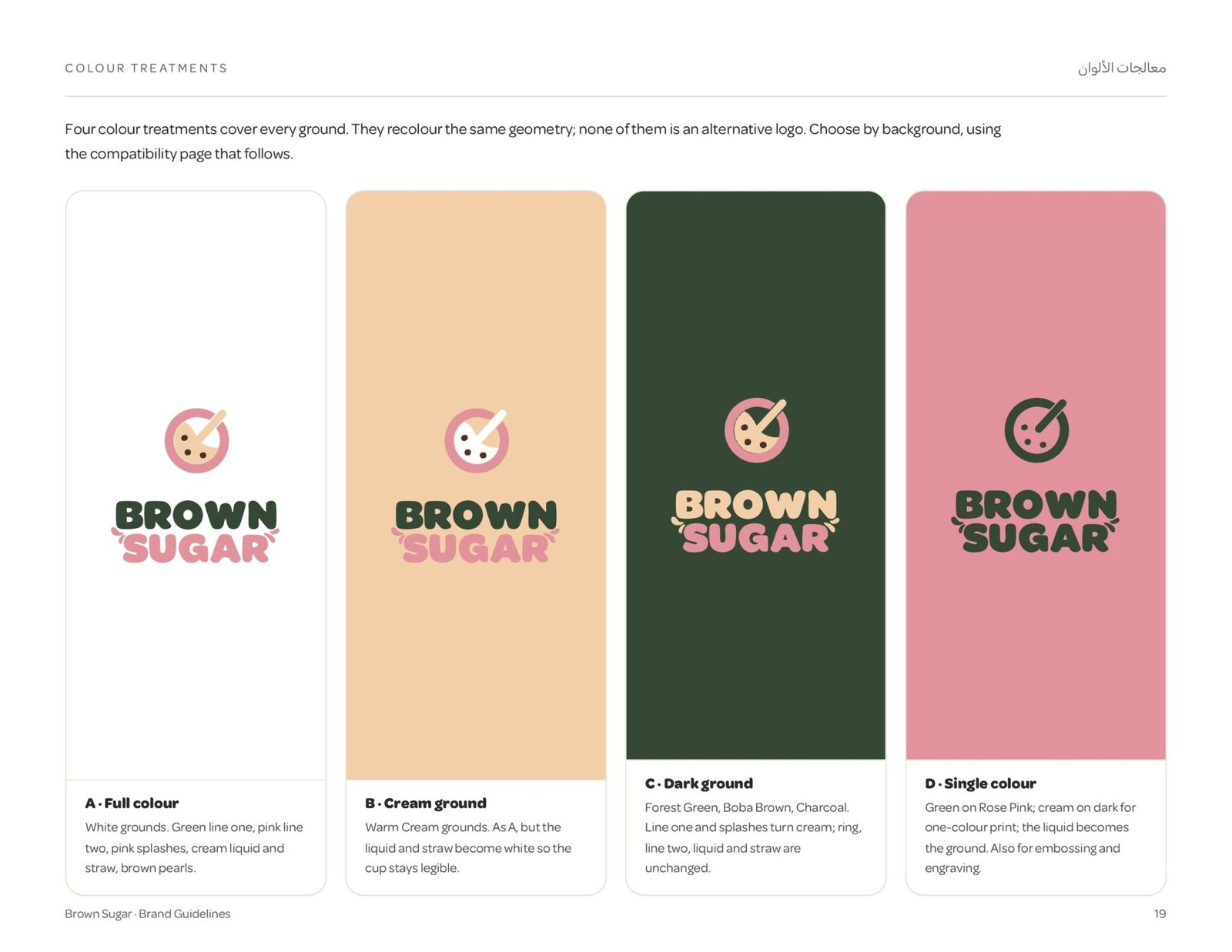
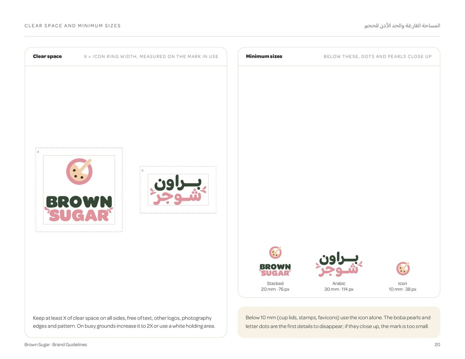
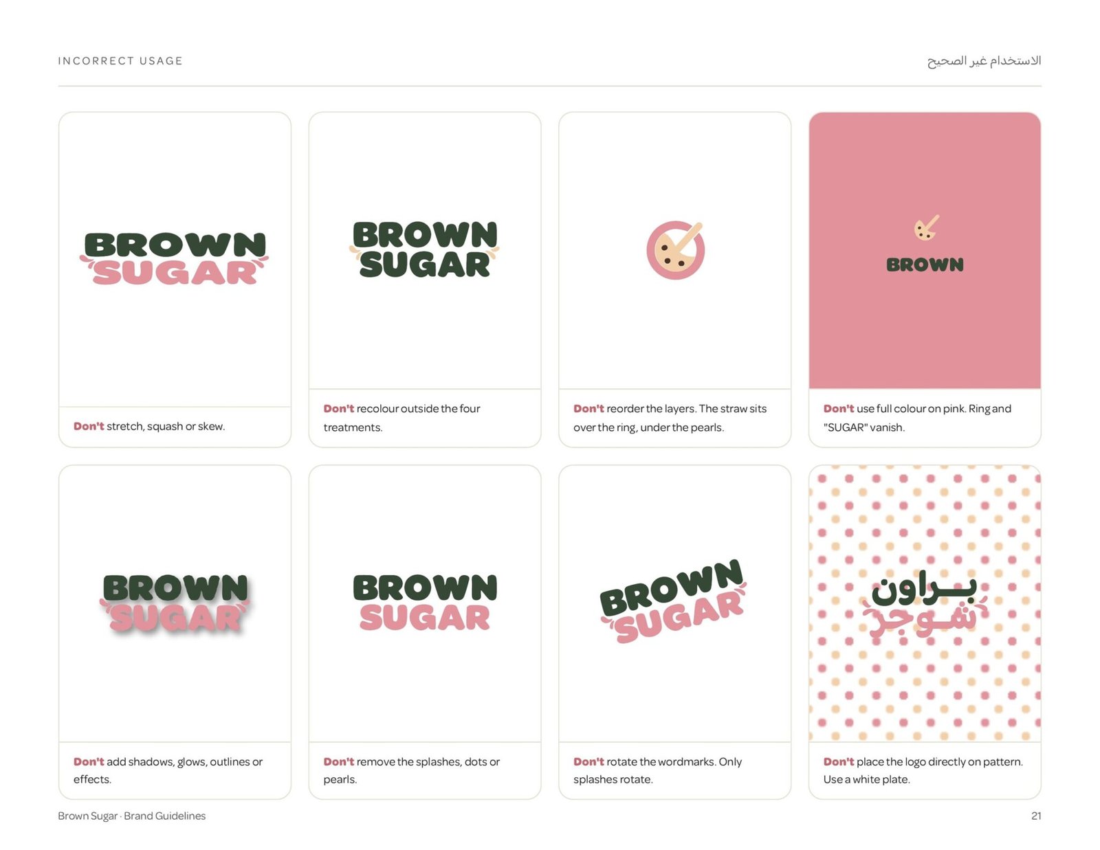
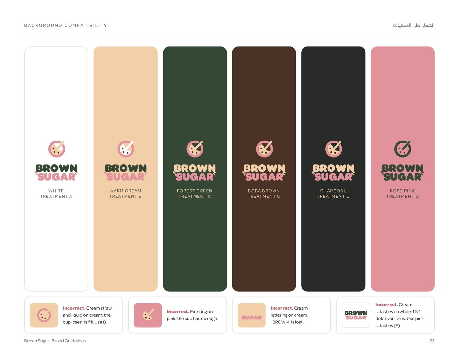
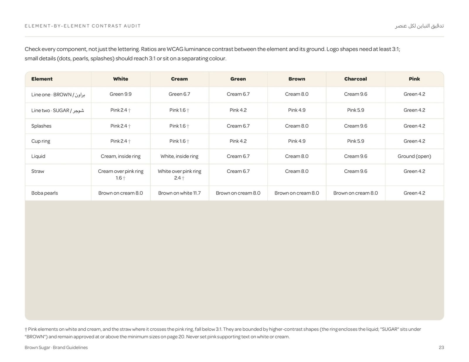
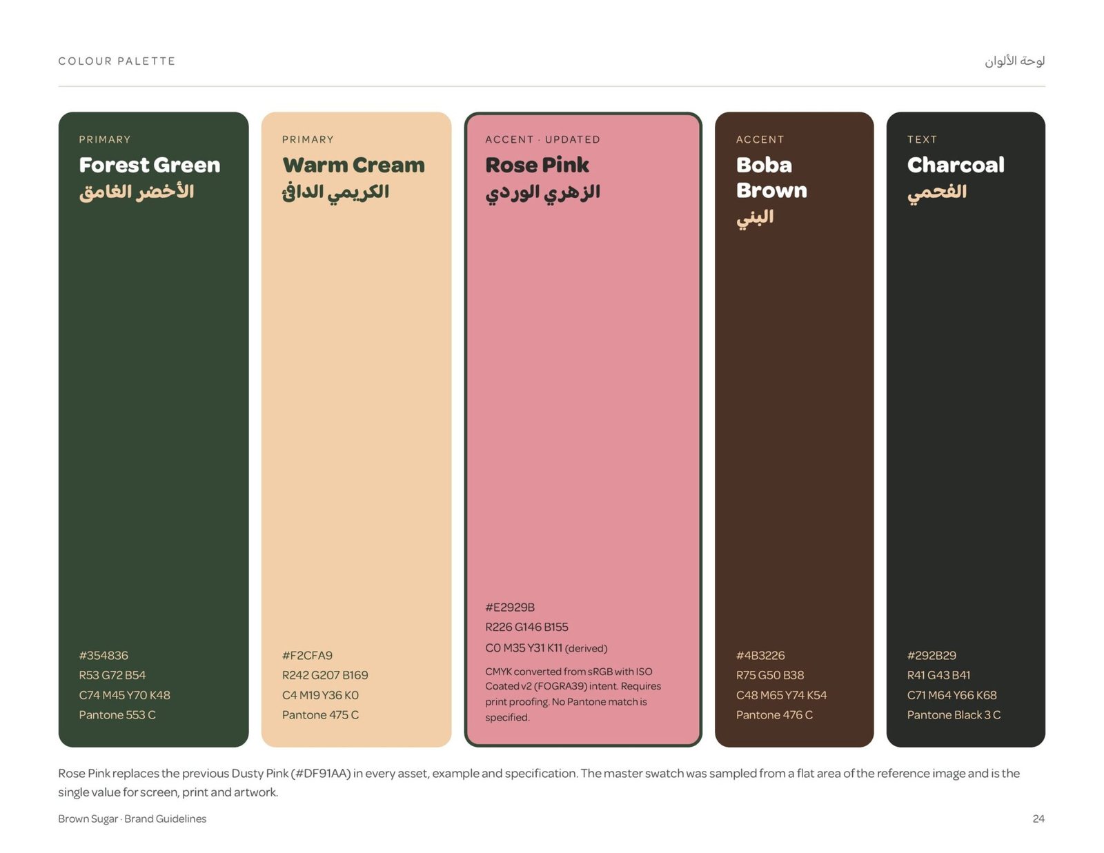
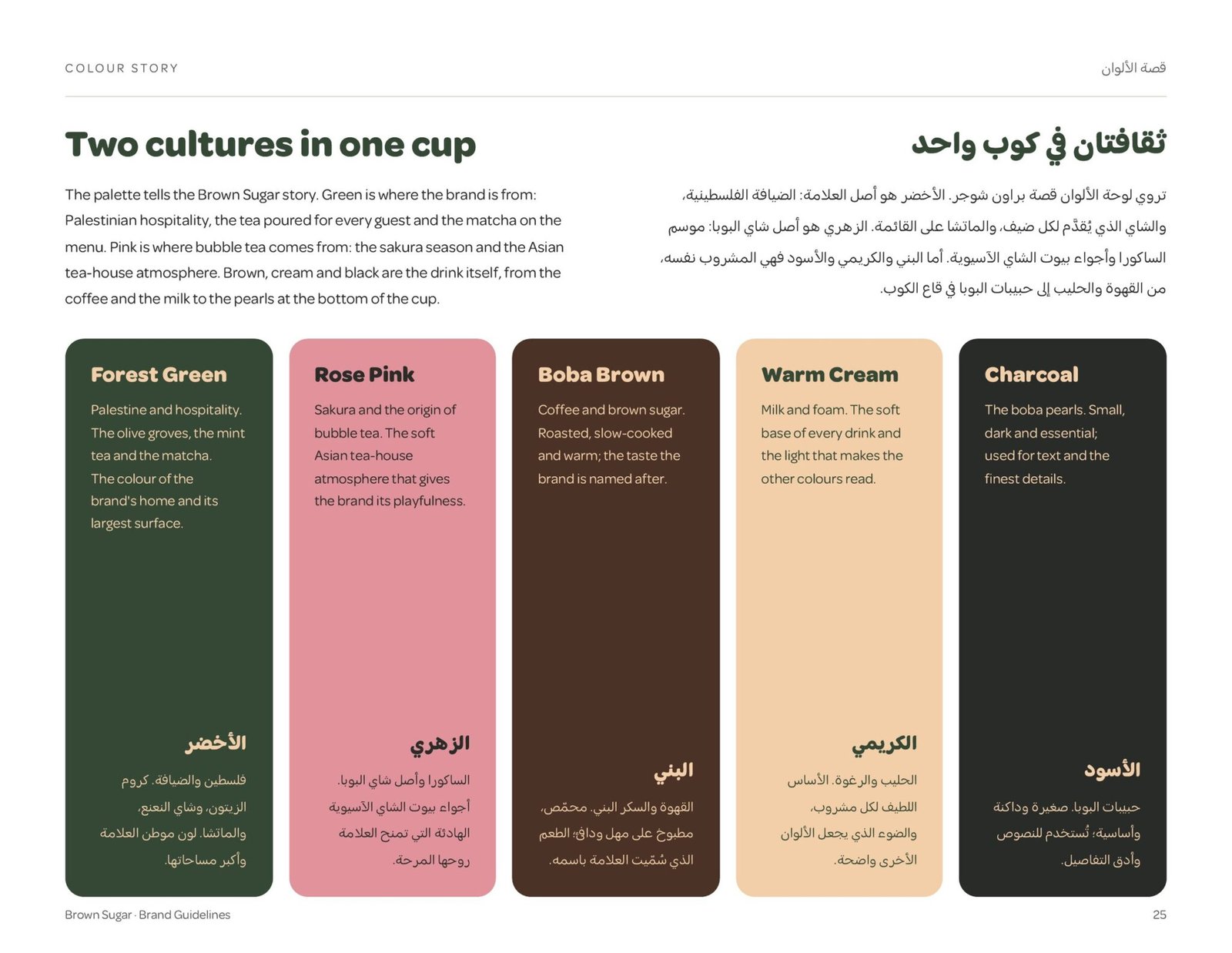
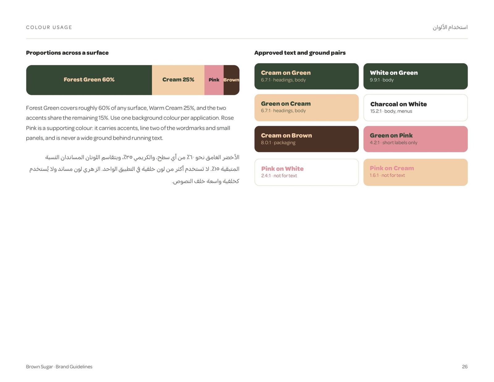
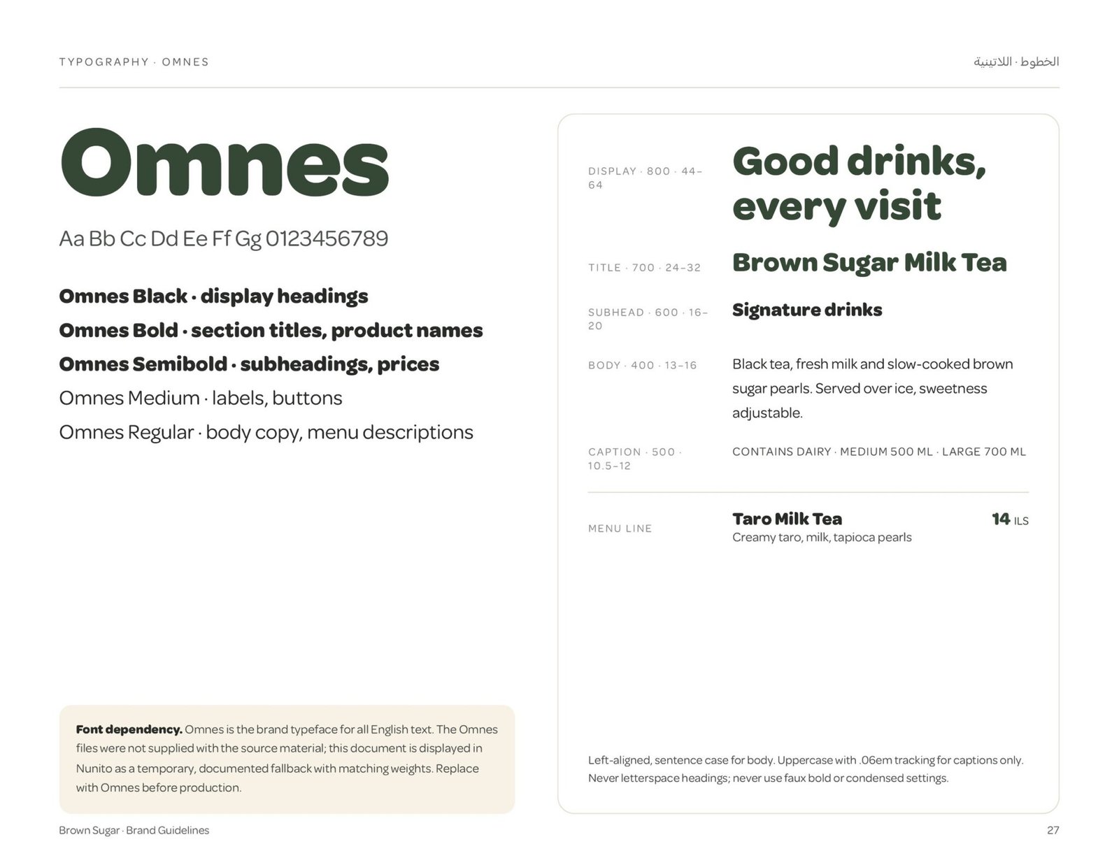
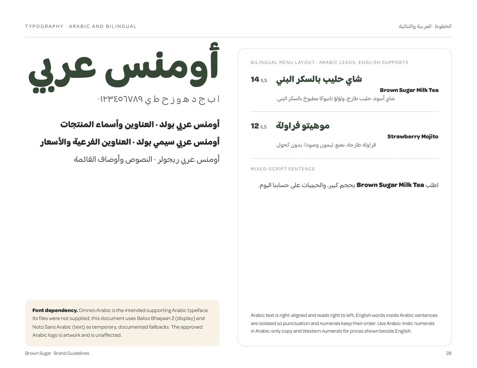
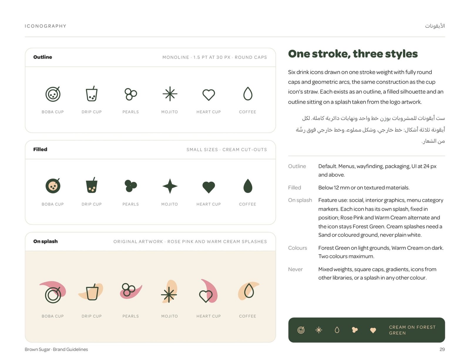
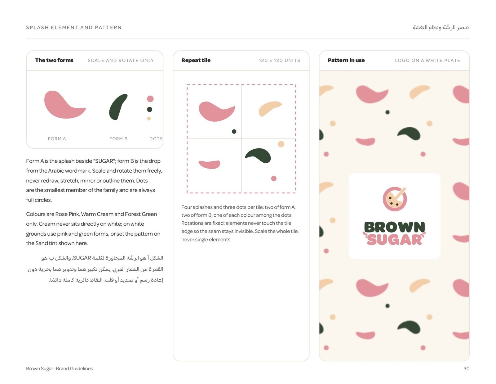
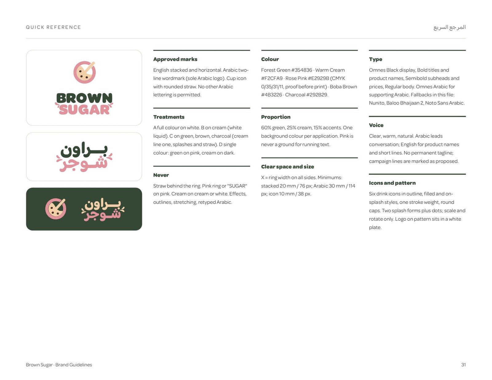
31 pages, stacked. Drag the top one aside to reach the next.
Social media
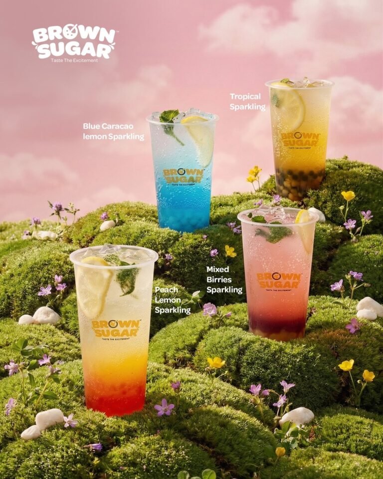
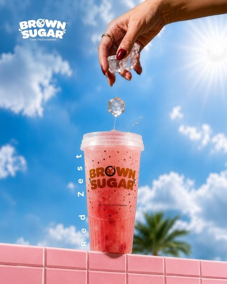
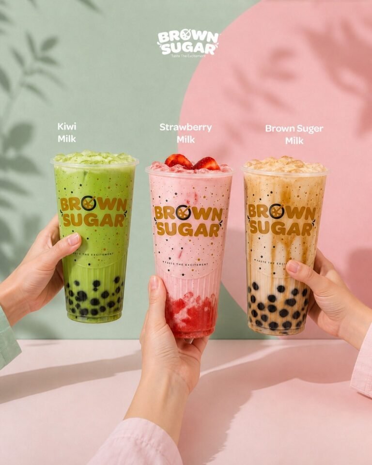
A working social system built from the identity: product promotions, seasonal content, branch communication and community posts.







Reels & video
Short form motion for the feed, cut vertical and built to read with the sound off.