
Branding
PalEat
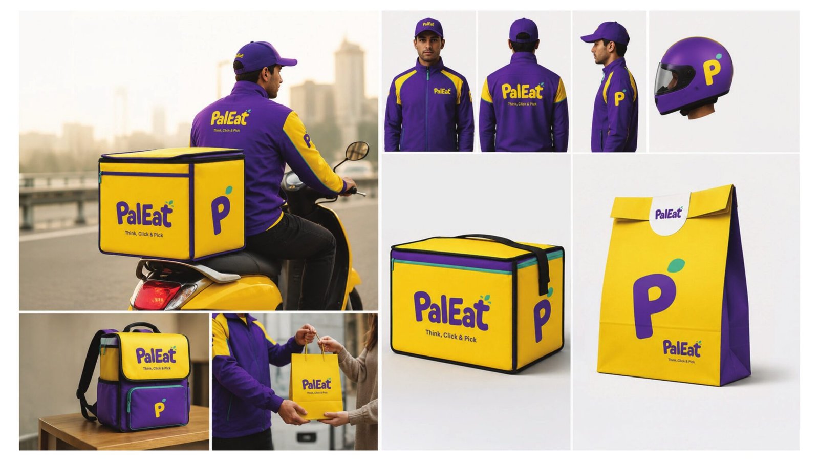
A delivery brand built to be recognised at a glance: on a bag, a helmet, a thermal box moving through traffic. Bilingual from the first sketch, with a character set that carries the tone into every touchpoint.
- Client
- PalEat
- Year
- 2026
- Disciplines
- Branding, Reels & Video, Social Media Designs
Think, Click & Pick.
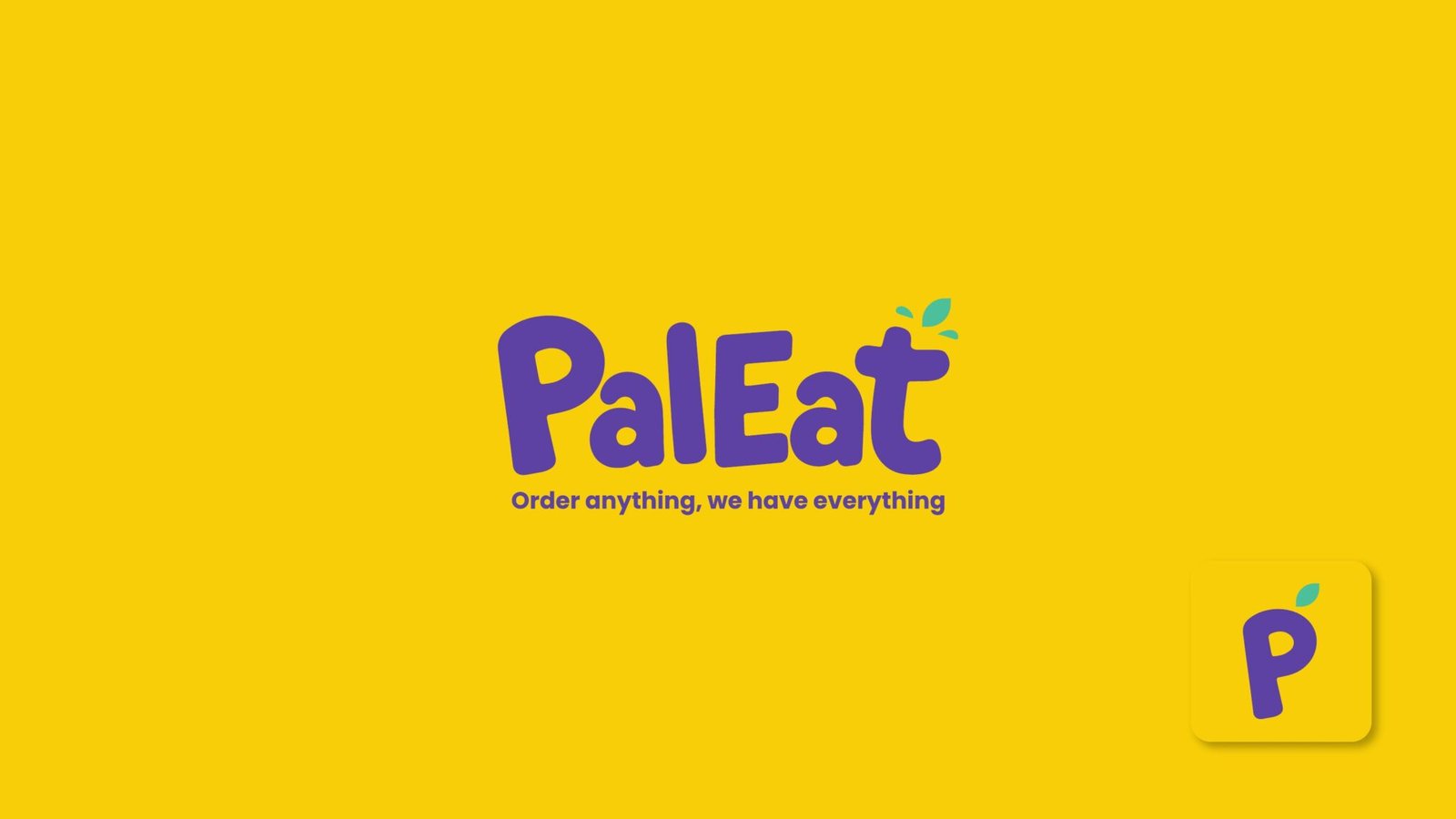
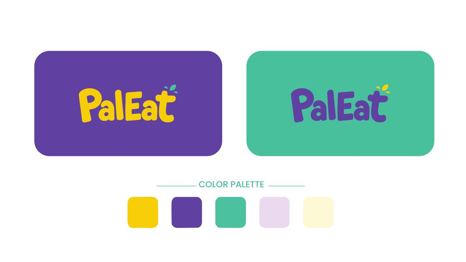
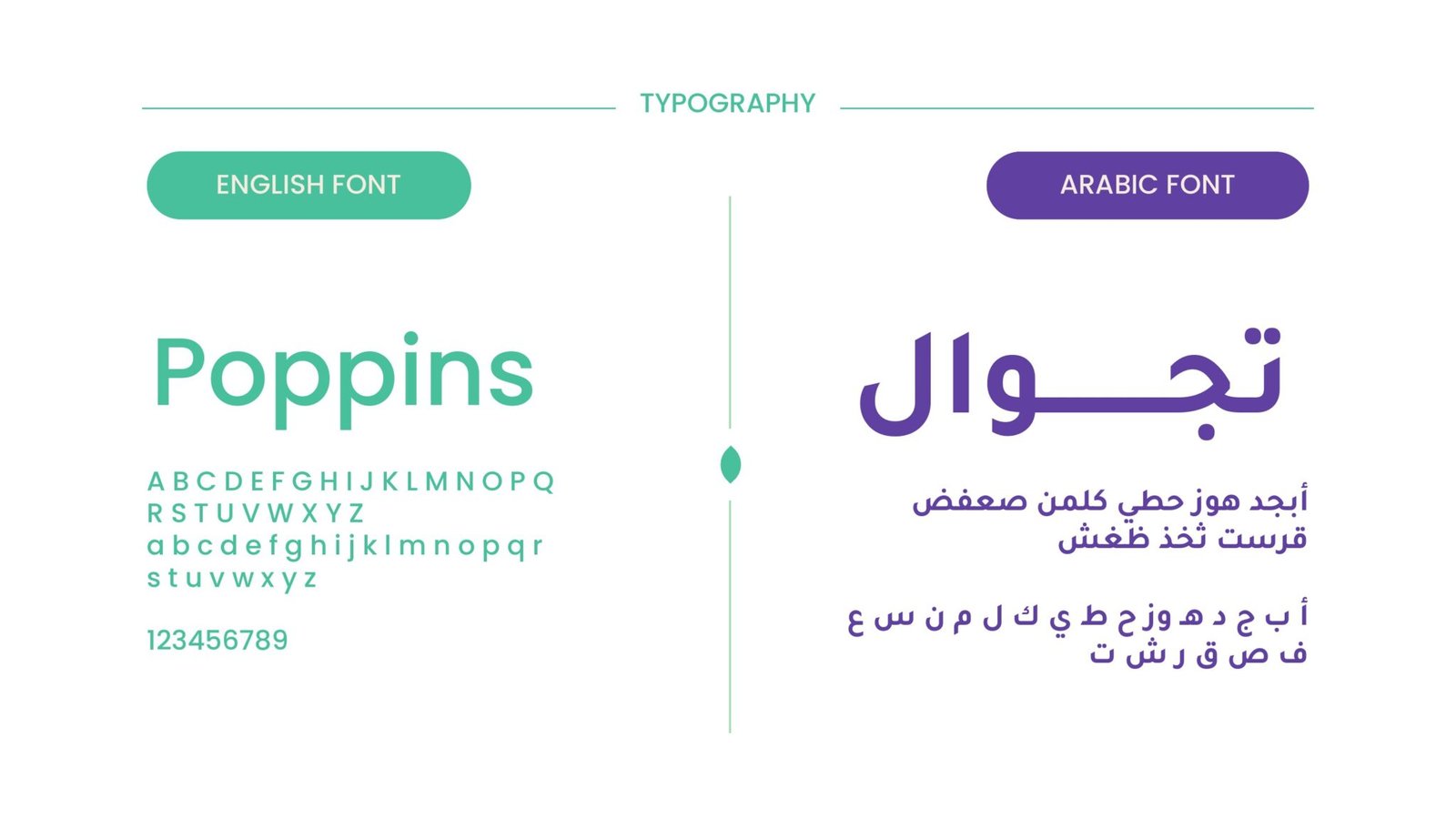
PalEat needed an identity that survives the street: legible at forty metres on the back of a scooter and at four centimetres on a phone. We built a rounded wordmark with a leaf-sprouted P that works as a standalone app mark, a five-colour system anchored on a high-visibility yellow, and a bilingual type pairing of Poppins and Tajawal so Arabic and English sit as equals rather than one being a translation of the other.
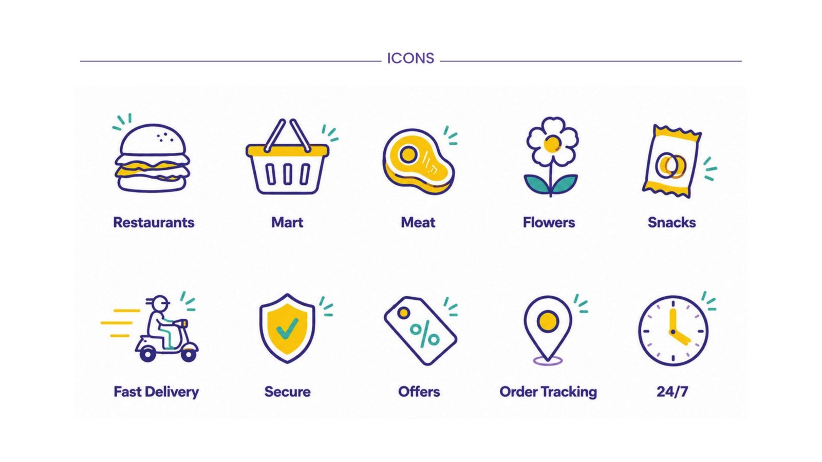
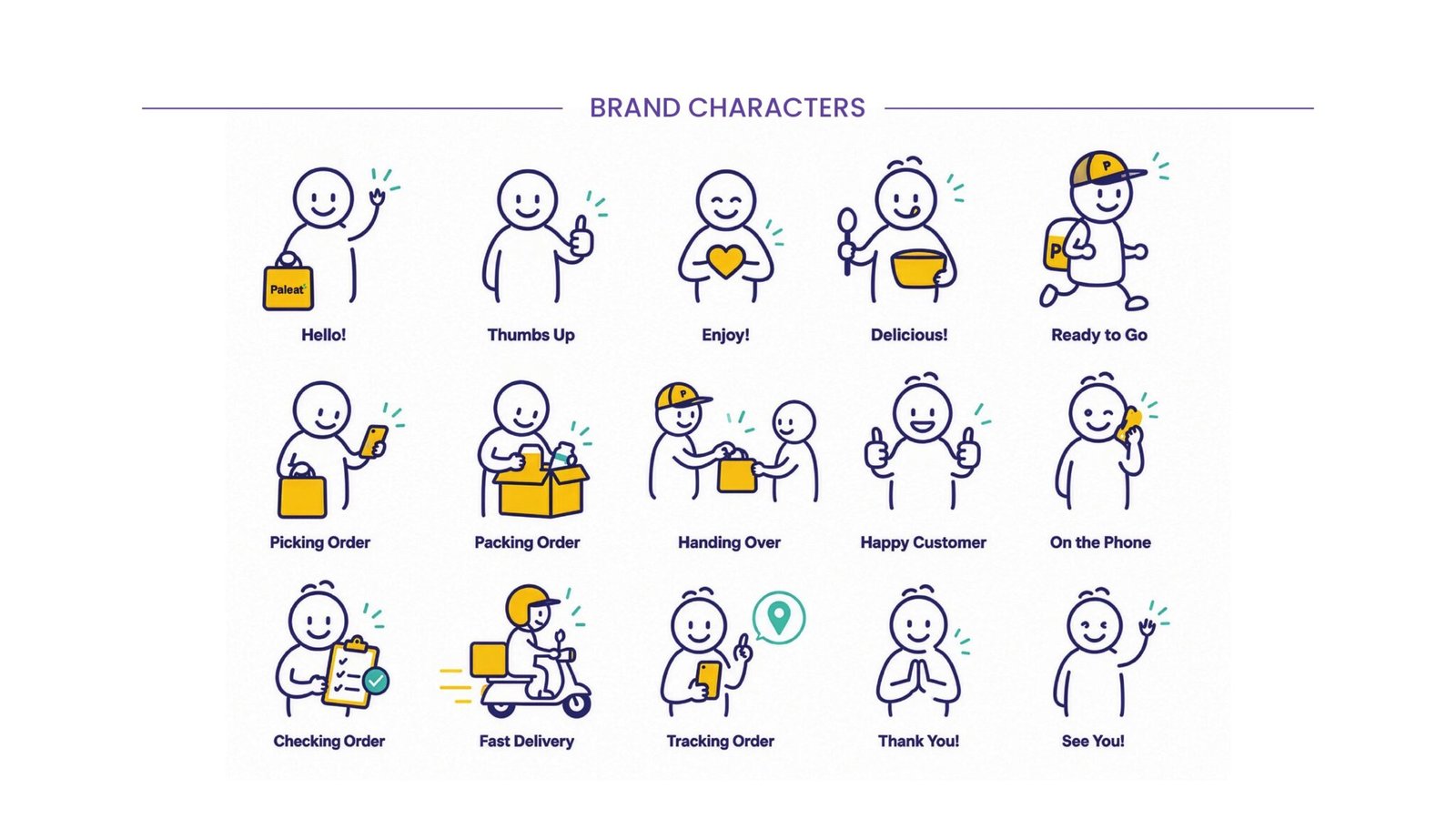
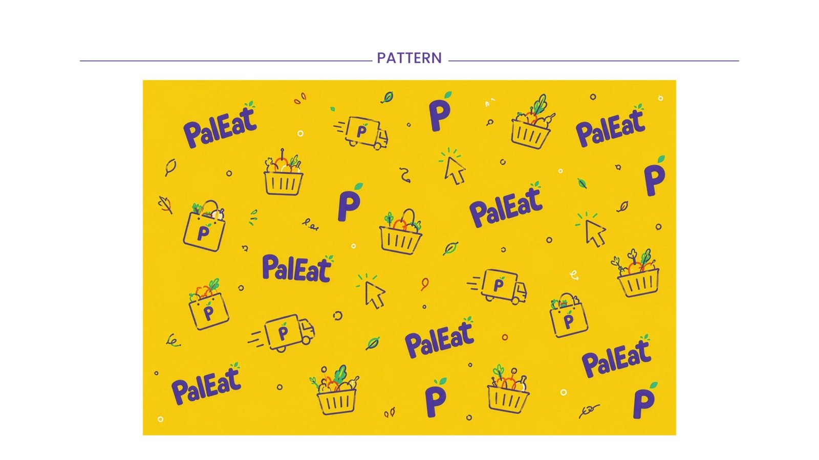
The system extends into rider uniforms, helmets, thermal boxes, packaging, a full icon set for the app’s categories, a cast of brand characters for in-app states and social, and a repeating pattern for packaging and surface.
Branding
The brand book: the wordmark and its leaf-sprouted P, the five-colour system anchored on high-visibility yellow, the bilingual type pairing, the app icon set and the cast of brand characters.

8 pages, stacked. Drag the top one aside to reach the next.
Social media
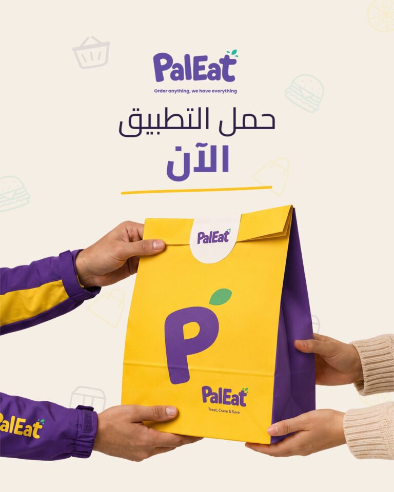
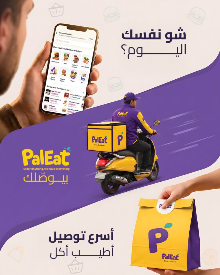
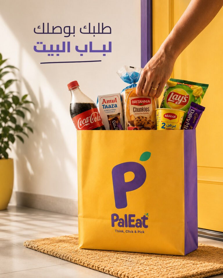
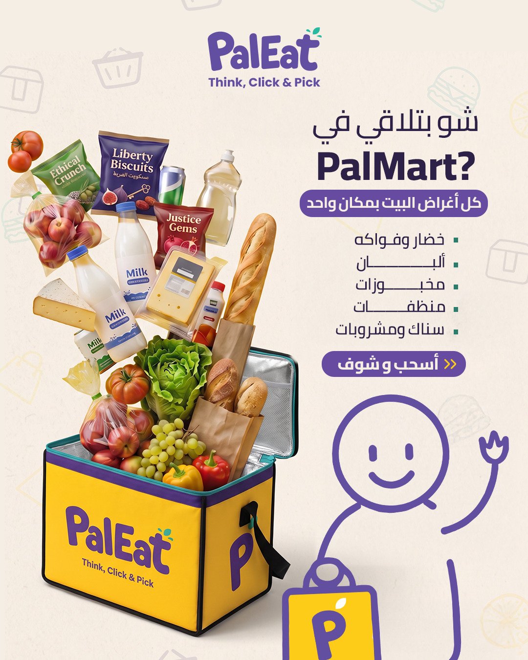
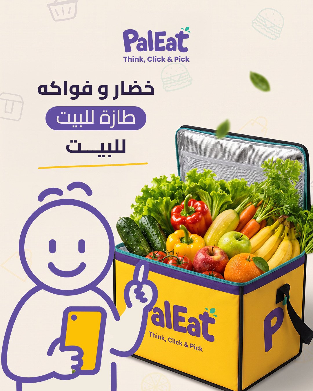
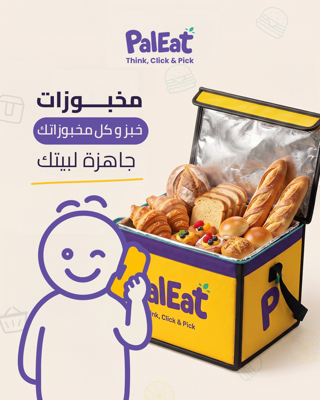
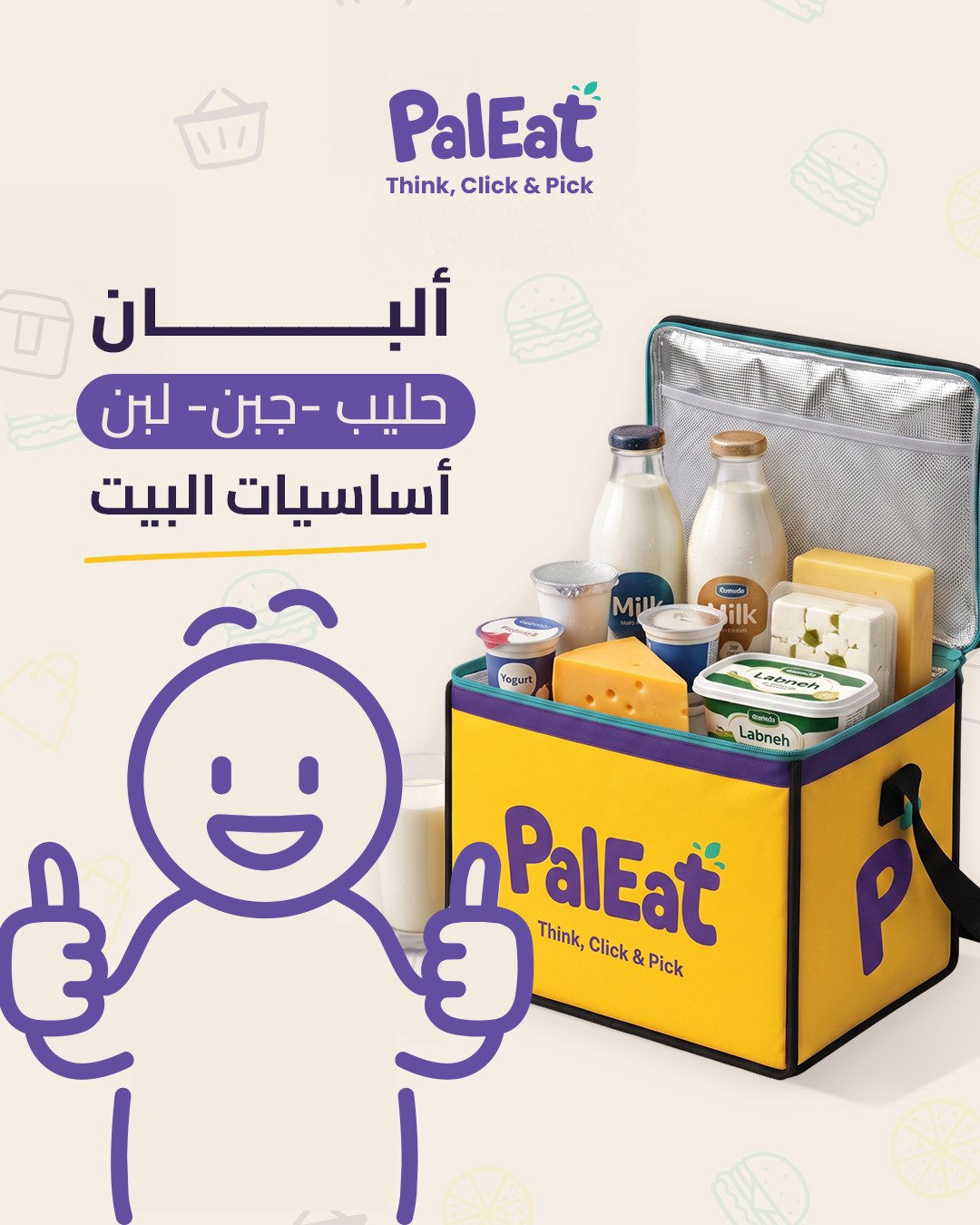
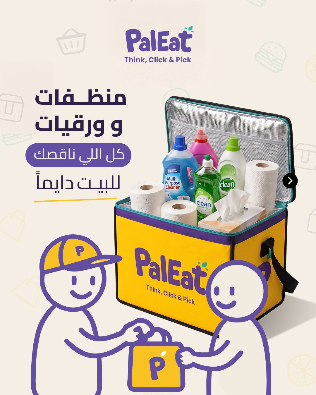
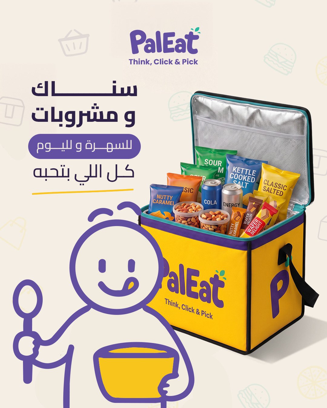
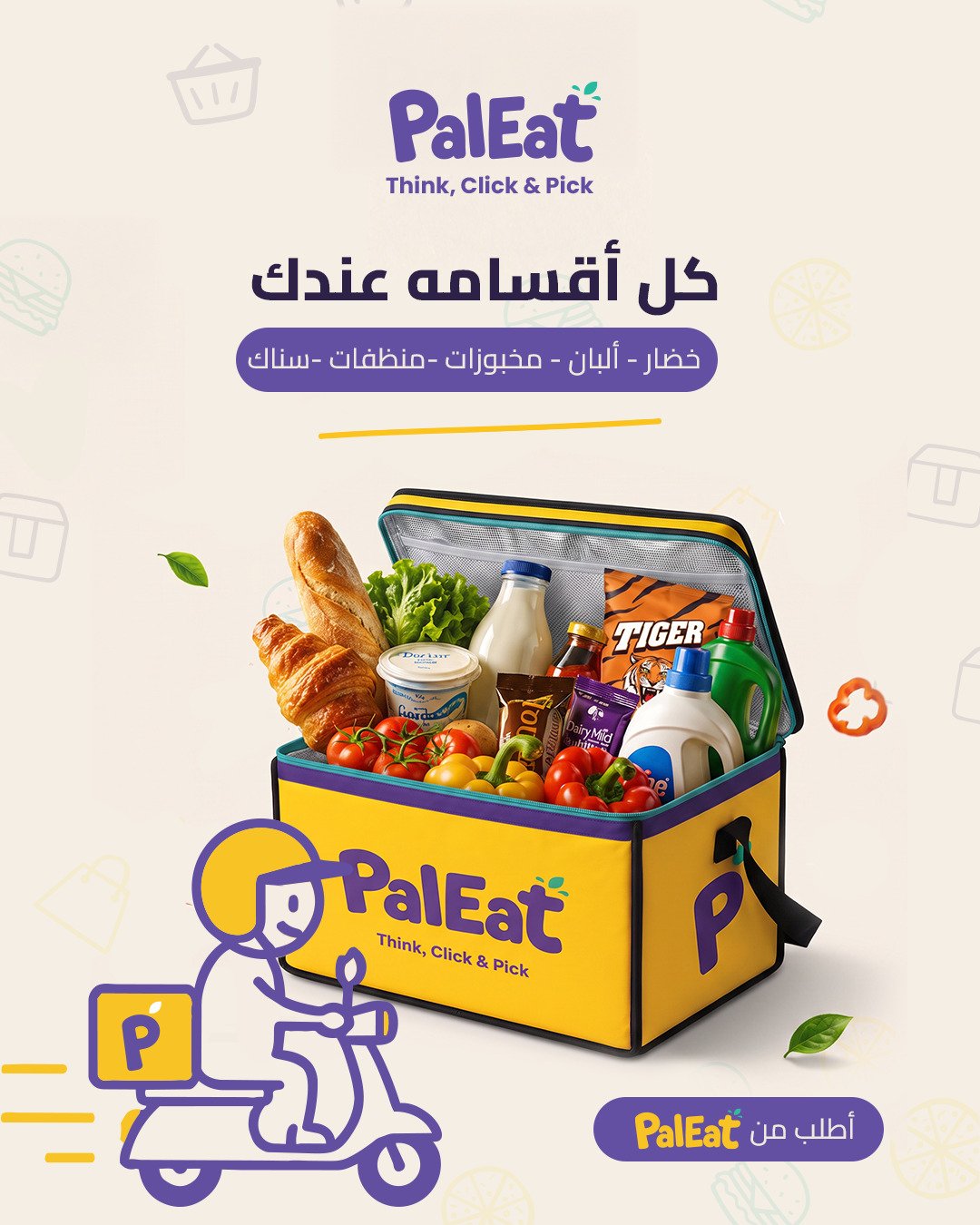
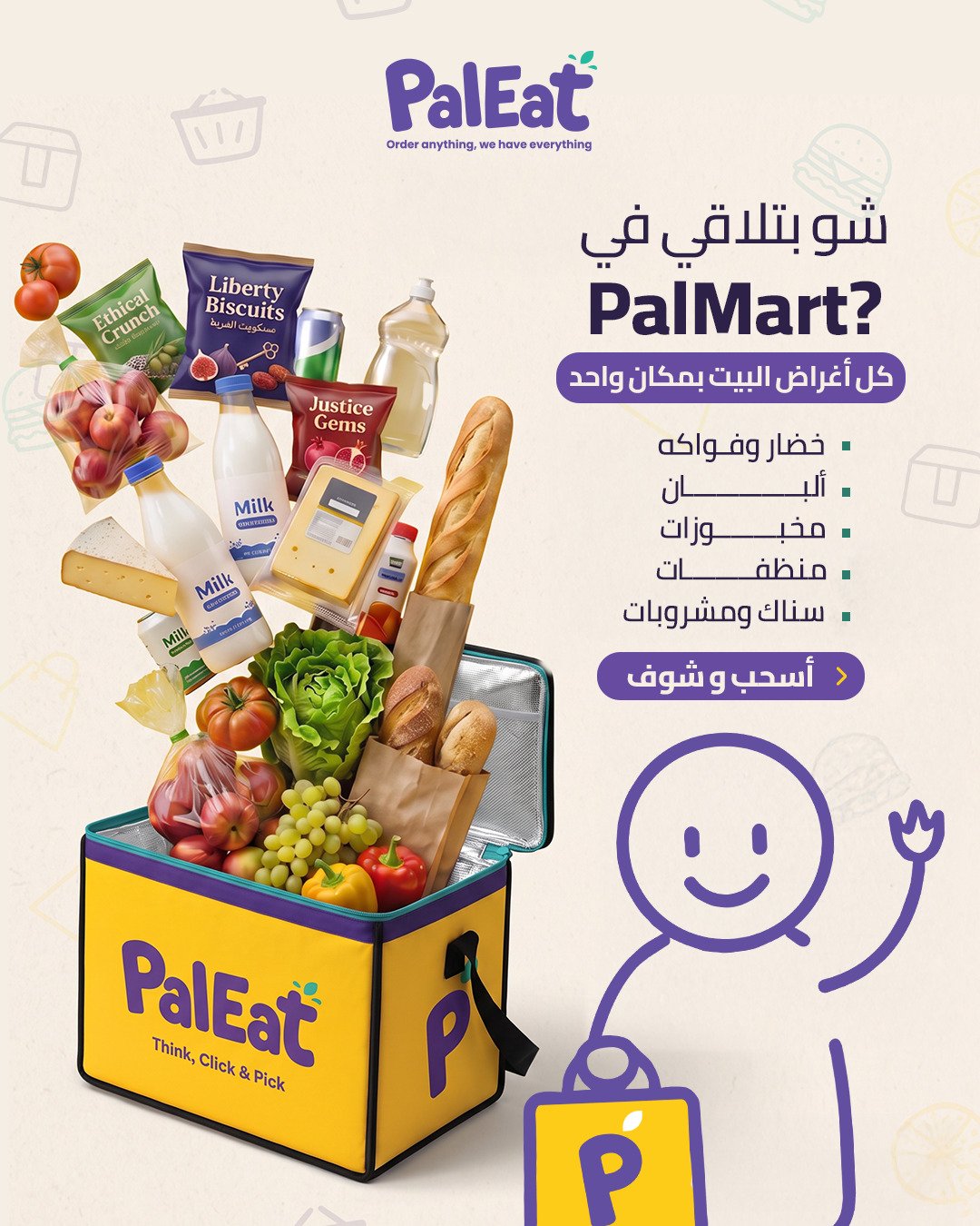
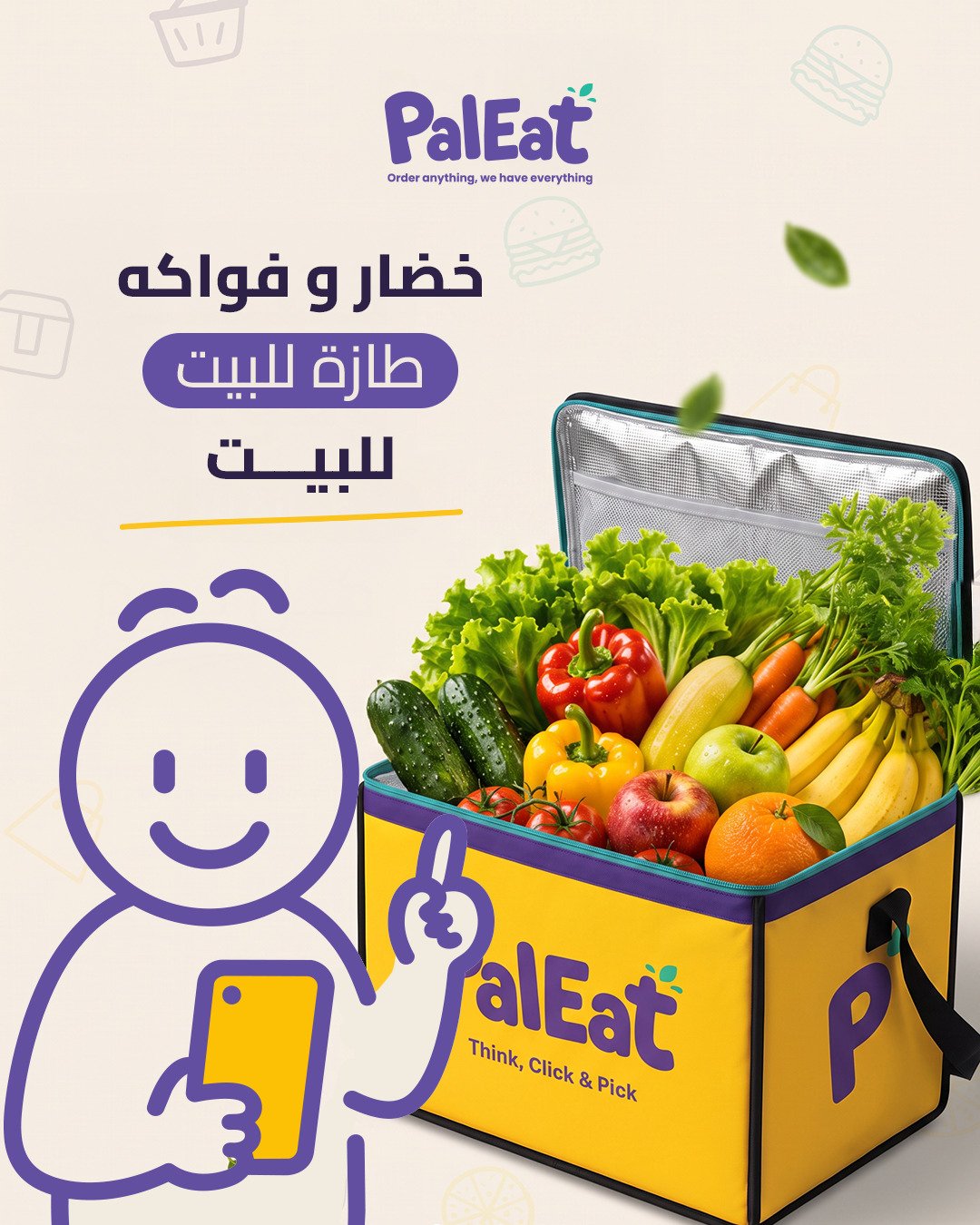
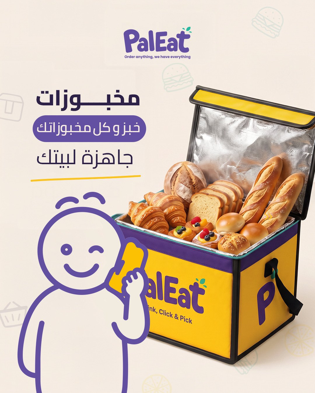
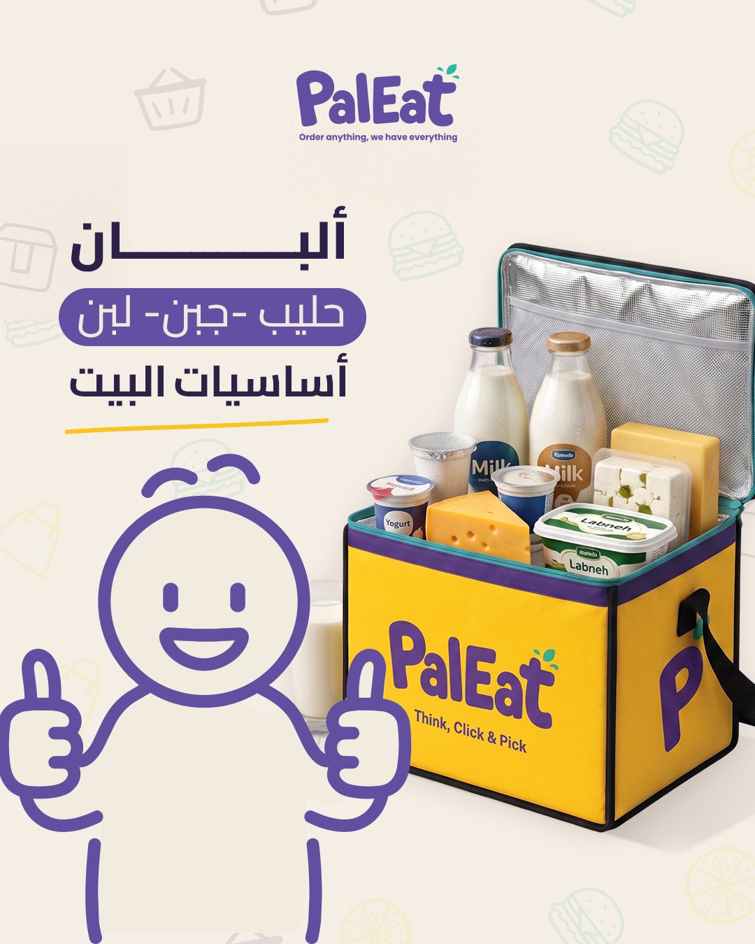
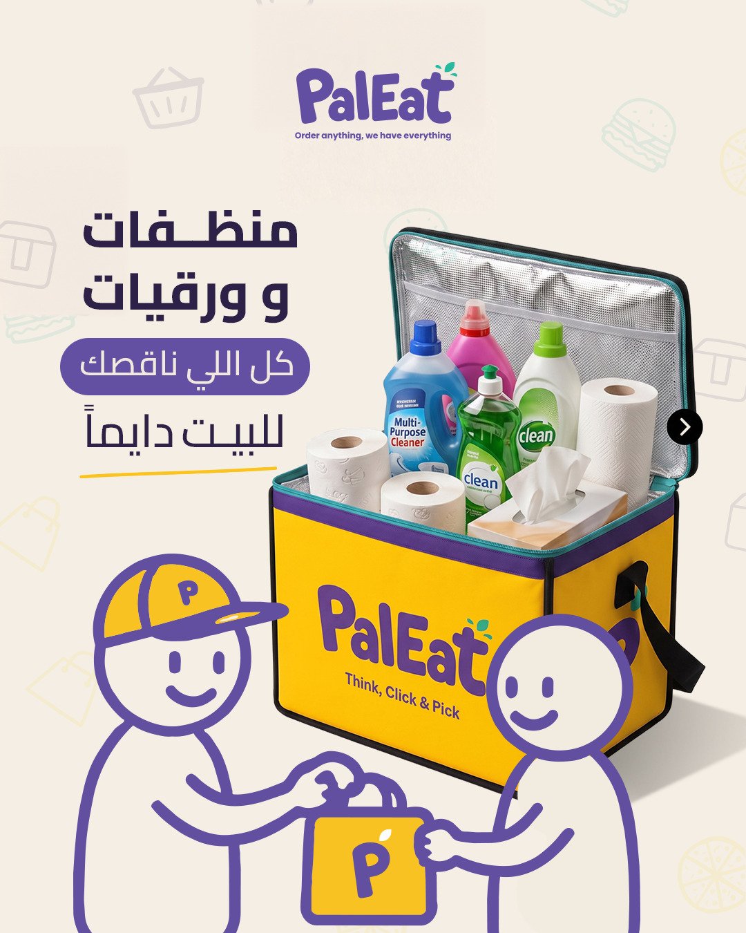
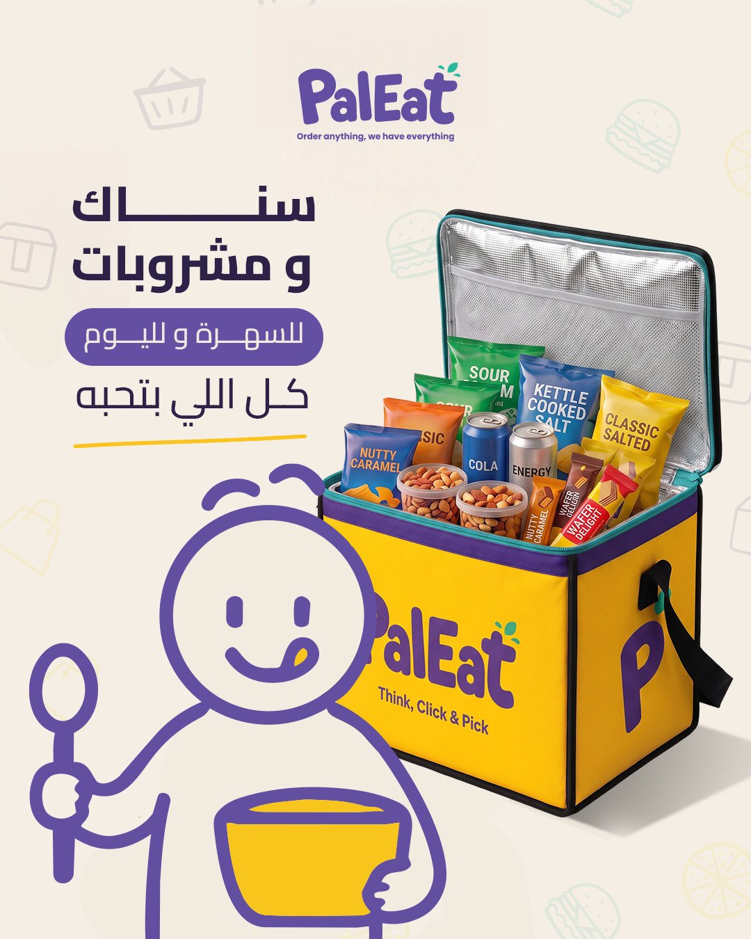
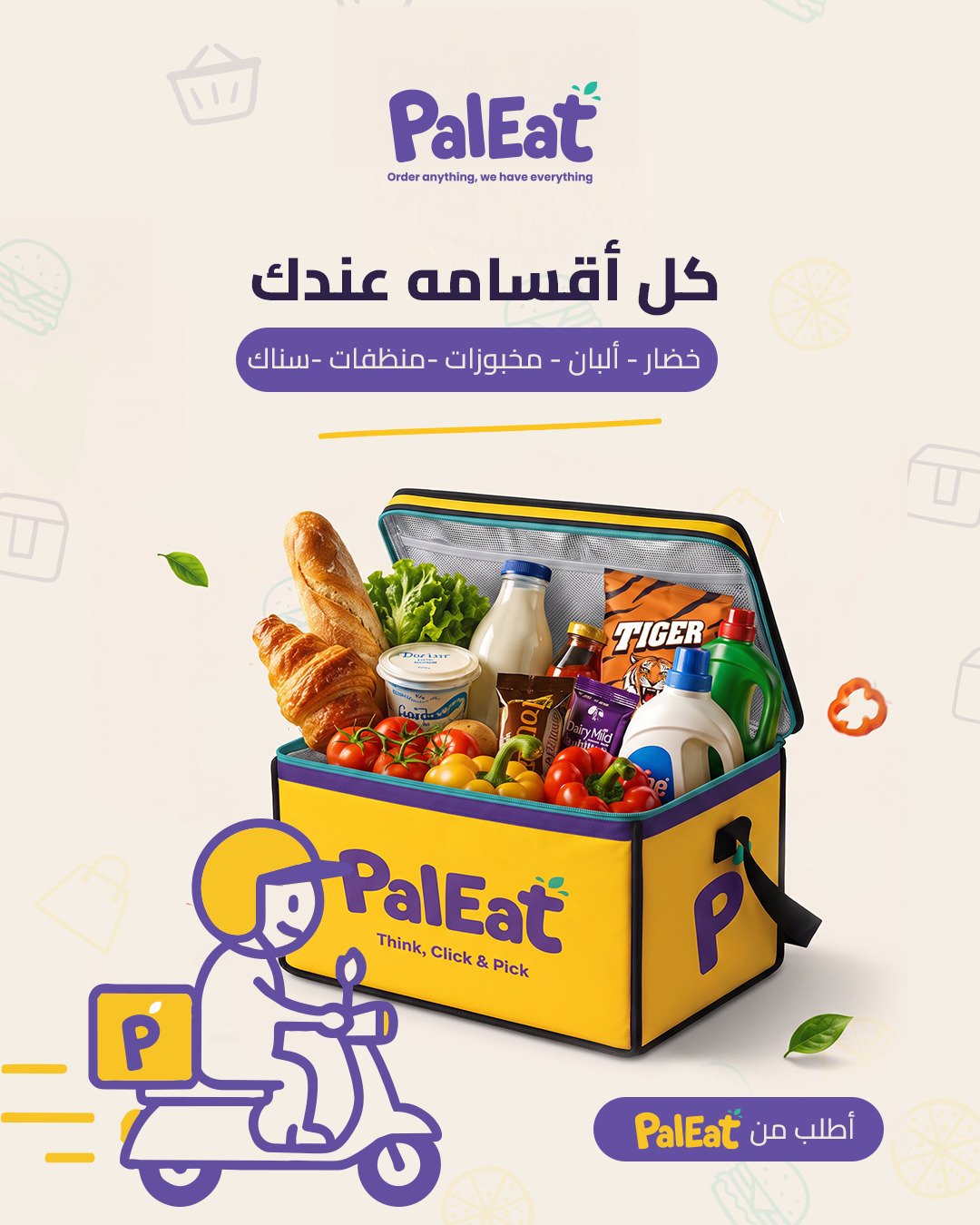
Feed designs and campaign carousels, built to stay legible at thumbnail size and bilingual throughout.
Carousel 17 slides
Carousel 27 slides
Reels & video
Short form motion for the feed.