Branding
Roasta
A Beit Sahour cafe drawn by hand, with a mascot that can carry a cup, a bag or a whole campaign.
Specialty coffee, fresh food, good company.
Roasta is a cafe in Beit Sahour, and the identity had to feel like the room it lives in: casual, warm, and made by people rather than by a template.
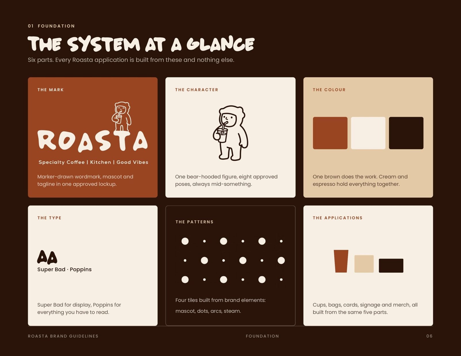
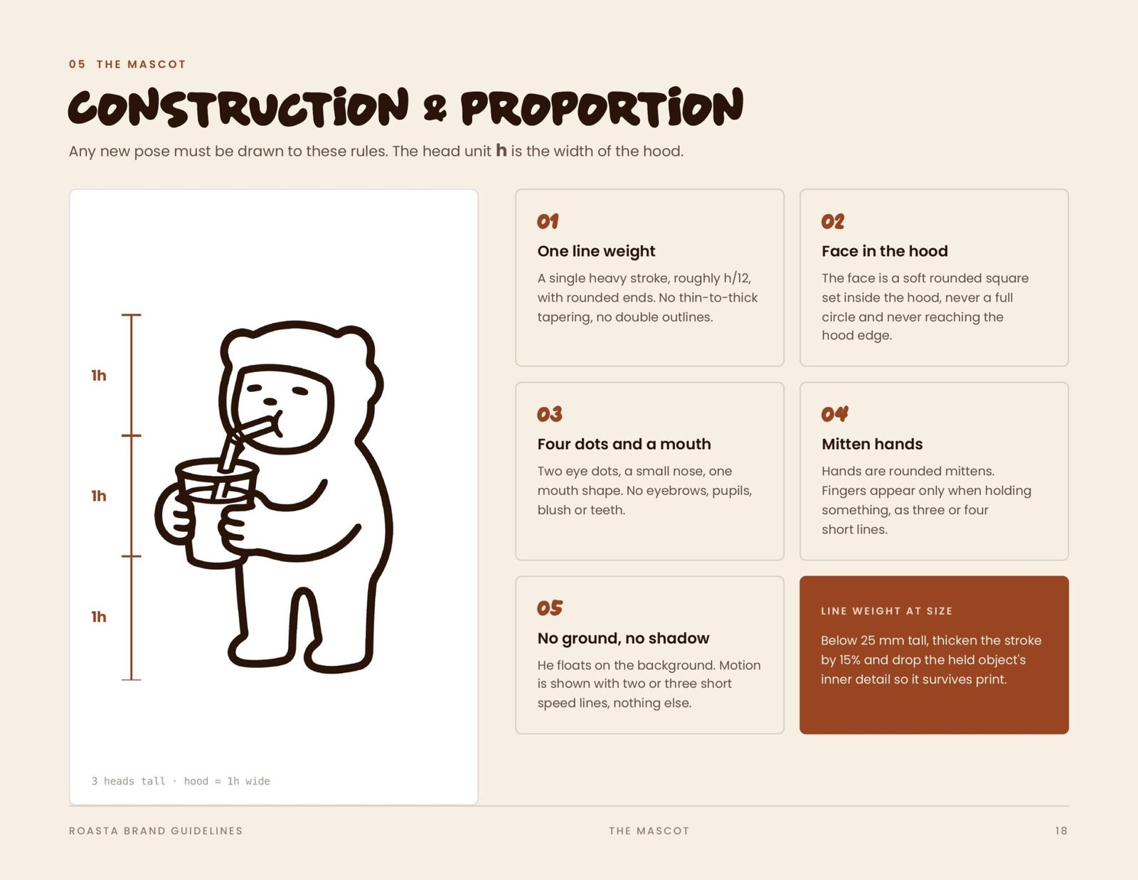
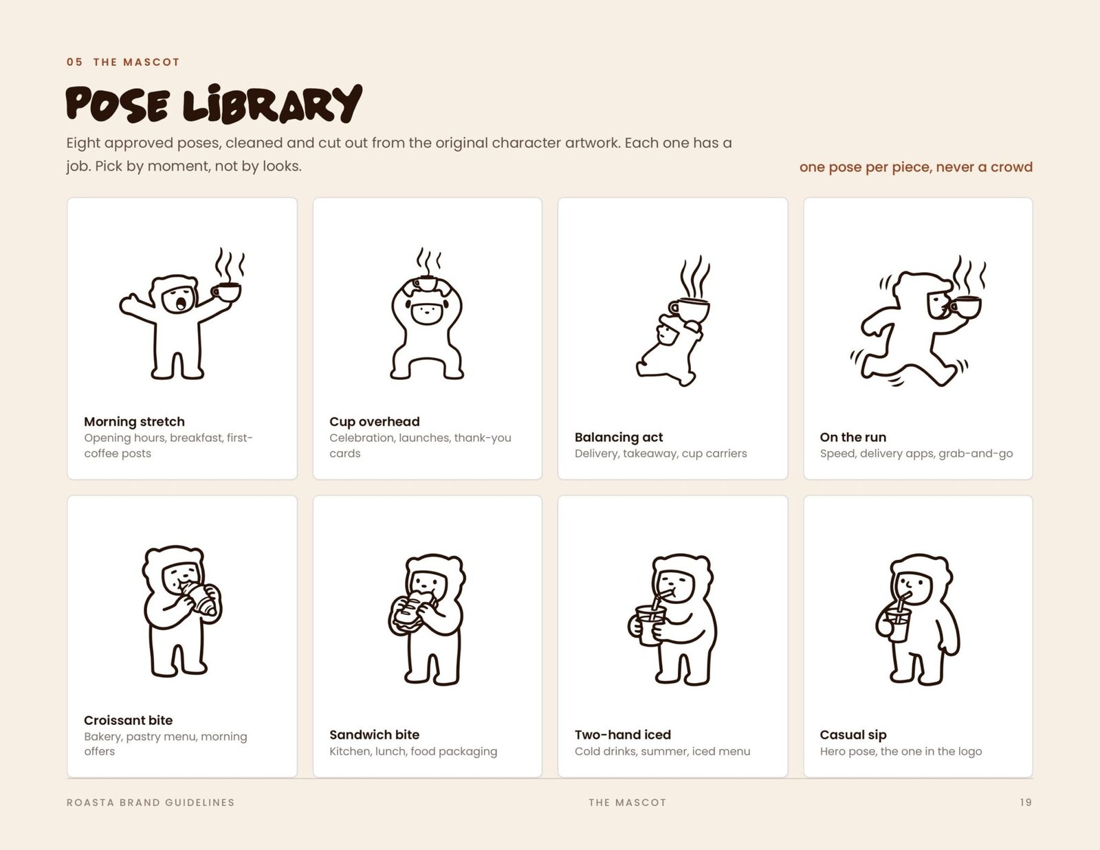
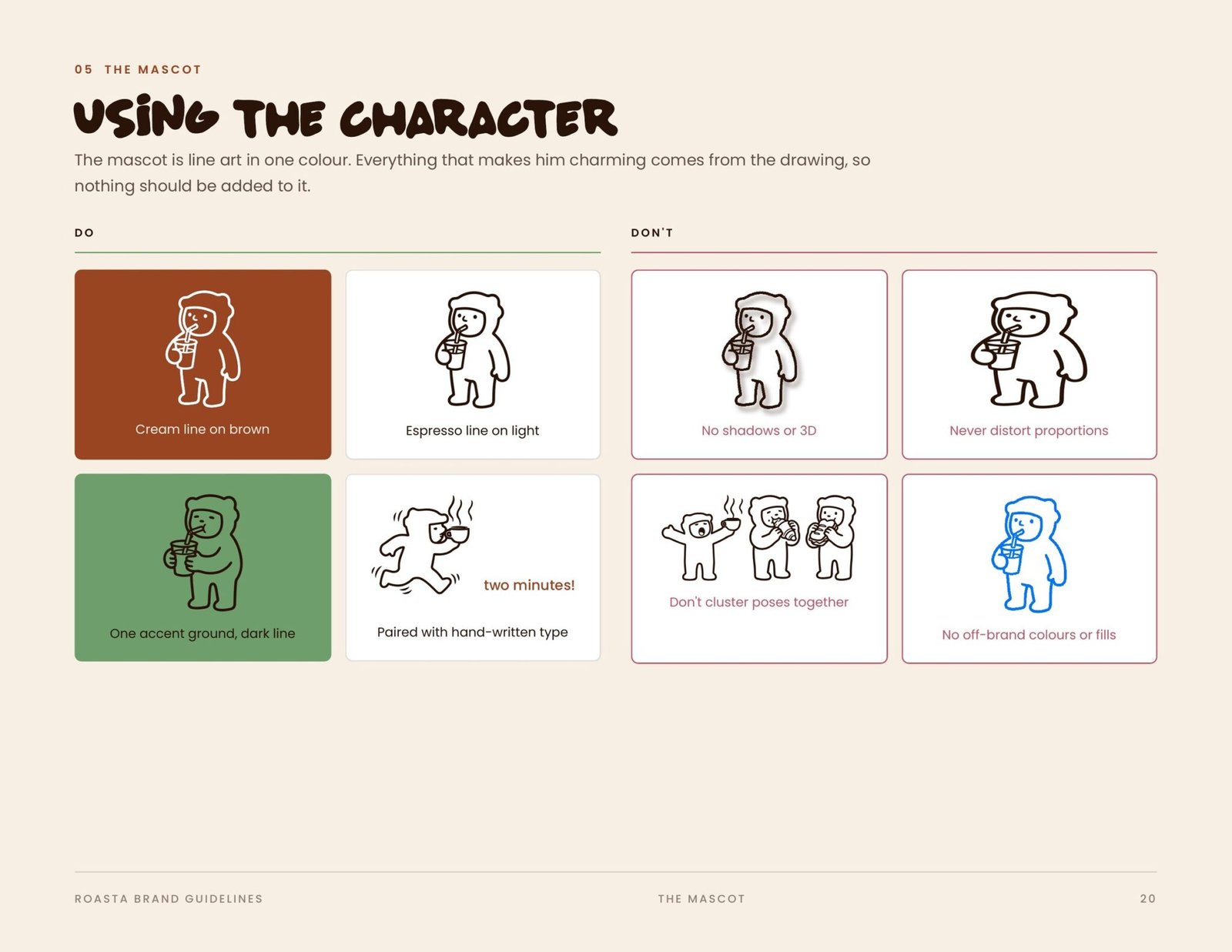
We built it on a naive drawing language. Simple forms, bold colour contrast, and hand-drawn lines that never quite sit straight. At the centre is a mascot with a personality of its own, drawn across a run of poses and expressions so it can turn up on a cup, a bag, a sign or a campaign and still read as the same character.
From there we ran the social: menu promotions, seasonal campaigns and everyday posts that keep the same hand.
- Client
- Roasta
- Year
- 2026
- Disciplines
- Branding, Motion
Branding
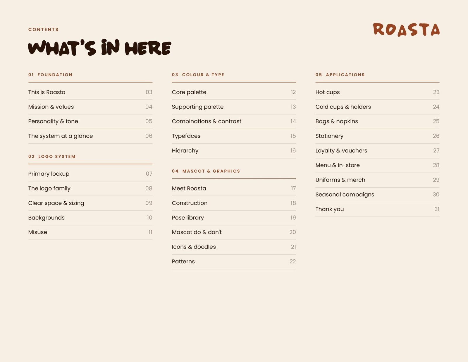
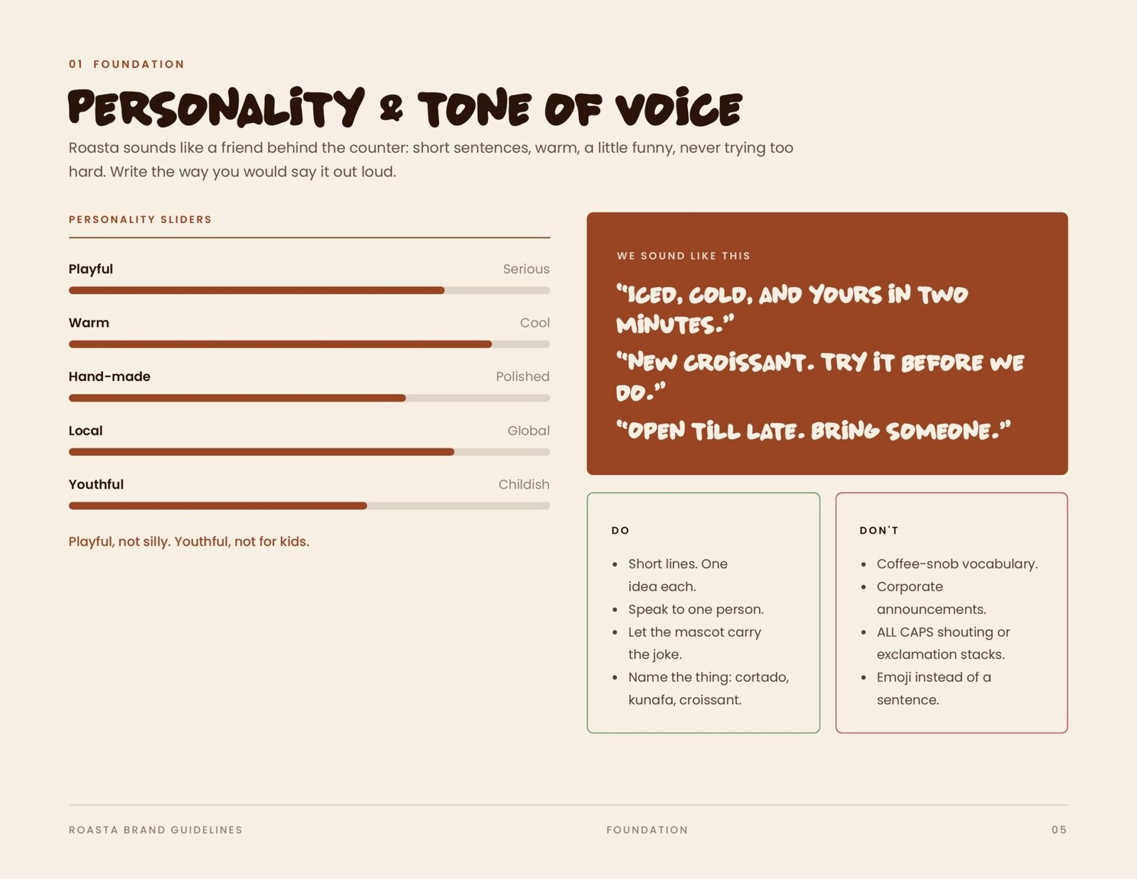
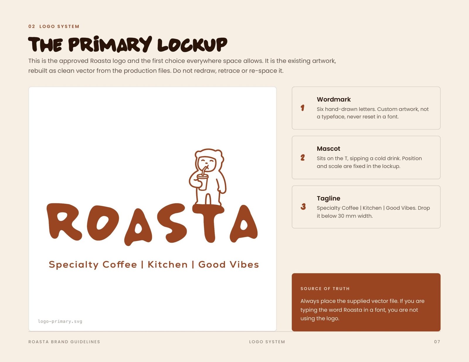
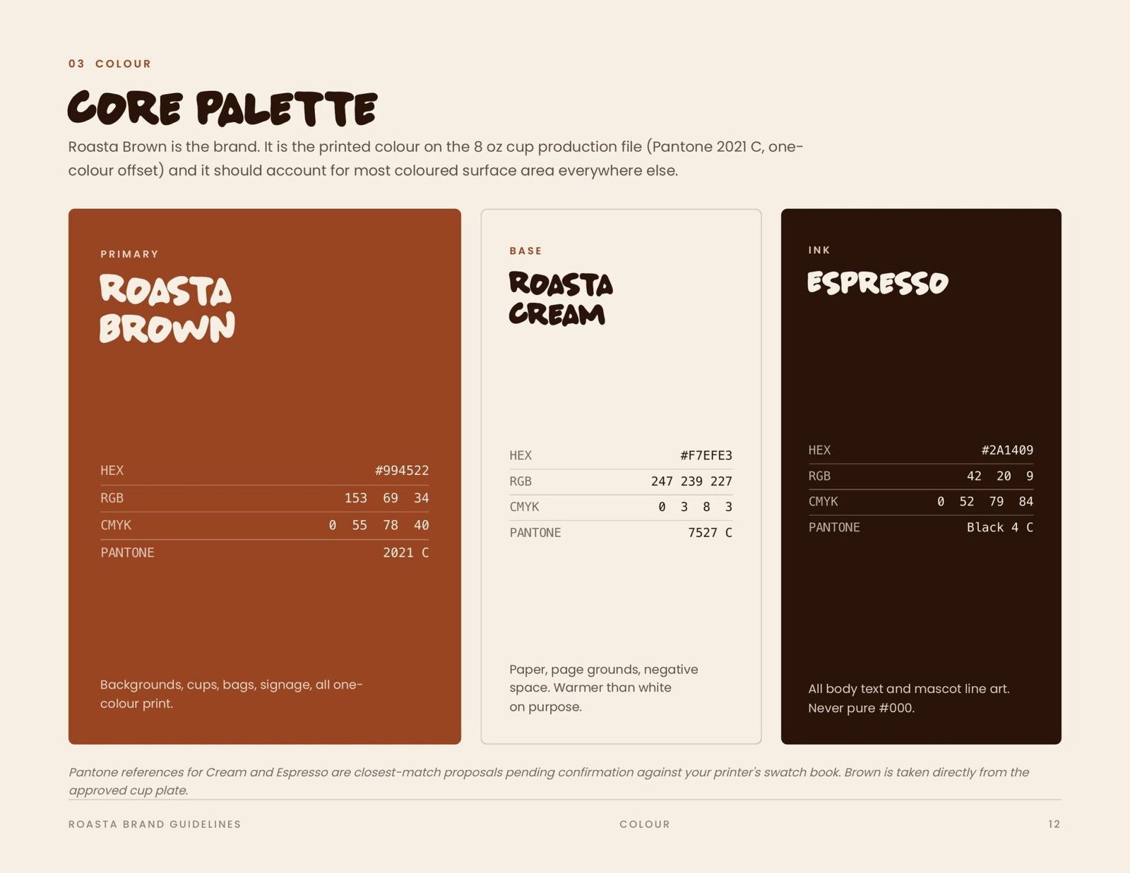
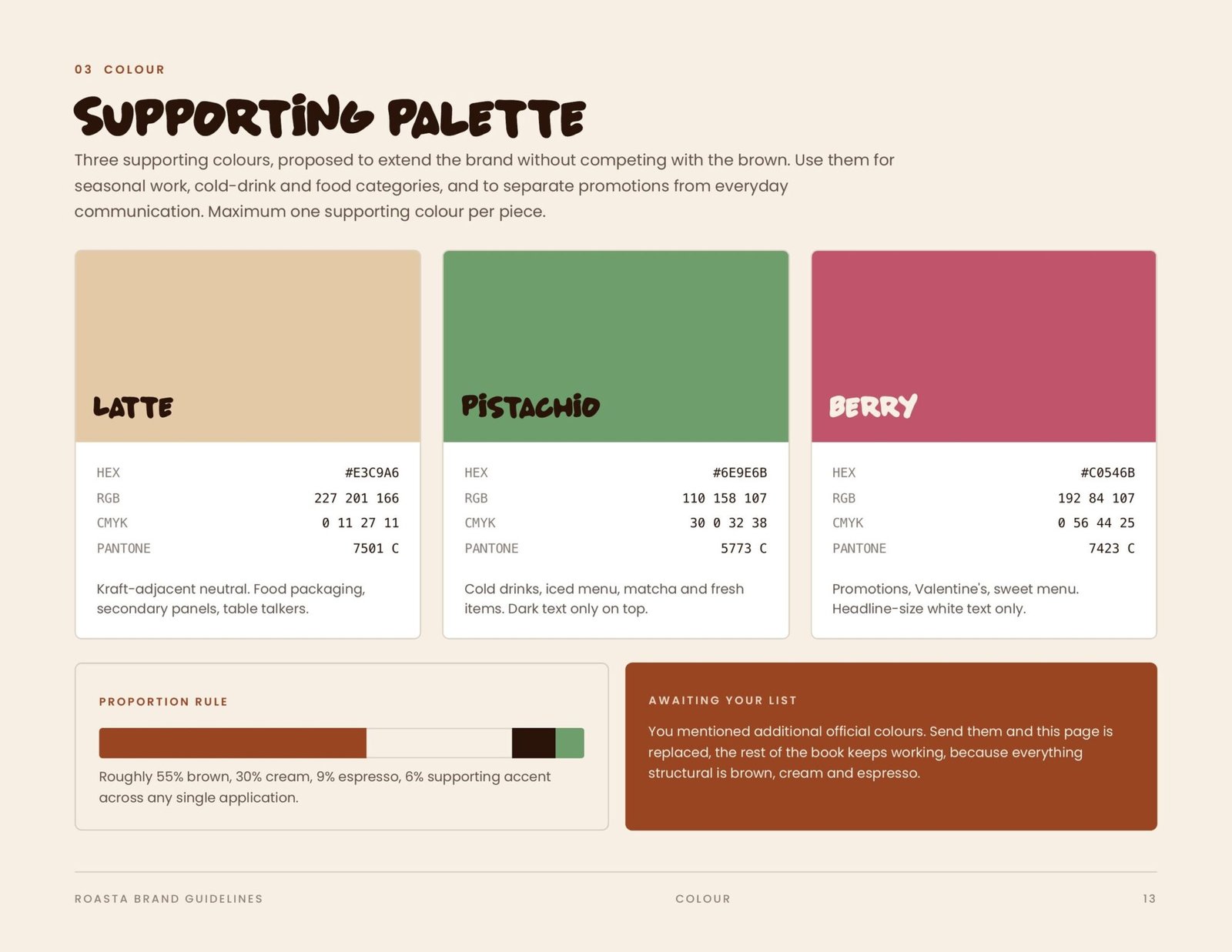
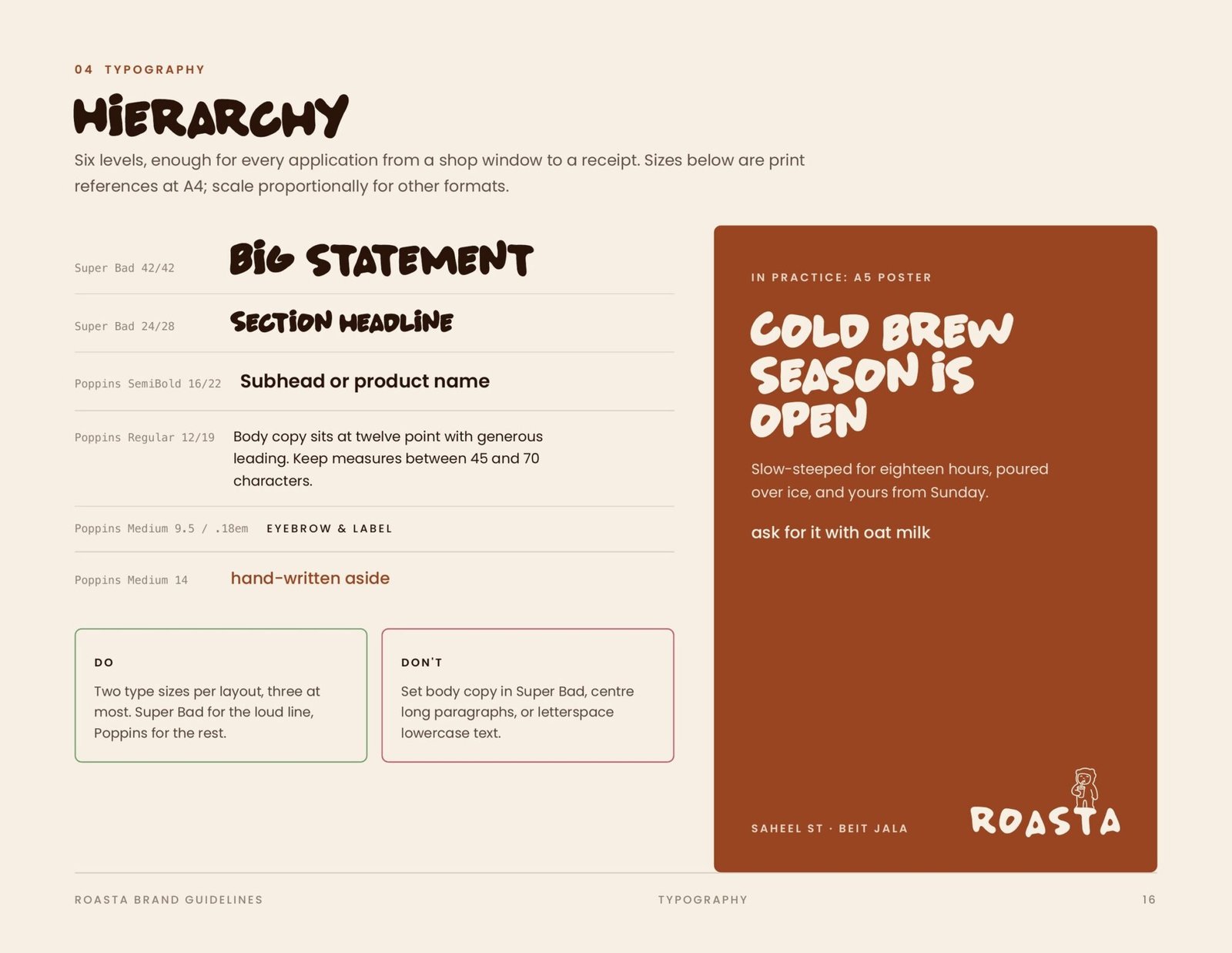
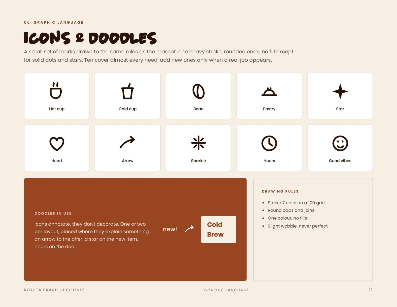
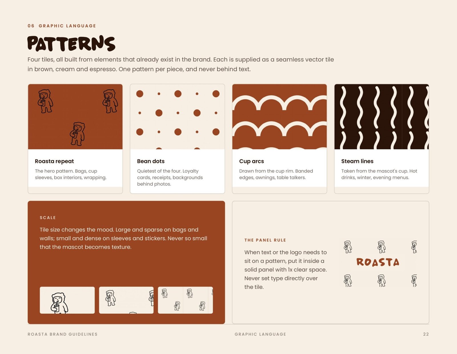
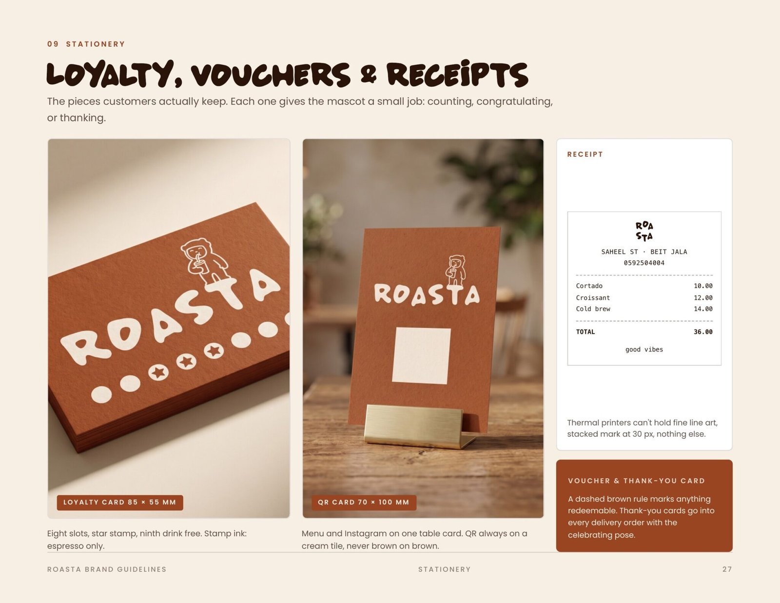
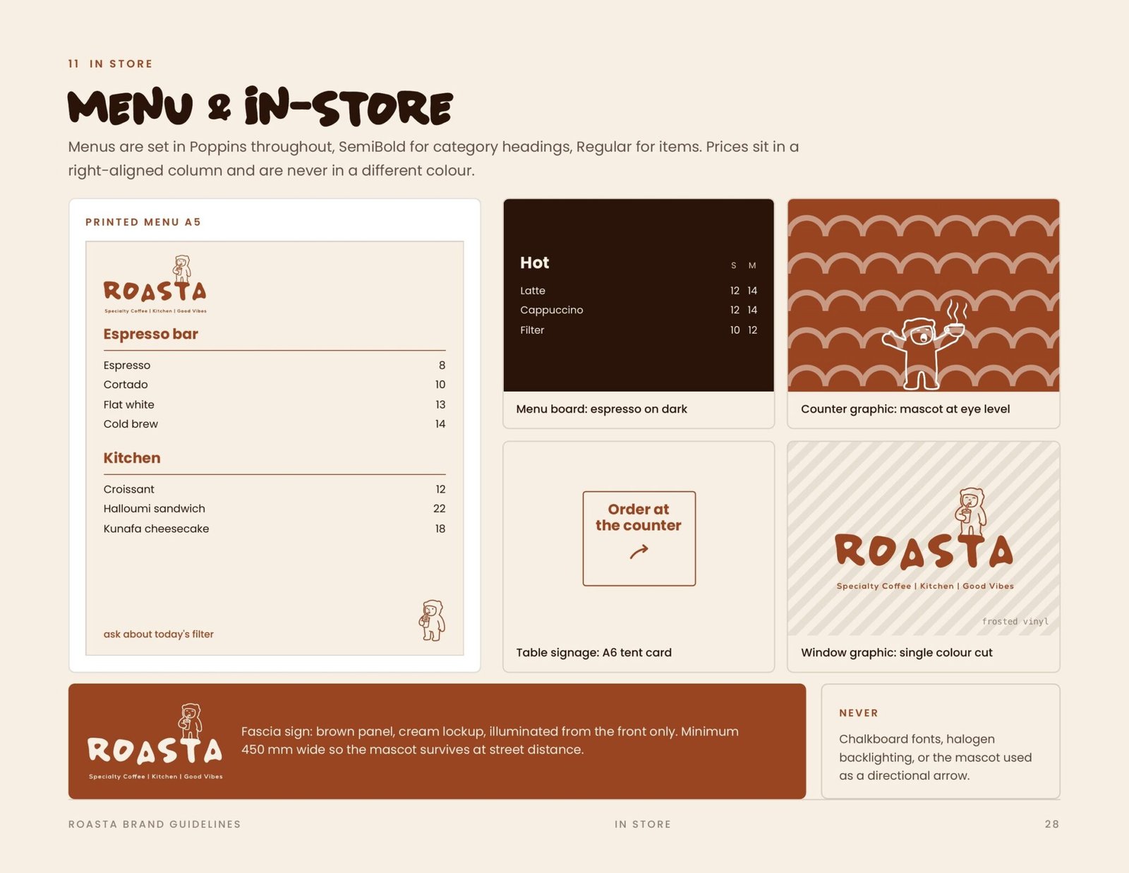
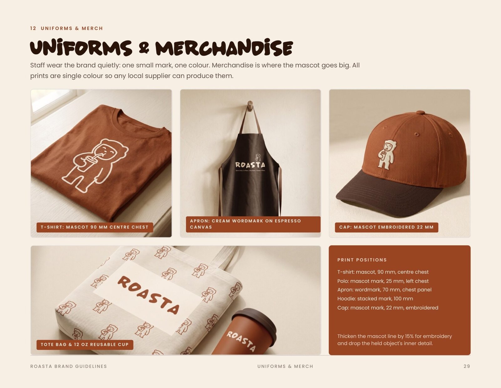
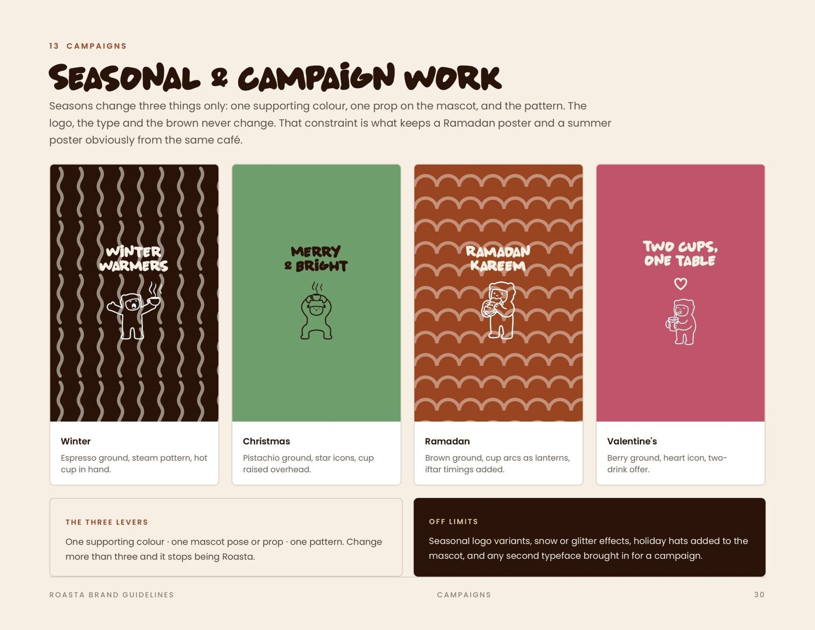
The full brand guidelines: the hand-drawn wordmark and its logo family, clear space and misuse, the Roasta Brown and Cream core palette with the Latte, Pistachio and Berry supports, the type scale, the mascot with its construction and pose library, the icon and pattern set, and the applications across cups, bags, napkins, stationery, uniforms, menus and seasonal campaigns.
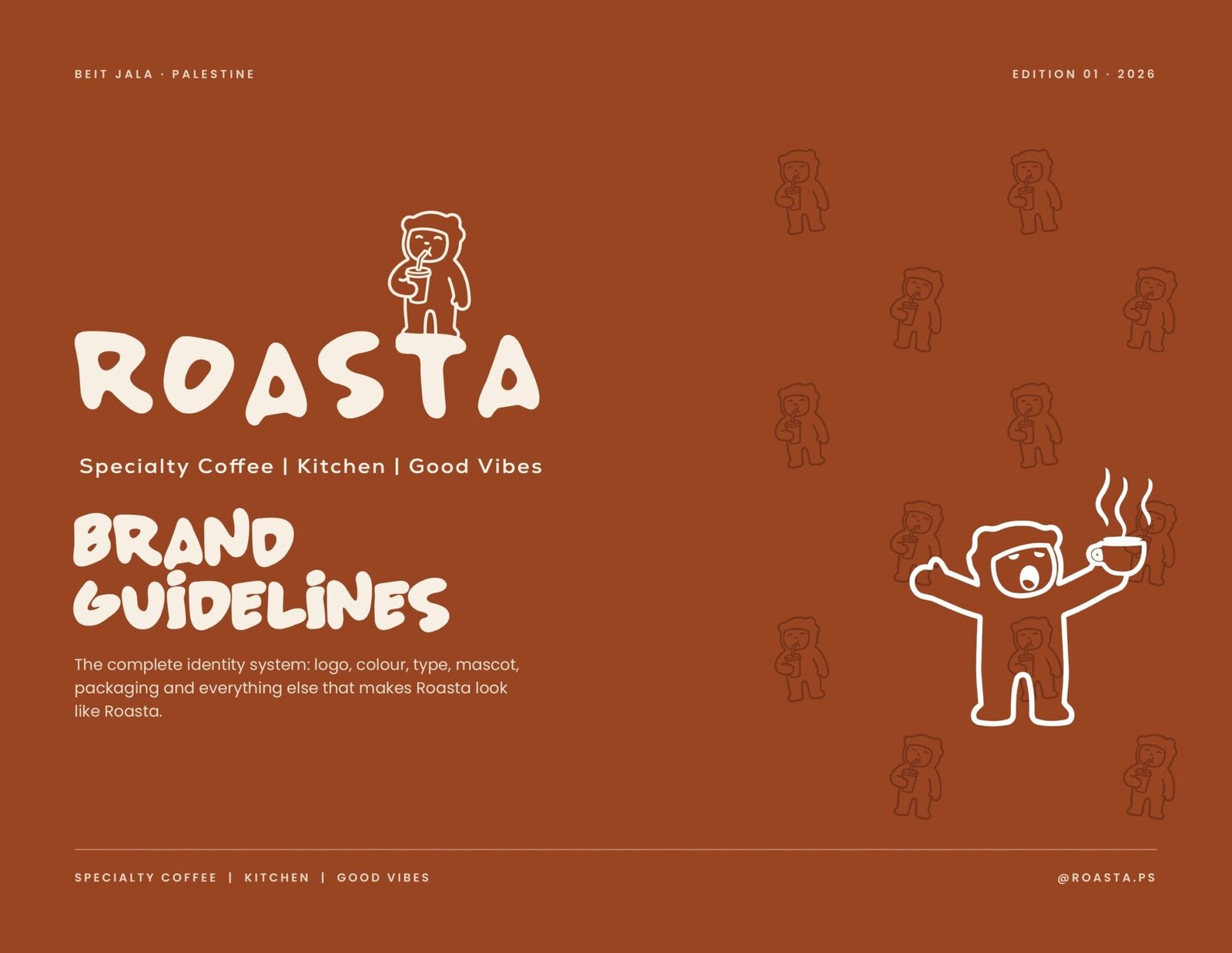


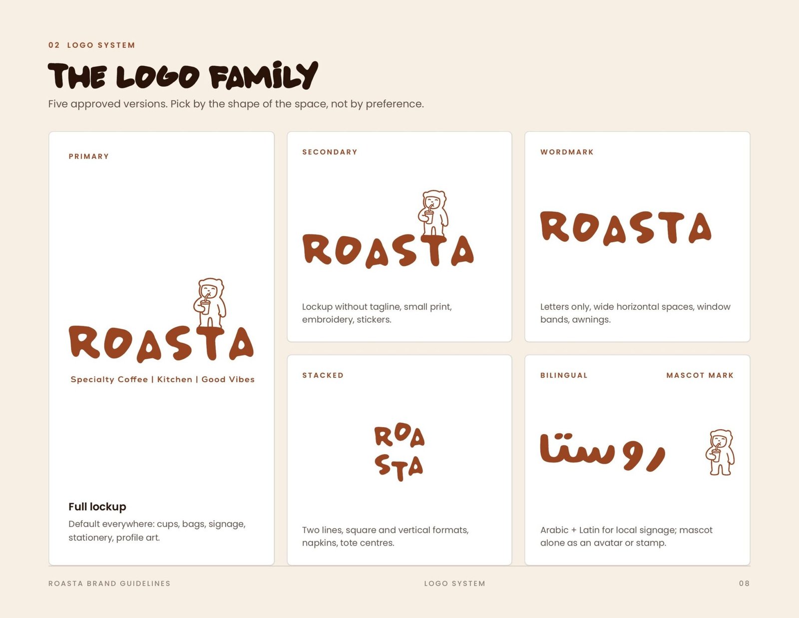
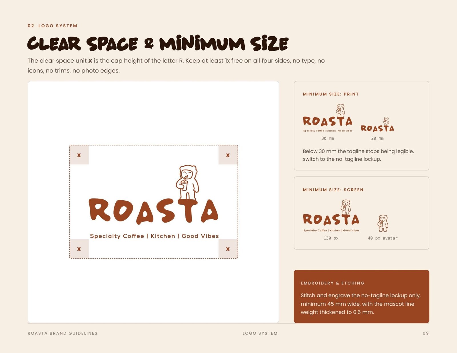
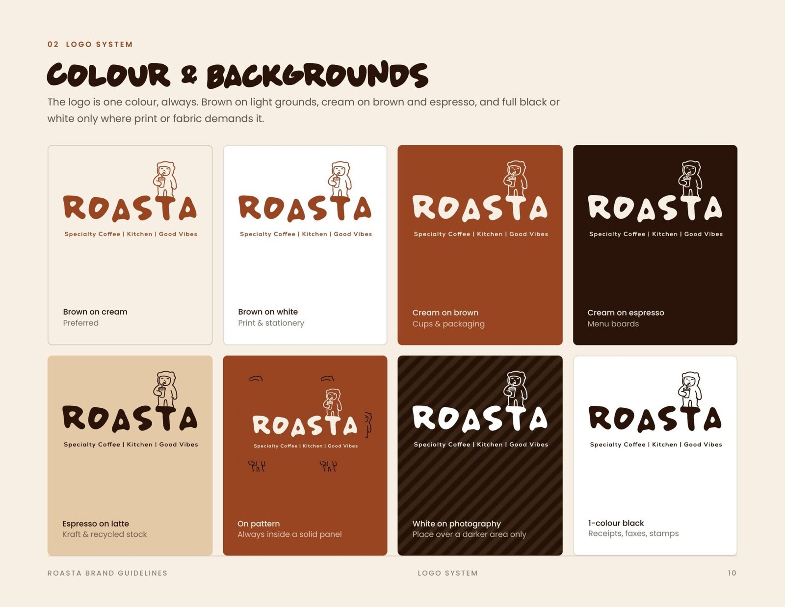
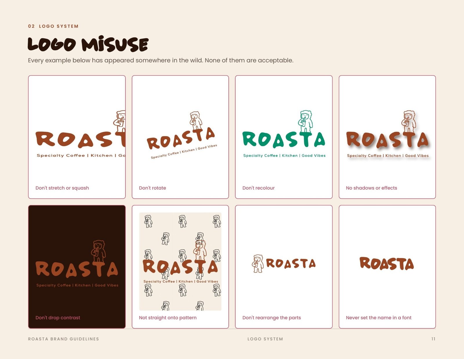



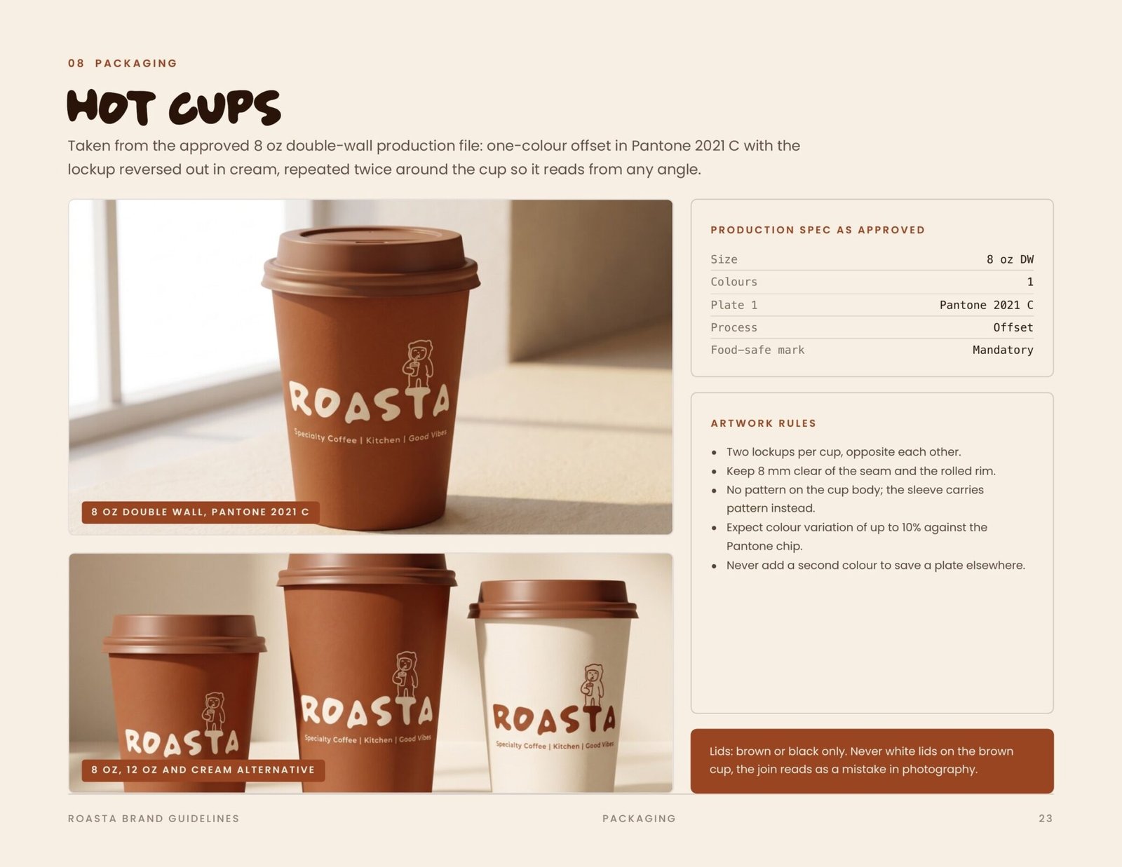
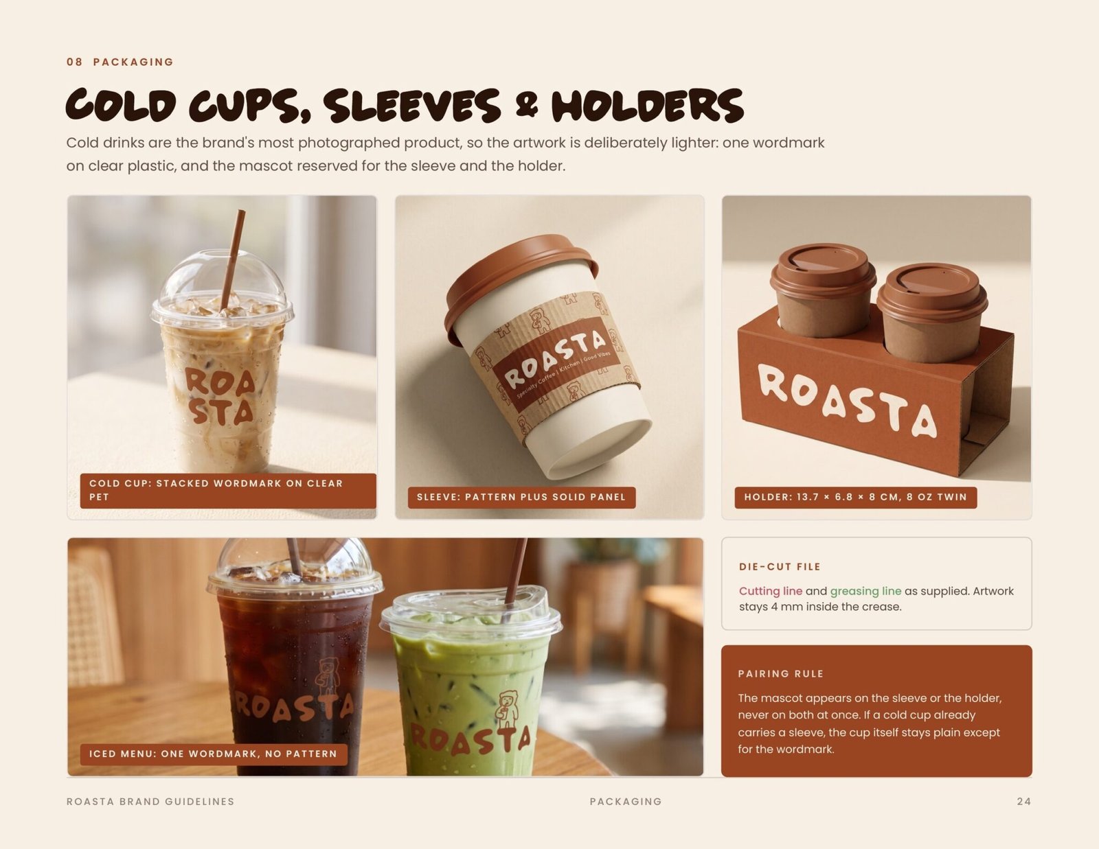
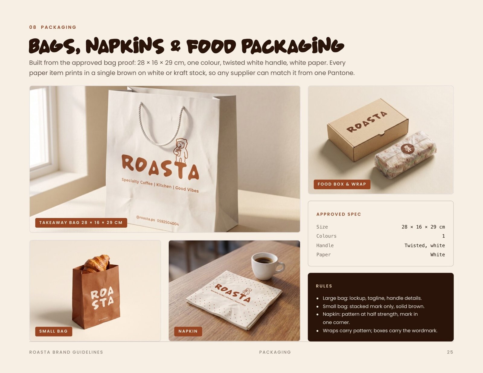
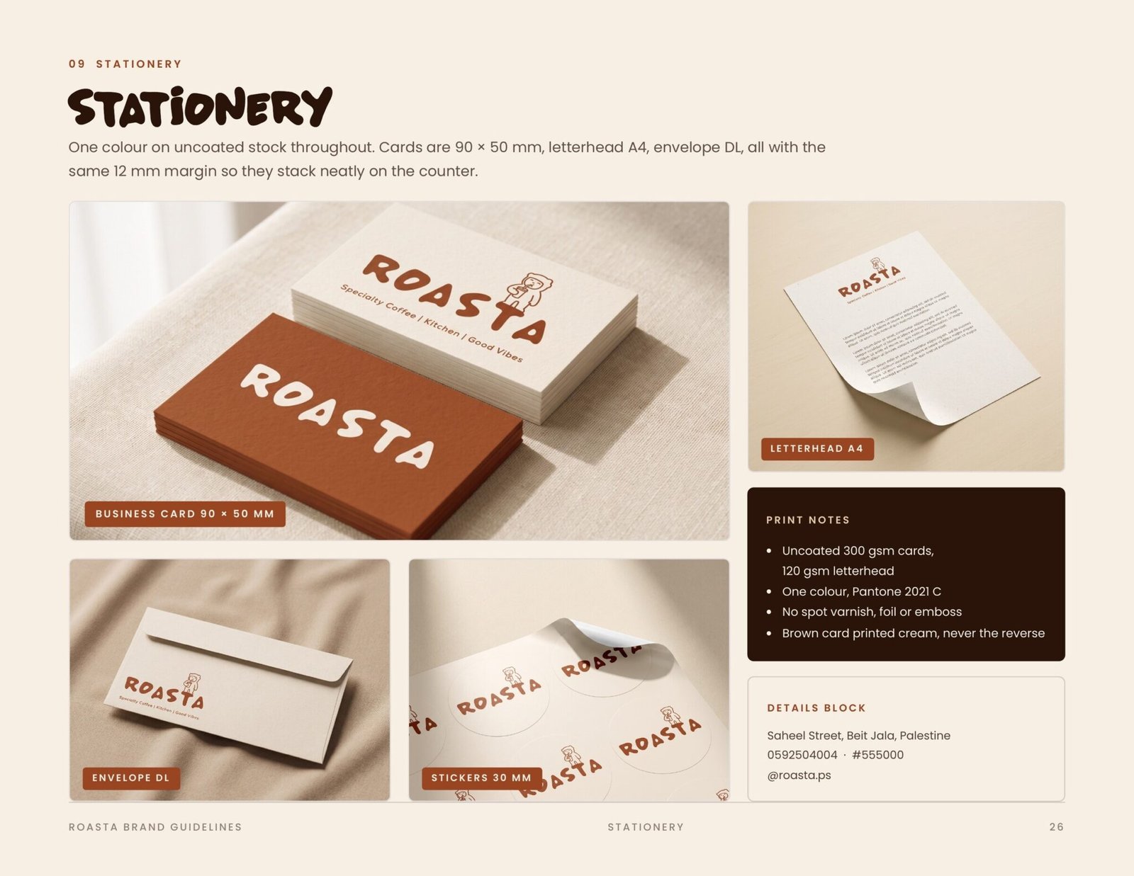

31 pages, stacked. Drag the top one aside to reach the next.
Reels & video
Short form motion for the feed.