Branding
Sodfeh
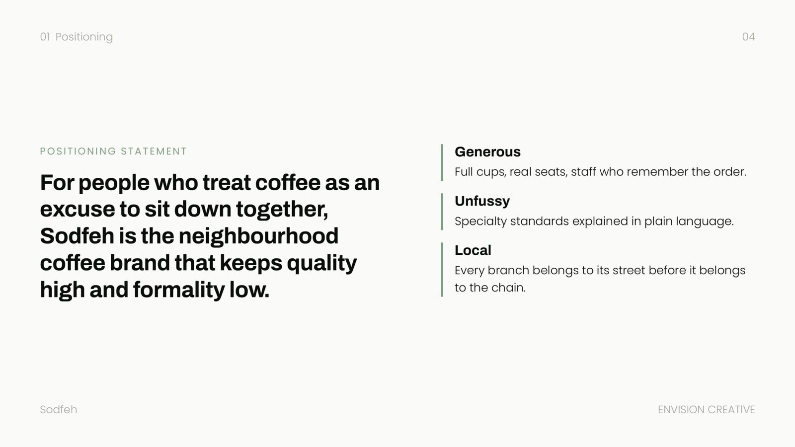
A neighbourhood coffee brand for people who treat coffee as an excuse to sit down together.
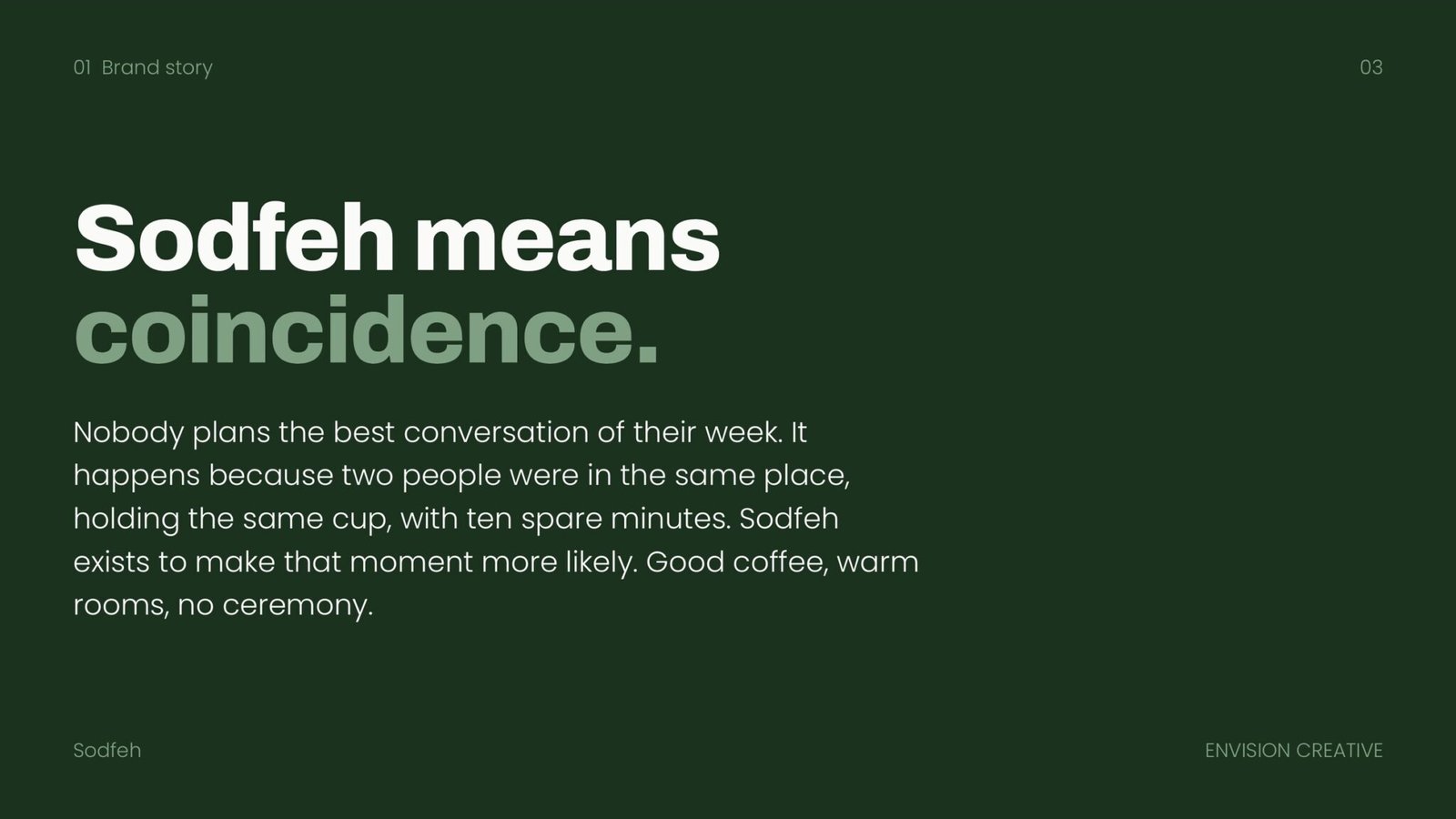
Sodfeh means coincidence. The brand is built on the idea that the best conversation of your week is the one nobody planned: two people in the same place, holding the same cup, with ten spare minutes.
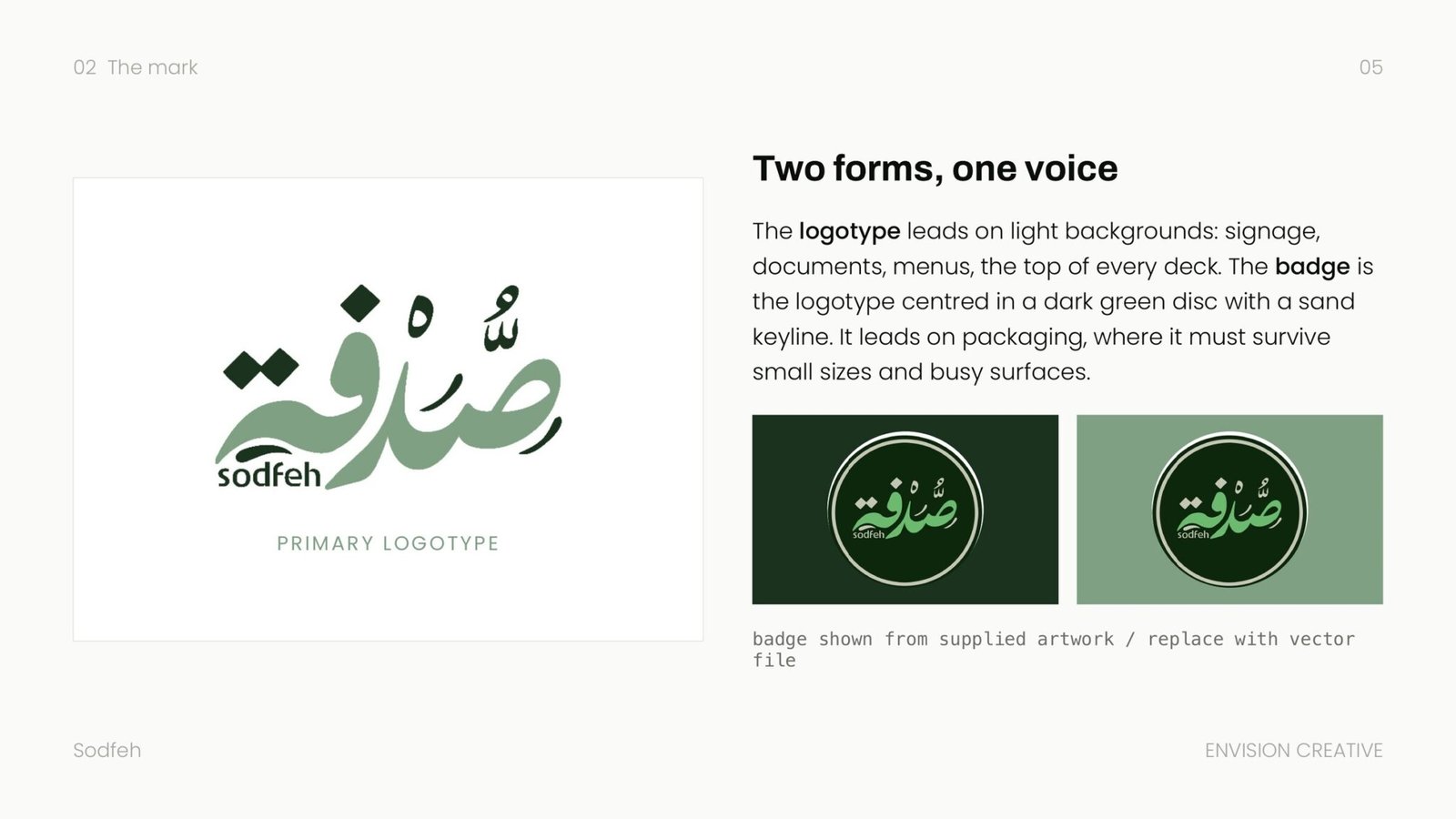
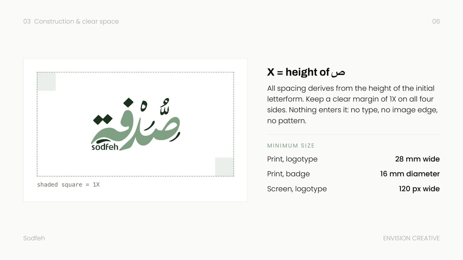
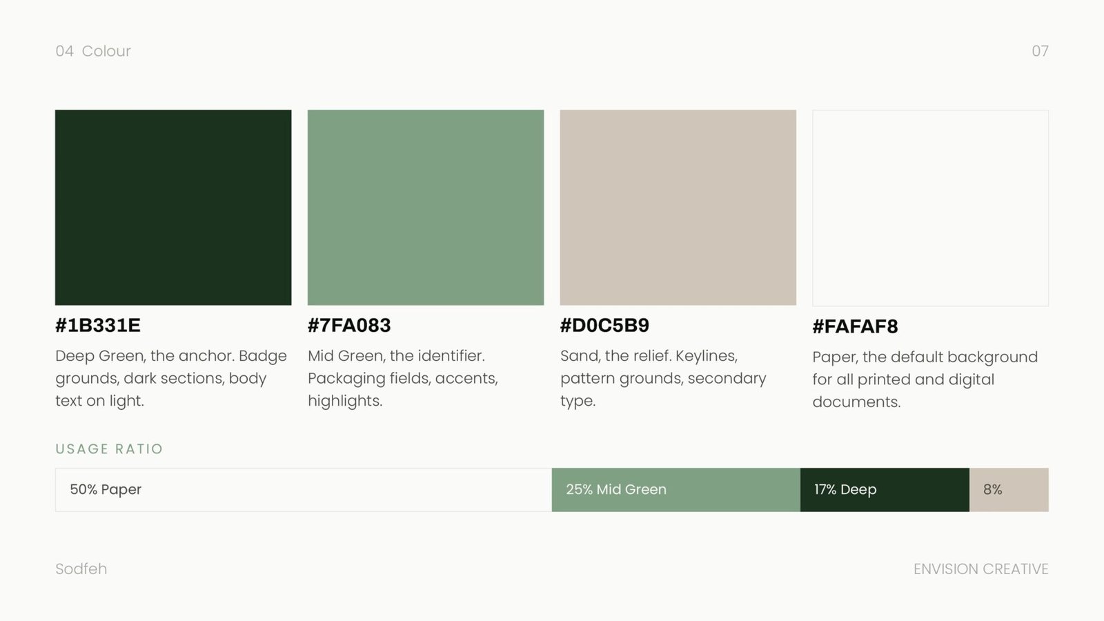
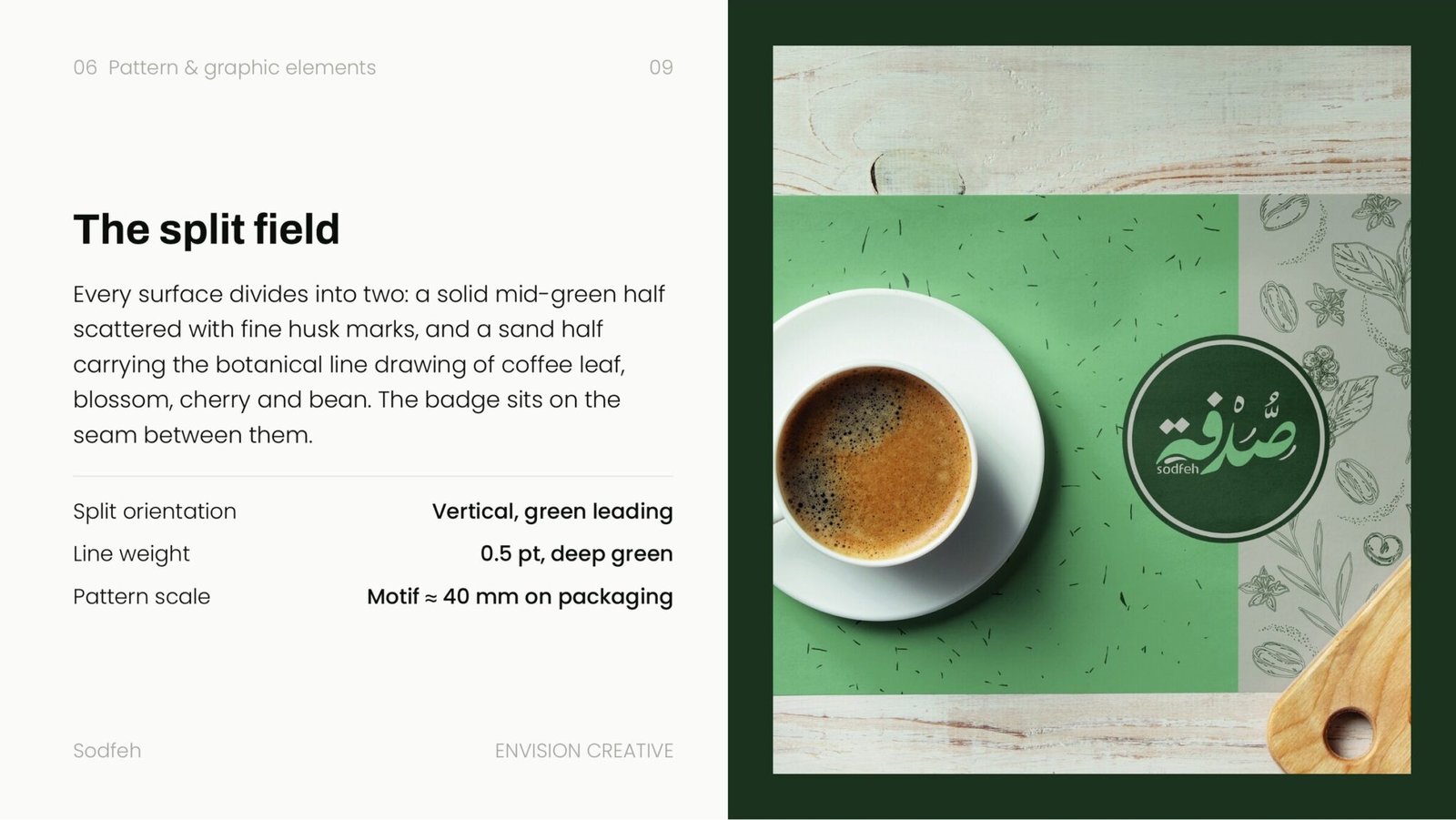
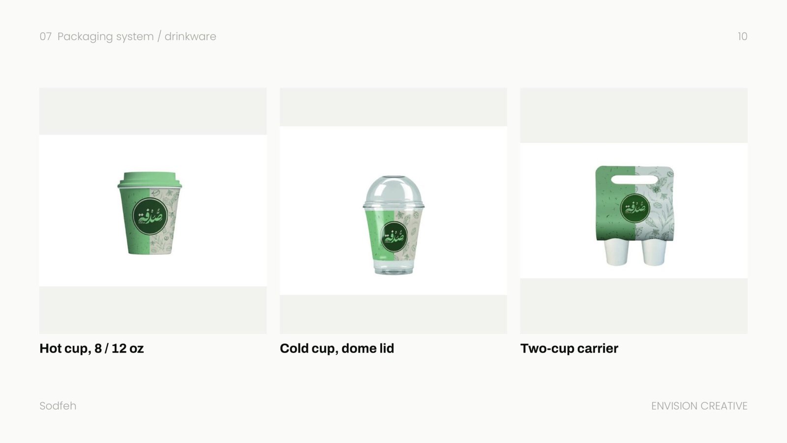
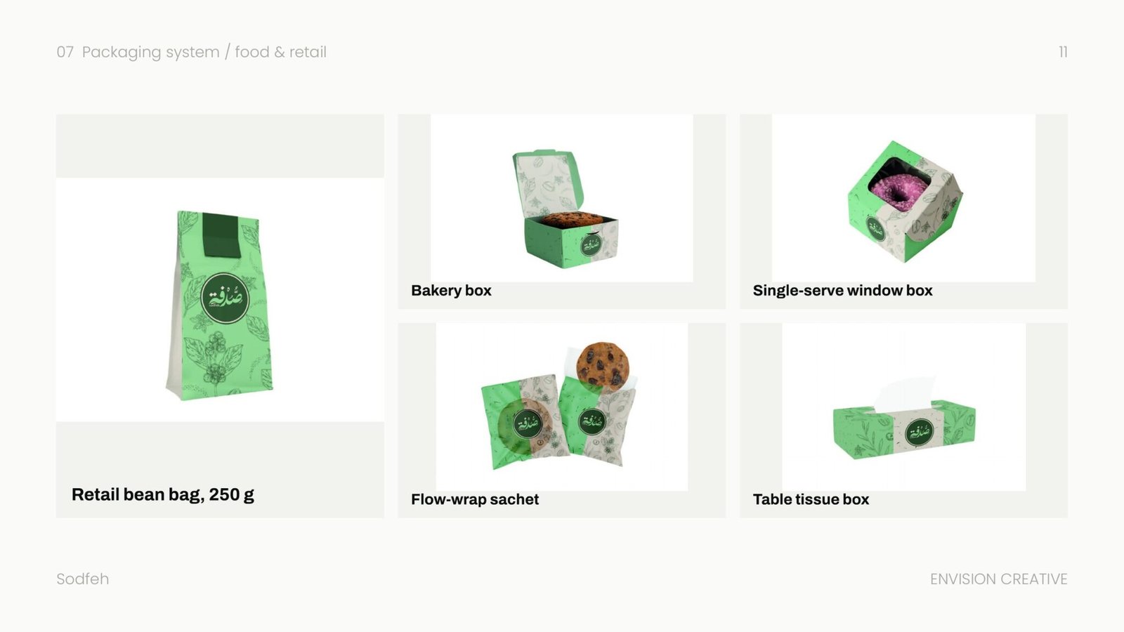
The identity carries that in a bilingual logotype that leads on light surfaces and a badge that survives small sizes and busy packaging. A deep green anchors the system, a mid green identifies it, and a sand neutral keeps the shelf calm. The split field runs through every surface, from the cup to the bean bag to the table tissue.
- Client
- Sodfeh
- Year
- 2026
- Disciplines
- Branding
Branding
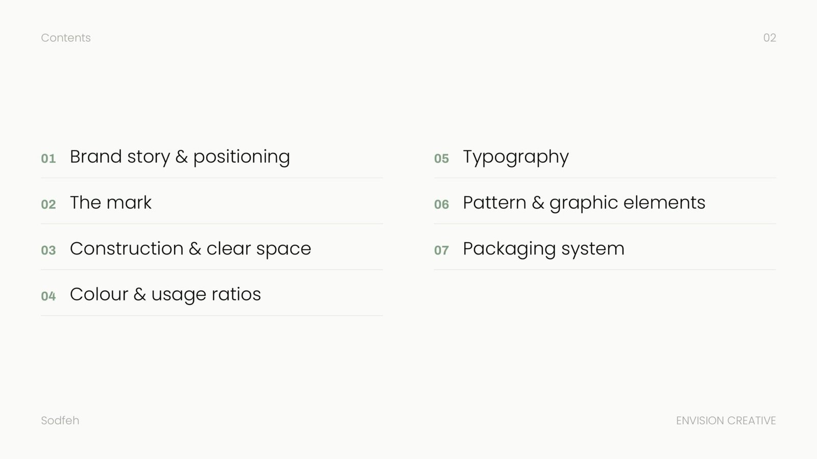
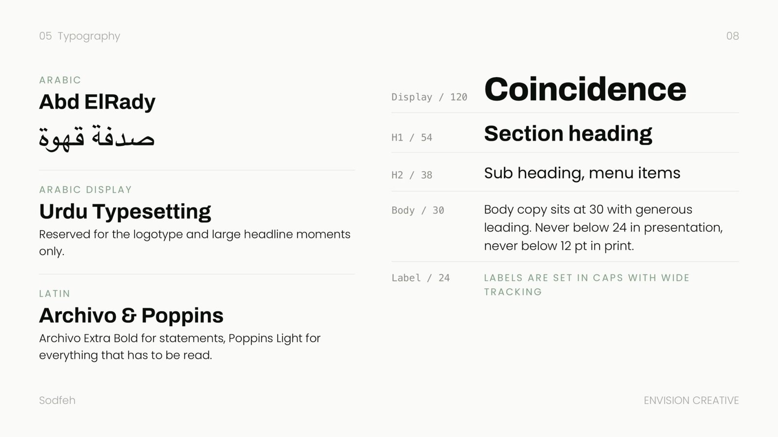
The full brand book: the bilingual logotype and badge, construction and clear space, the colour ratios, the type scale, the split field pattern and the packaging system across cups, bags and boxes.
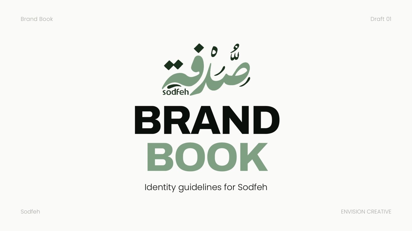
12 pages, stacked. Drag the top one aside to reach the next.