
Branding
Dilato
An identity you can eat: pick, dip, enjoy.
Pick. Dip. Enjoy.
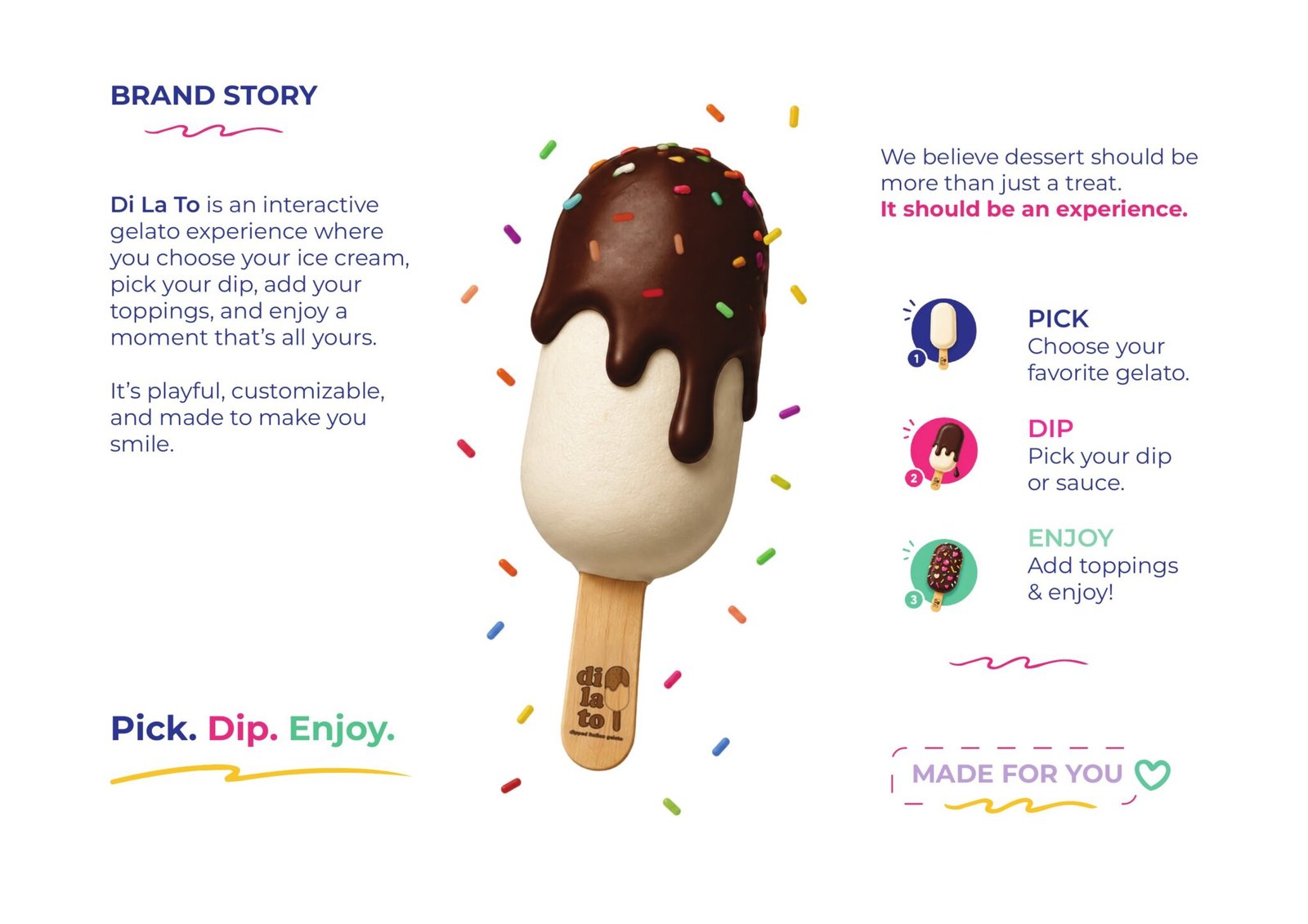
Di La To is an interactive gelato experience: you choose the gelato, pick the dip, add the toppings, and walk out with something nobody else ordered. The brief was to make that choosing feel like the product, not a step before it.
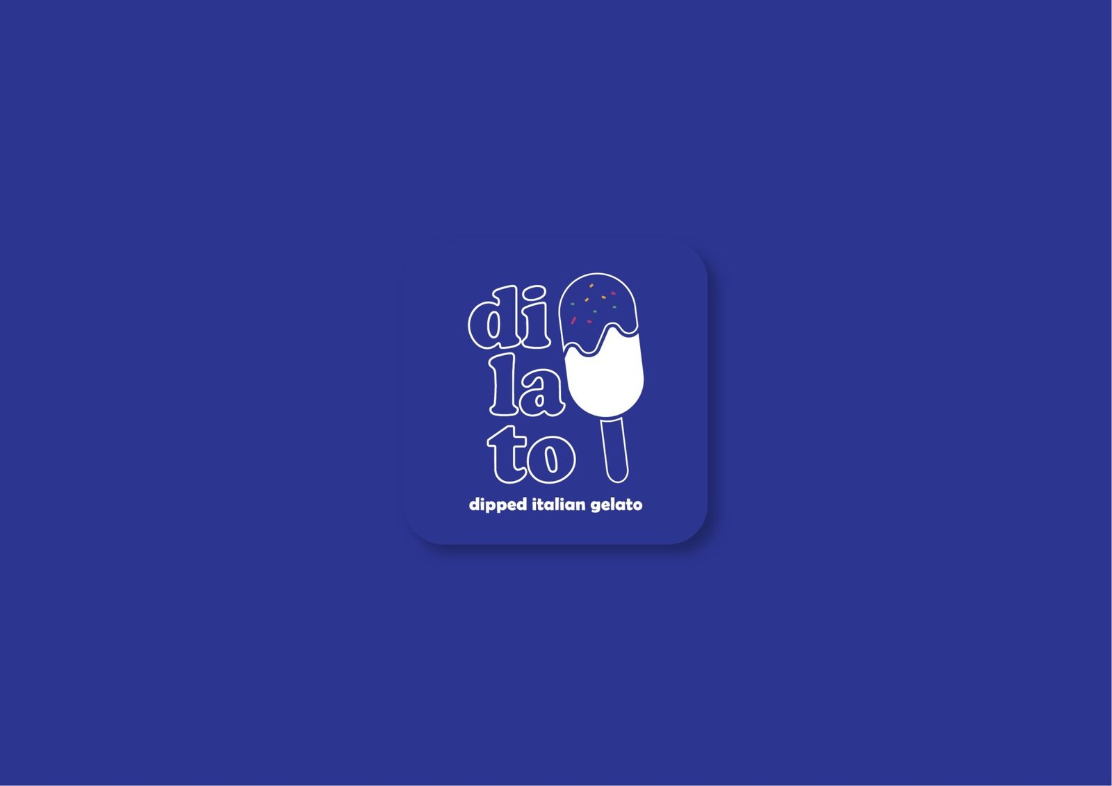
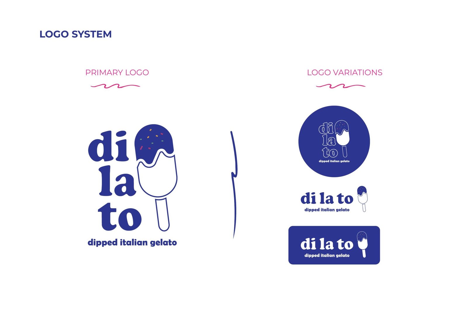
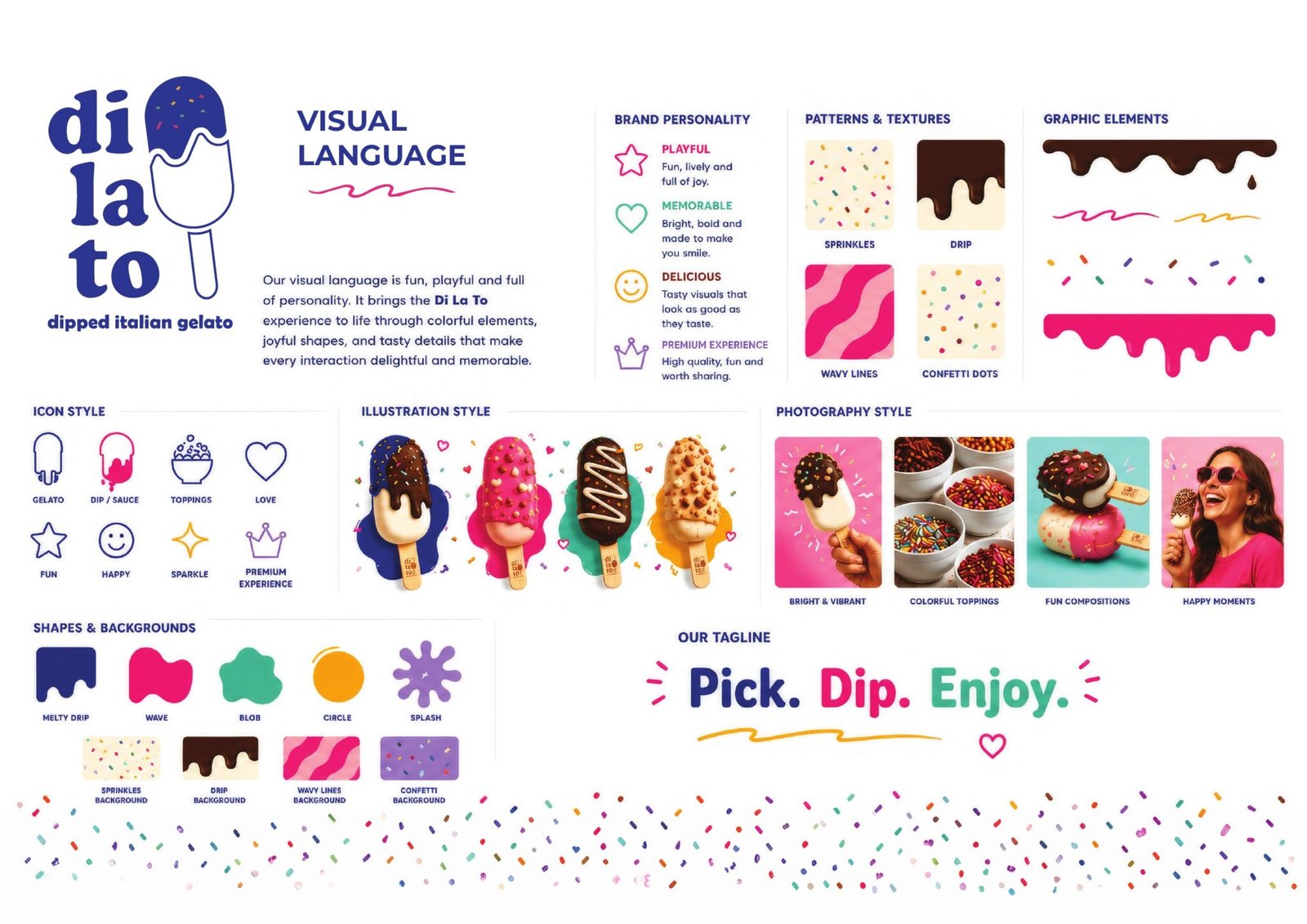
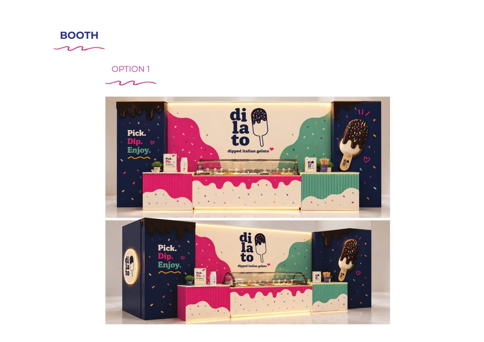
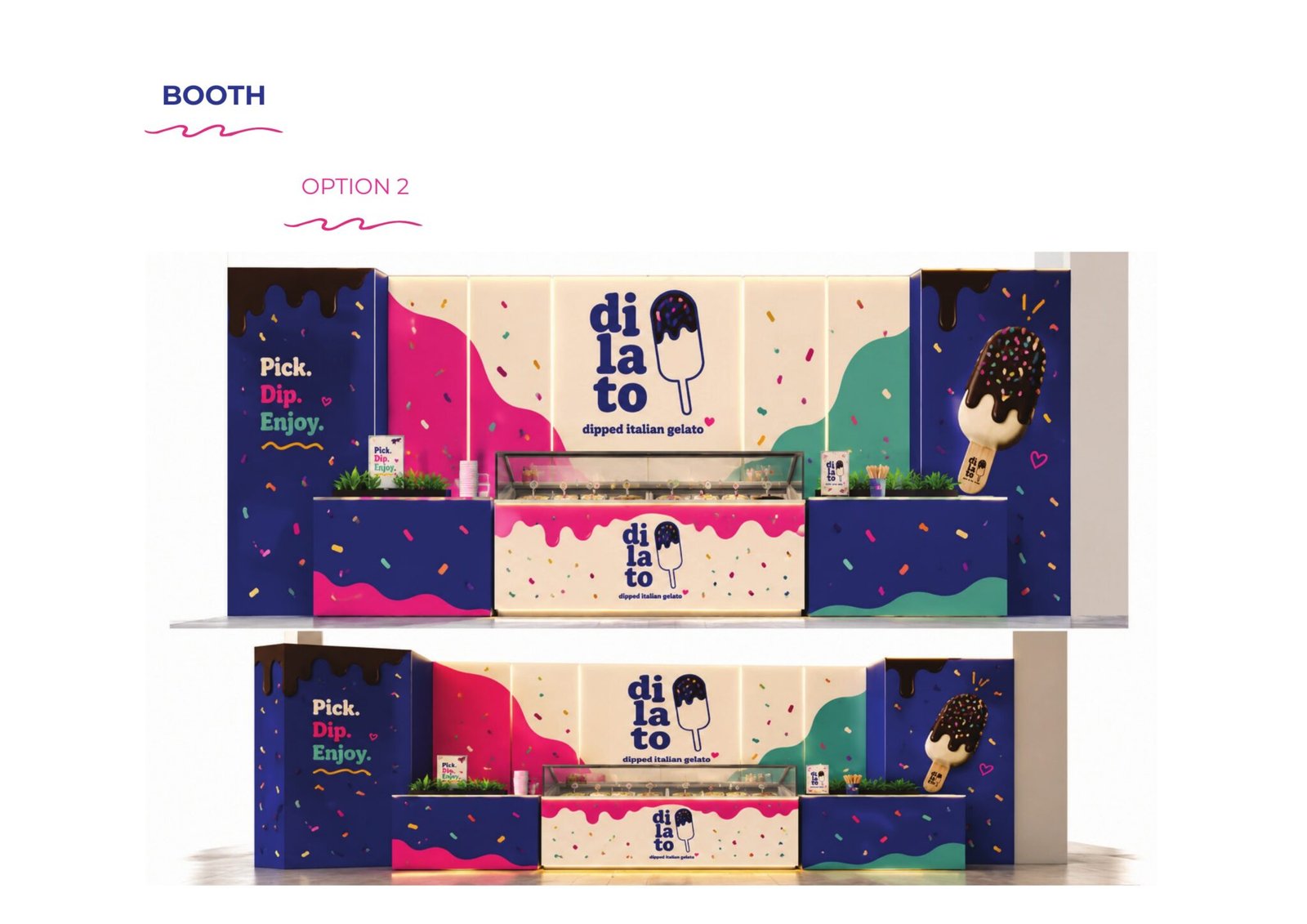
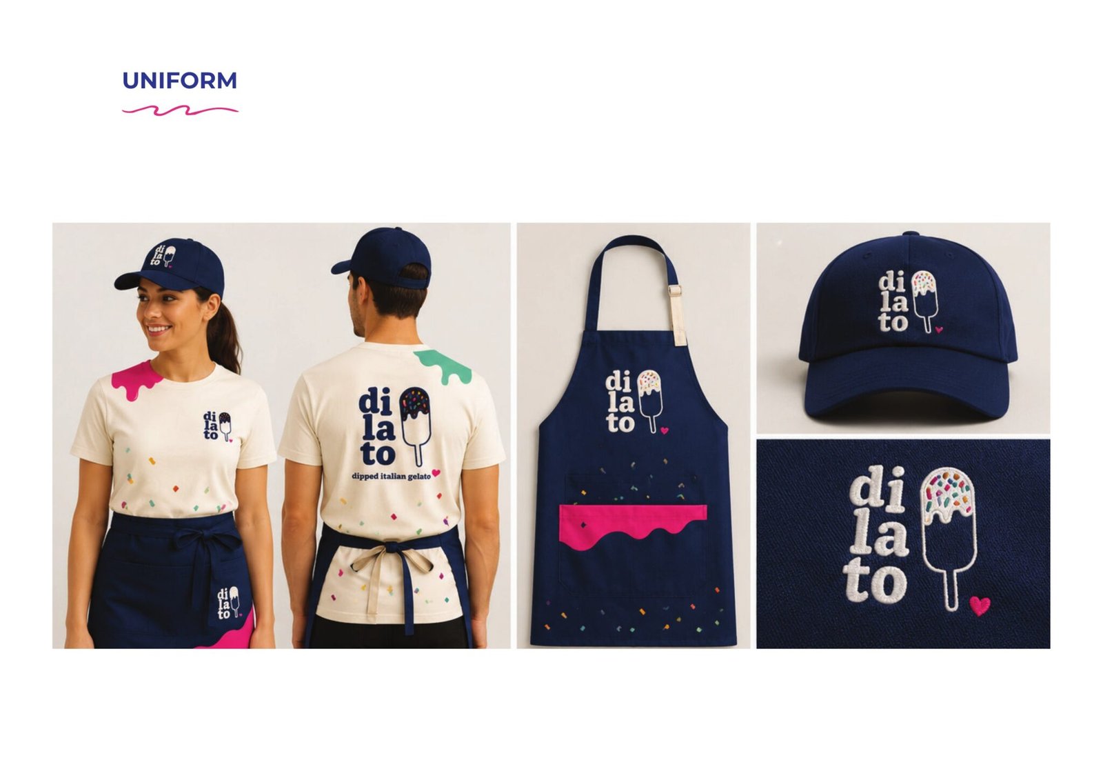
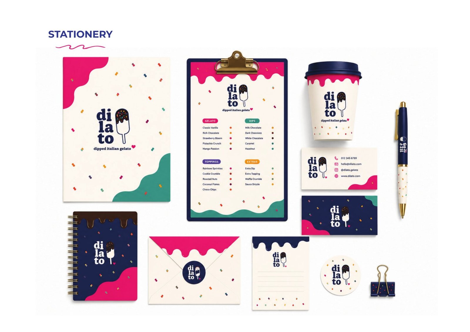
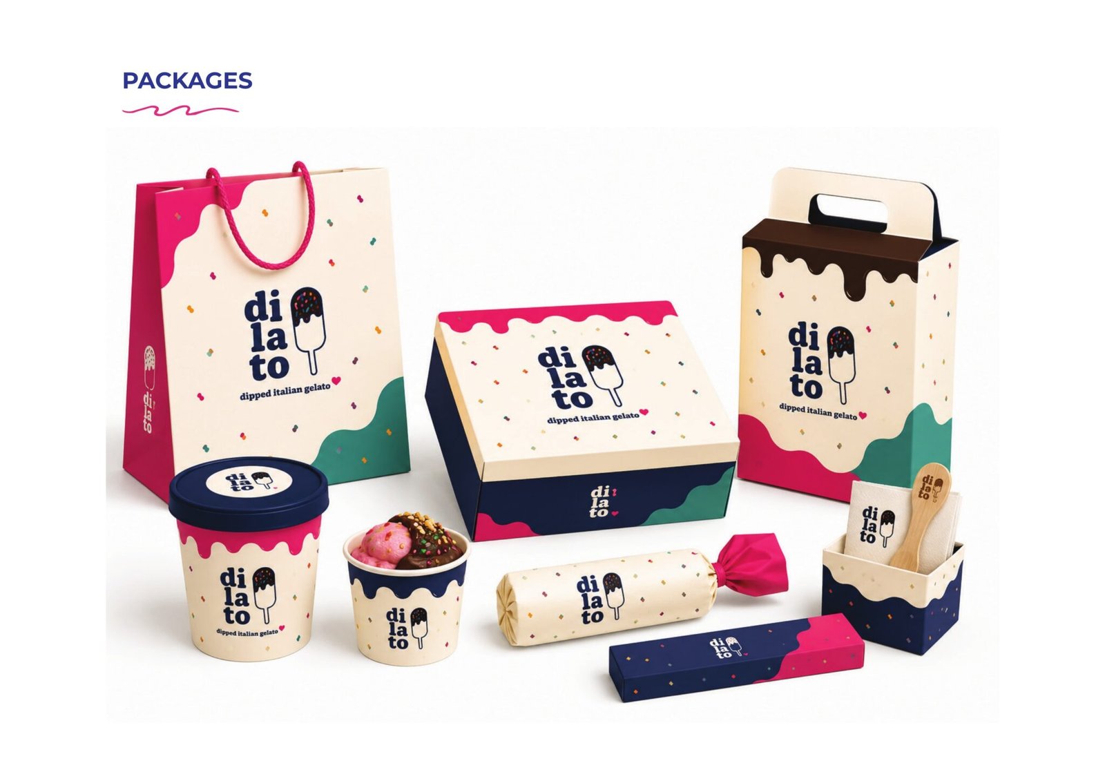
The identity is built around the bar itself. The wordmark stacks into three short lines with the dipped bar standing in as the final letter, so the mark reads as the thing you are about to eat. Around it sits a visual language of drips, splashes, wavy lines, sprinkles and confetti, an icon set for gelato, dip, toppings and the moments in between, and a photography direction that keeps the colour loud and the hands in frame.
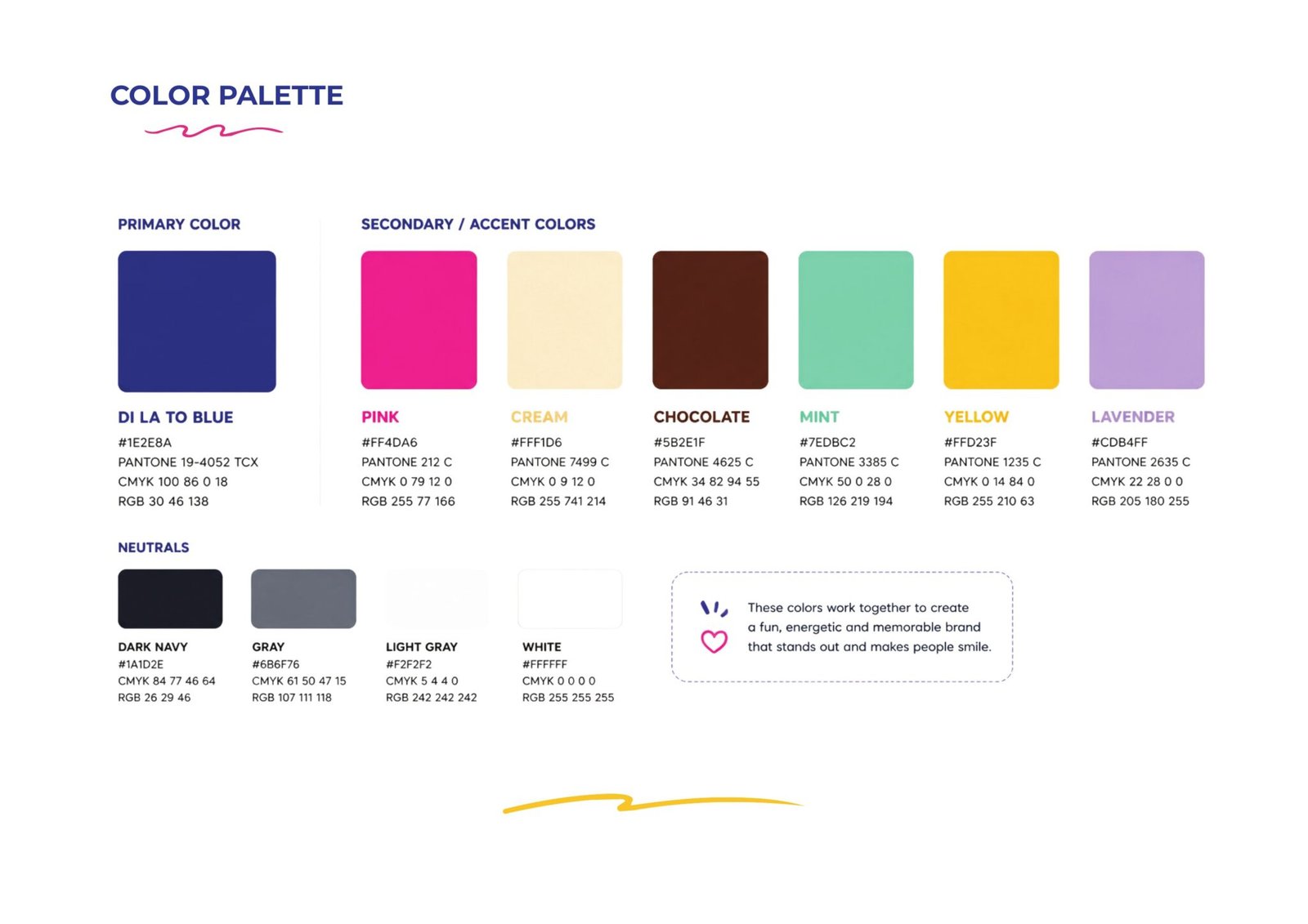
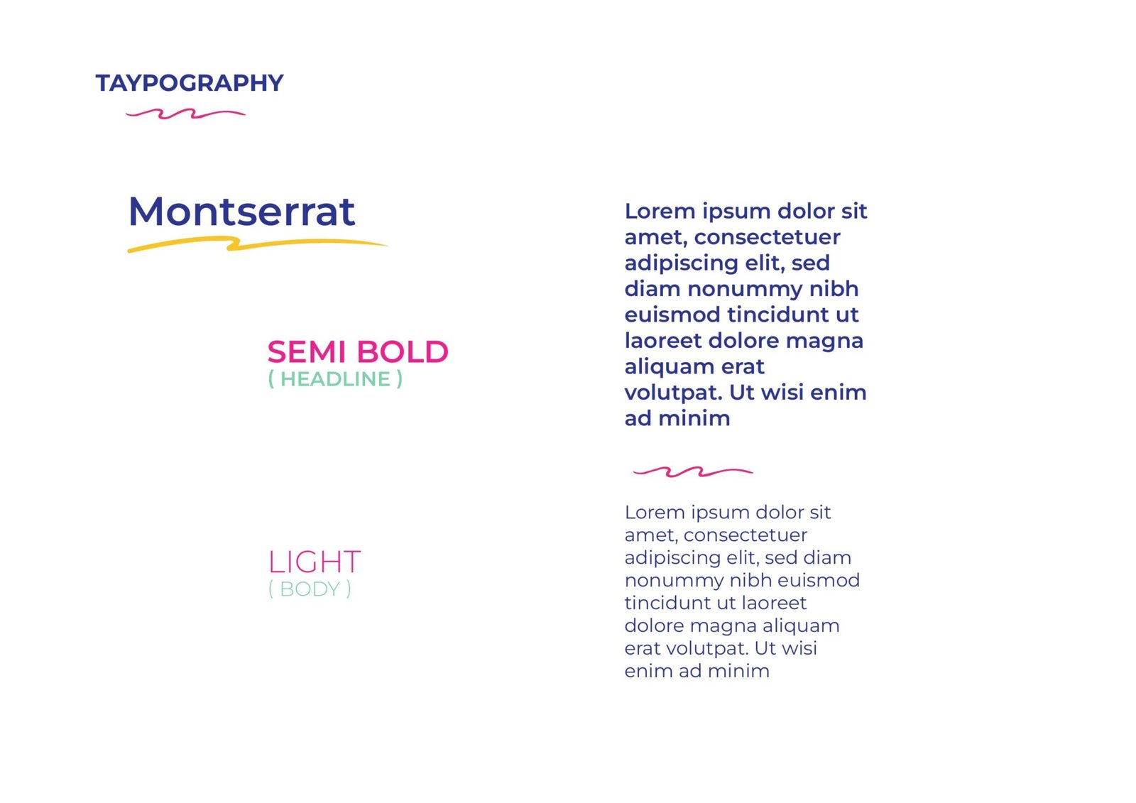
The book covers the logo system and its lock-ups, the palette, typography, the pattern and texture set, illustration and photography direction, and the tagline that runs through all of it.
- Client
- Dilato
- Year
- 2026
- Disciplines
- Branding
Branding
The brand book in full: the logo system and its lock-ups, the palette, typography, the pattern and texture set, the icon family, illustration and photography direction, and the tagline that ties it together.

12 pages, stacked. Drag the top one aside to reach the next.