Branding
Mamora
A maternity brand built around the months before the baby arrives.
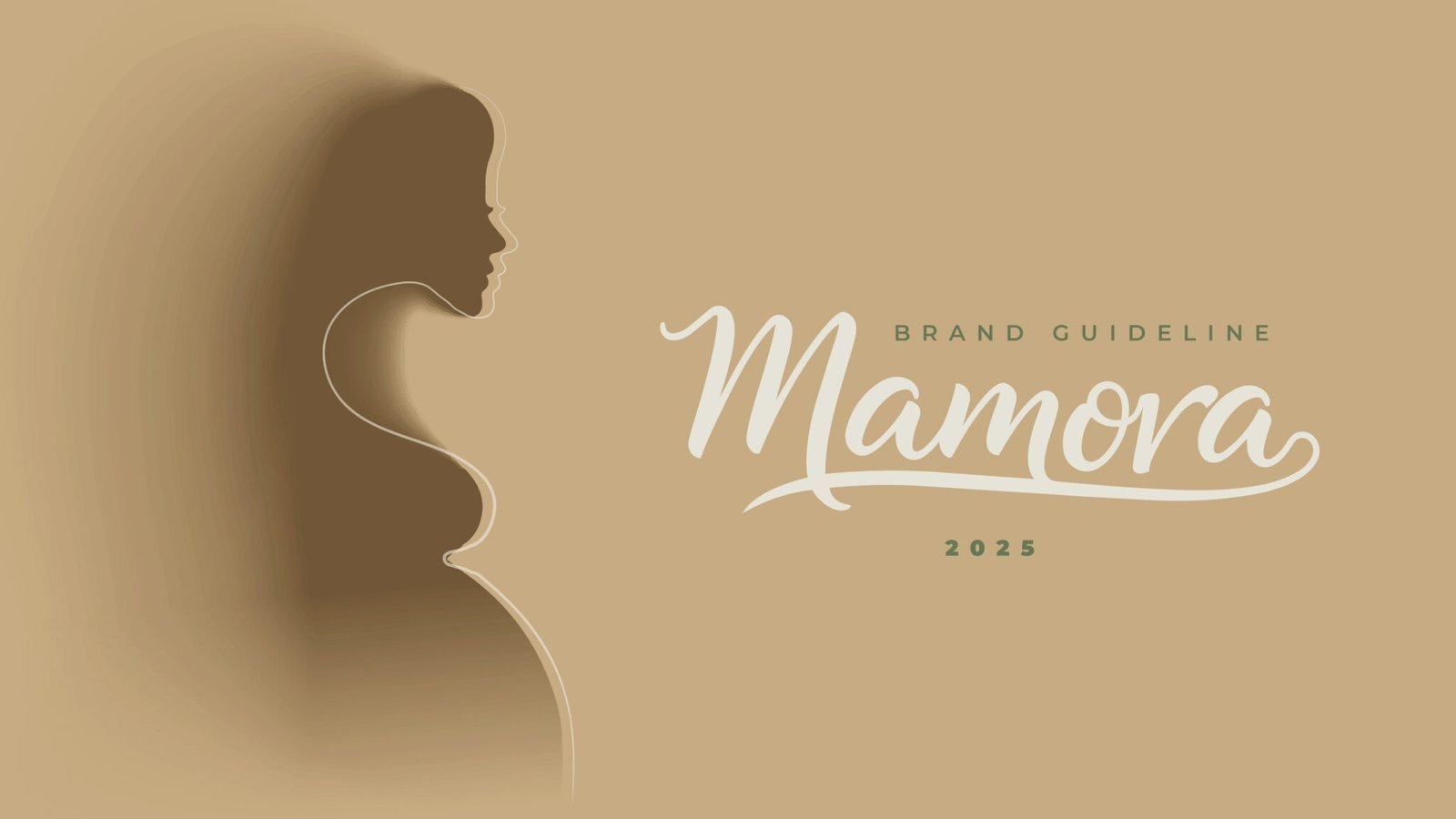
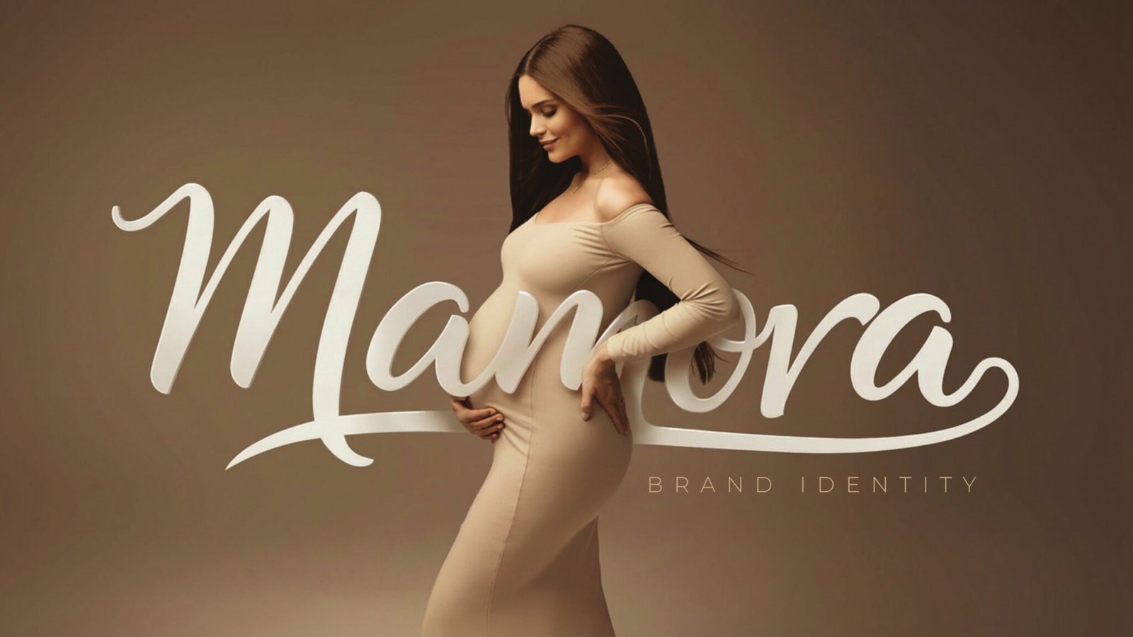
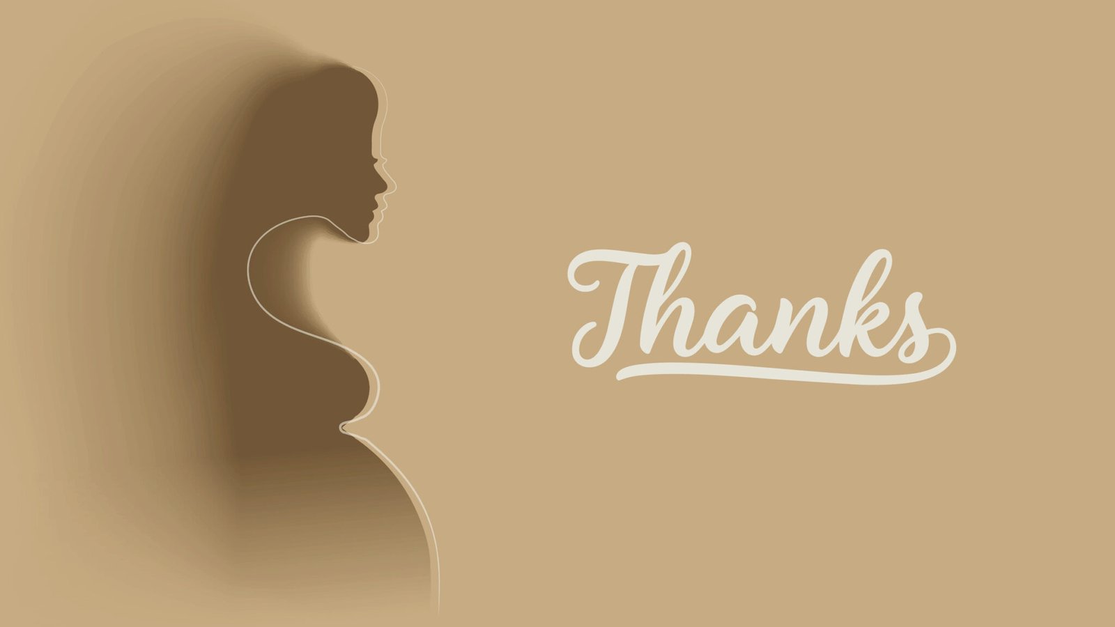
Mamora is a maternity and baby care brand, and the guideline treats the pregnancy as the subject rather than the products. The mark is a single script word with a swash that runs underneath it like a line drawn without lifting the pen.
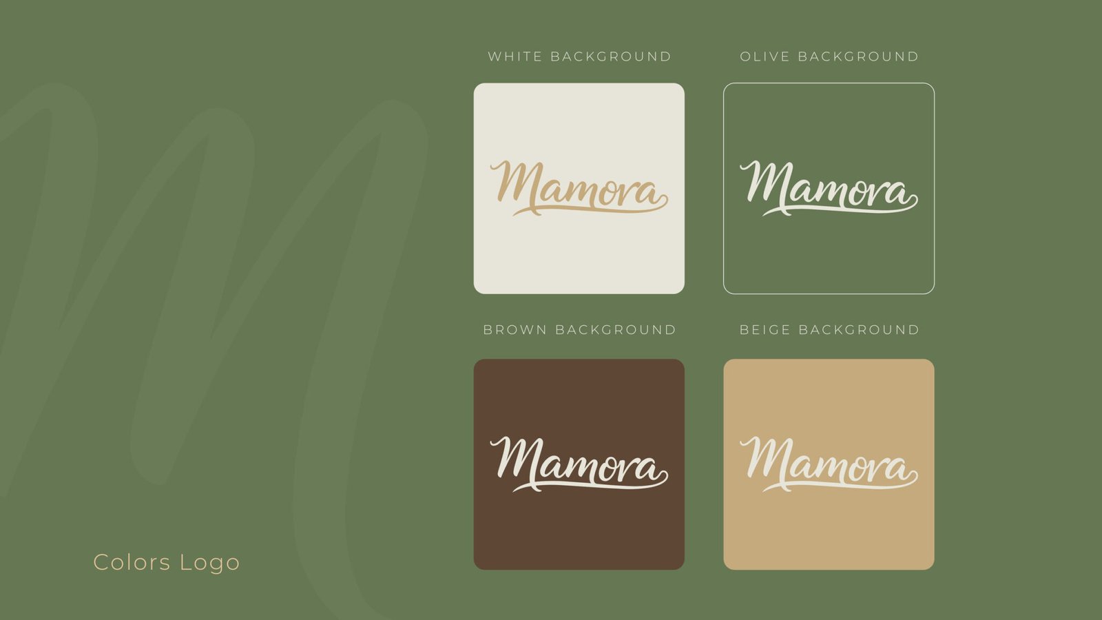
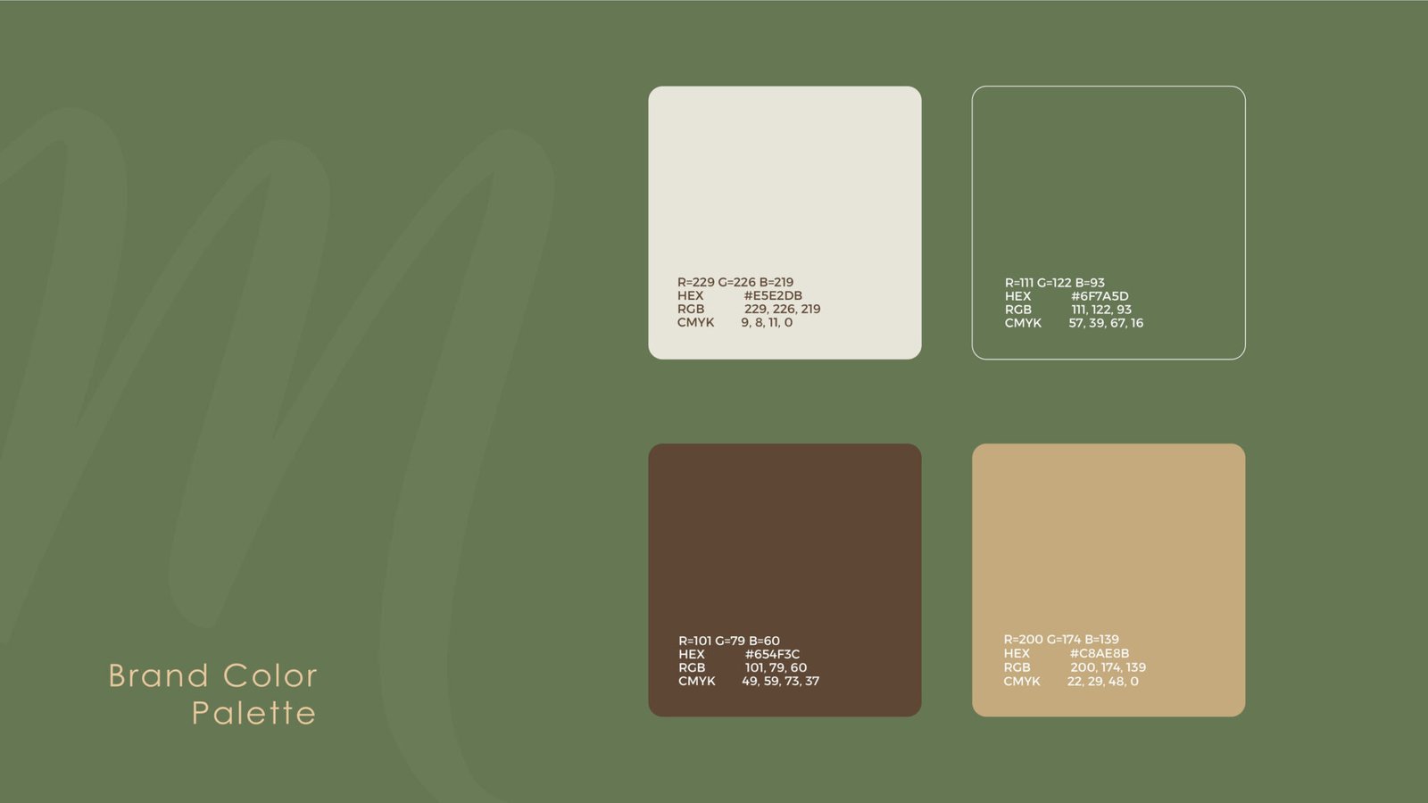
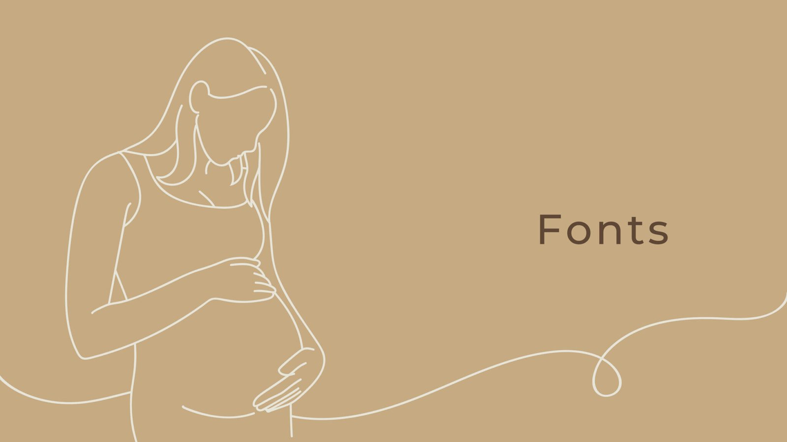
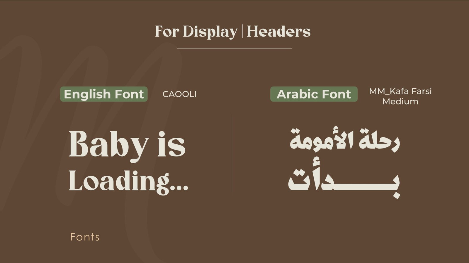
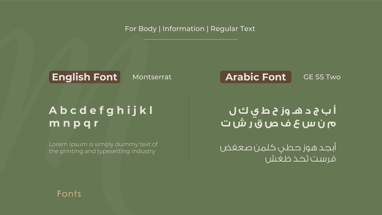
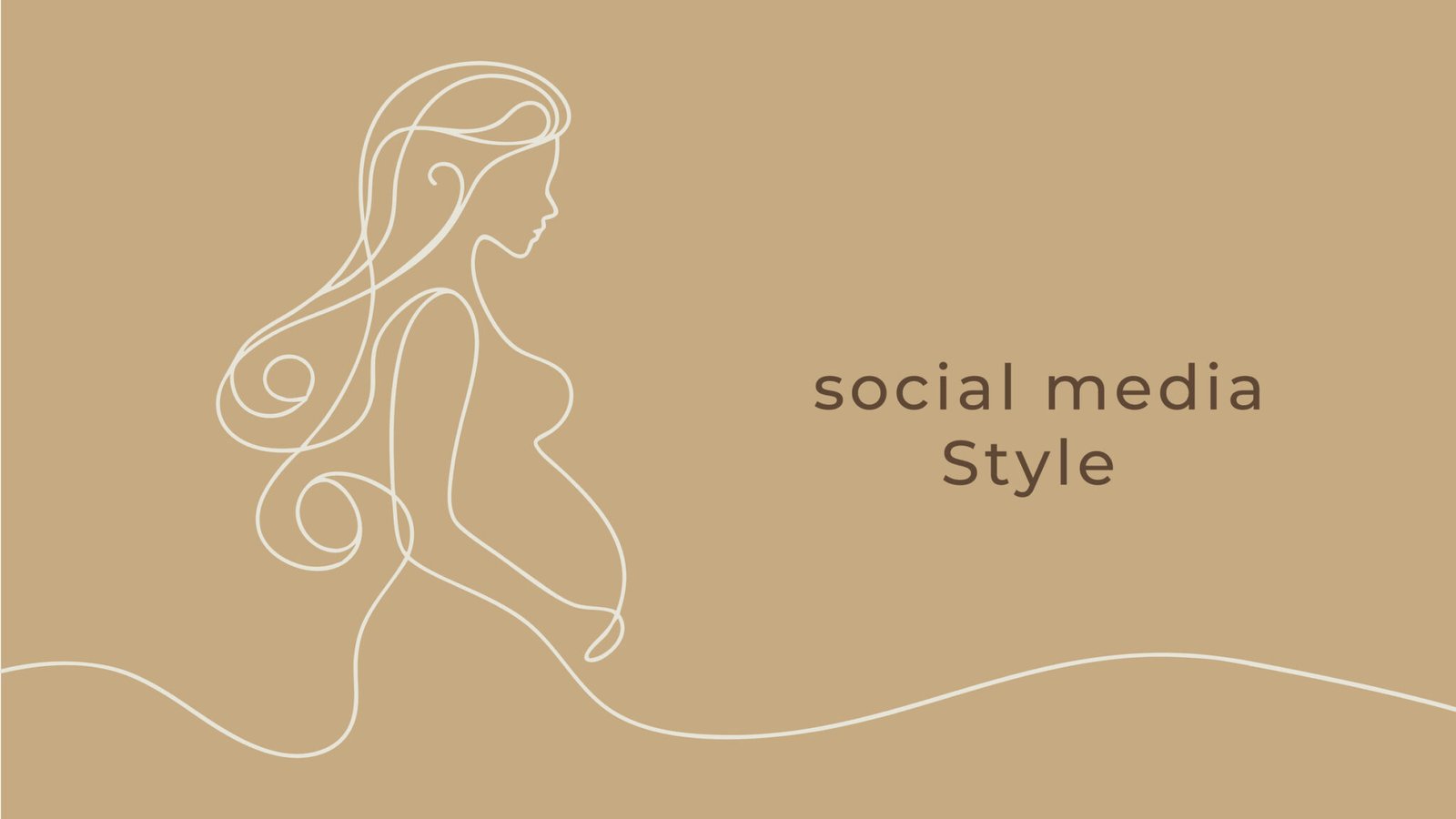
The system stays deliberately quiet. An off white, an olive, a soft brown and a beige, with the logotype tested on all four grounds before anything else is decided. Caooli and MM Kafa Farsi carry the headlines in English and Arabic, Montserrat and GE SS Two carry the reading text, and the illustration is one continuous line, so the brand can sit over a photograph or hold a page on its own.
- Client
- Mamora
- Year
- 2025
- Disciplines
- Branding
Branding
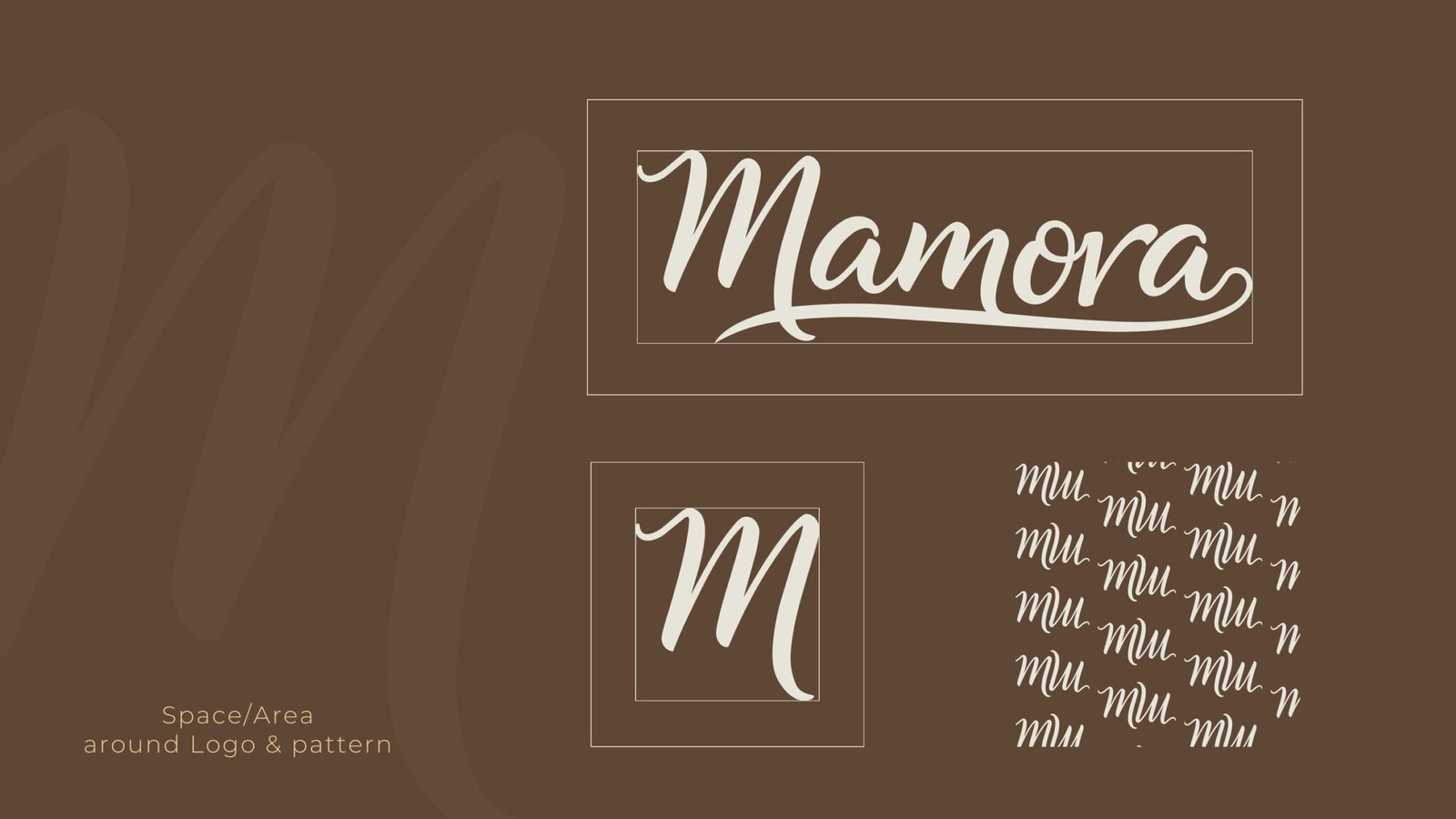
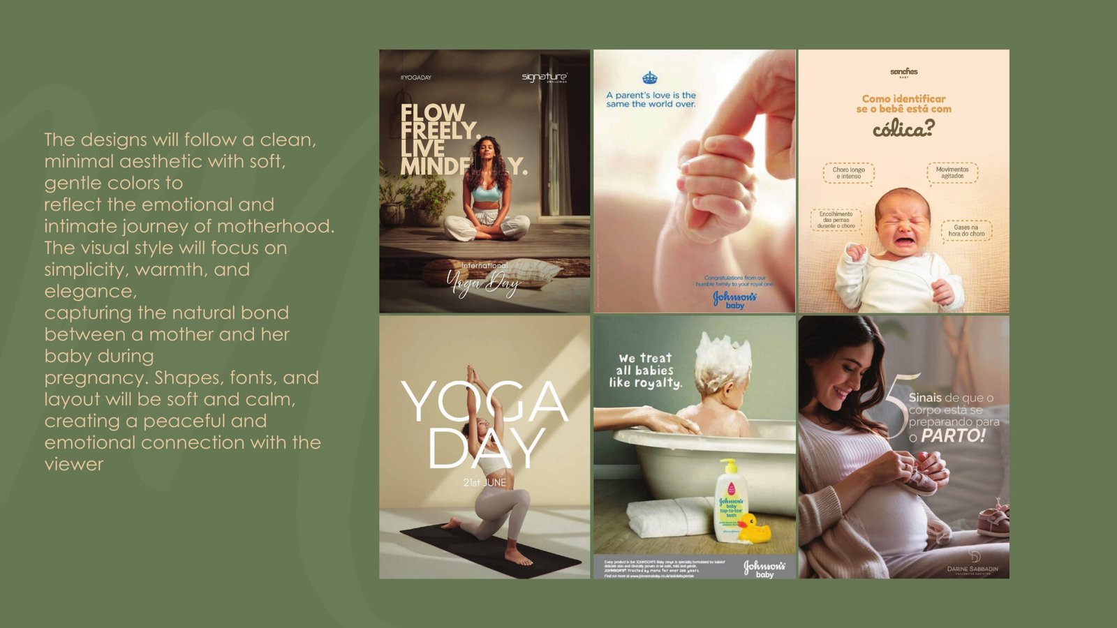
The full brand book: the script logotype and the M monogram, clear space and the pattern built from it, the logo proved on all four brand grounds, the palette with build values, the bilingual type pairings, and the single line illustration that carries the feed.
11 pages, stacked. Drag the top one aside to reach the next.