Branding
Glory Developments
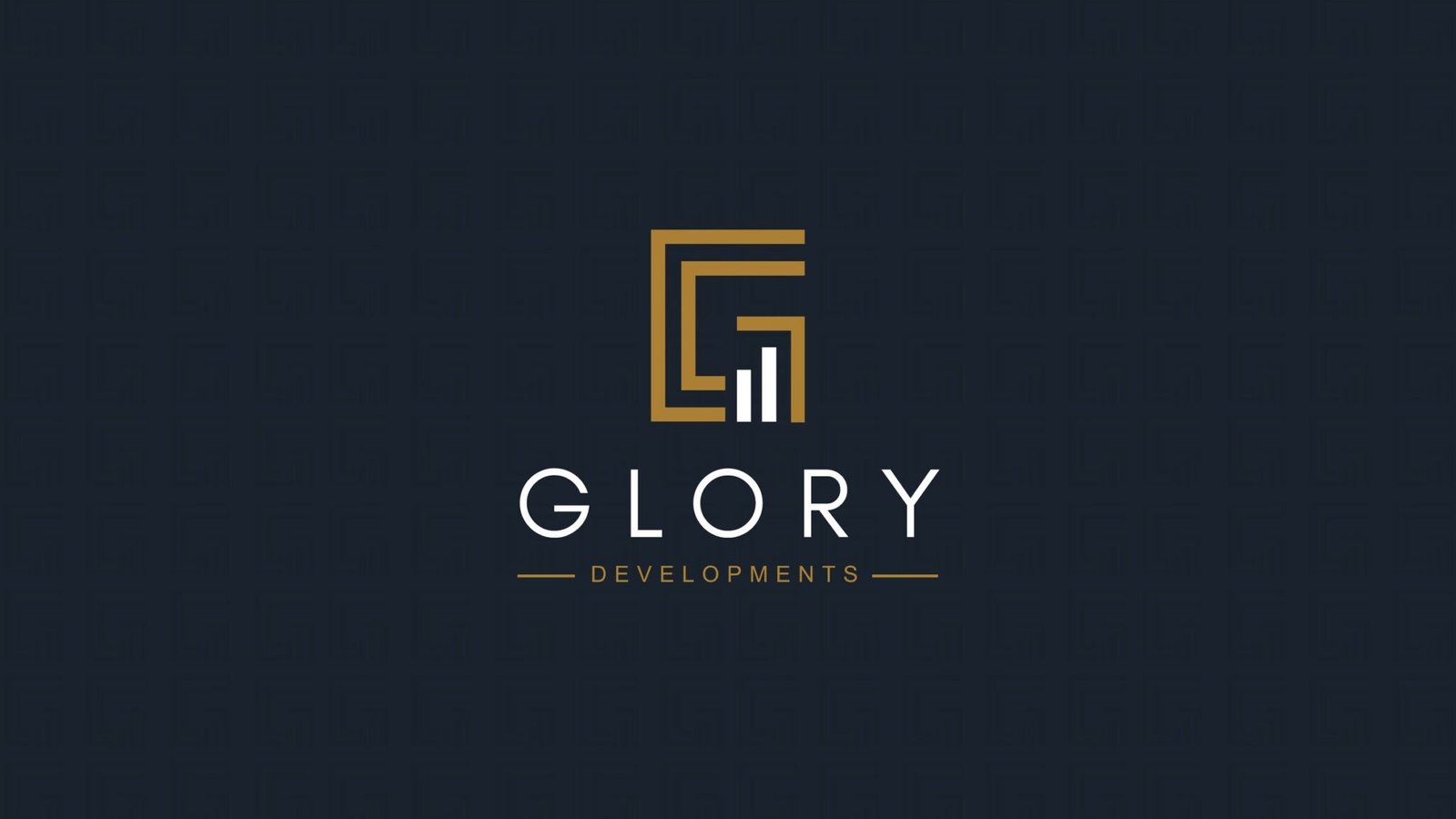
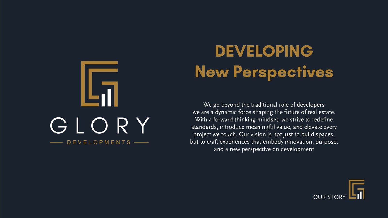
A property developer whose monogram is a building and a growth chart at the same time.
Glory Developments builds property, so the identity had to carry two ideas at once: something is being constructed, and it is worth investing in.
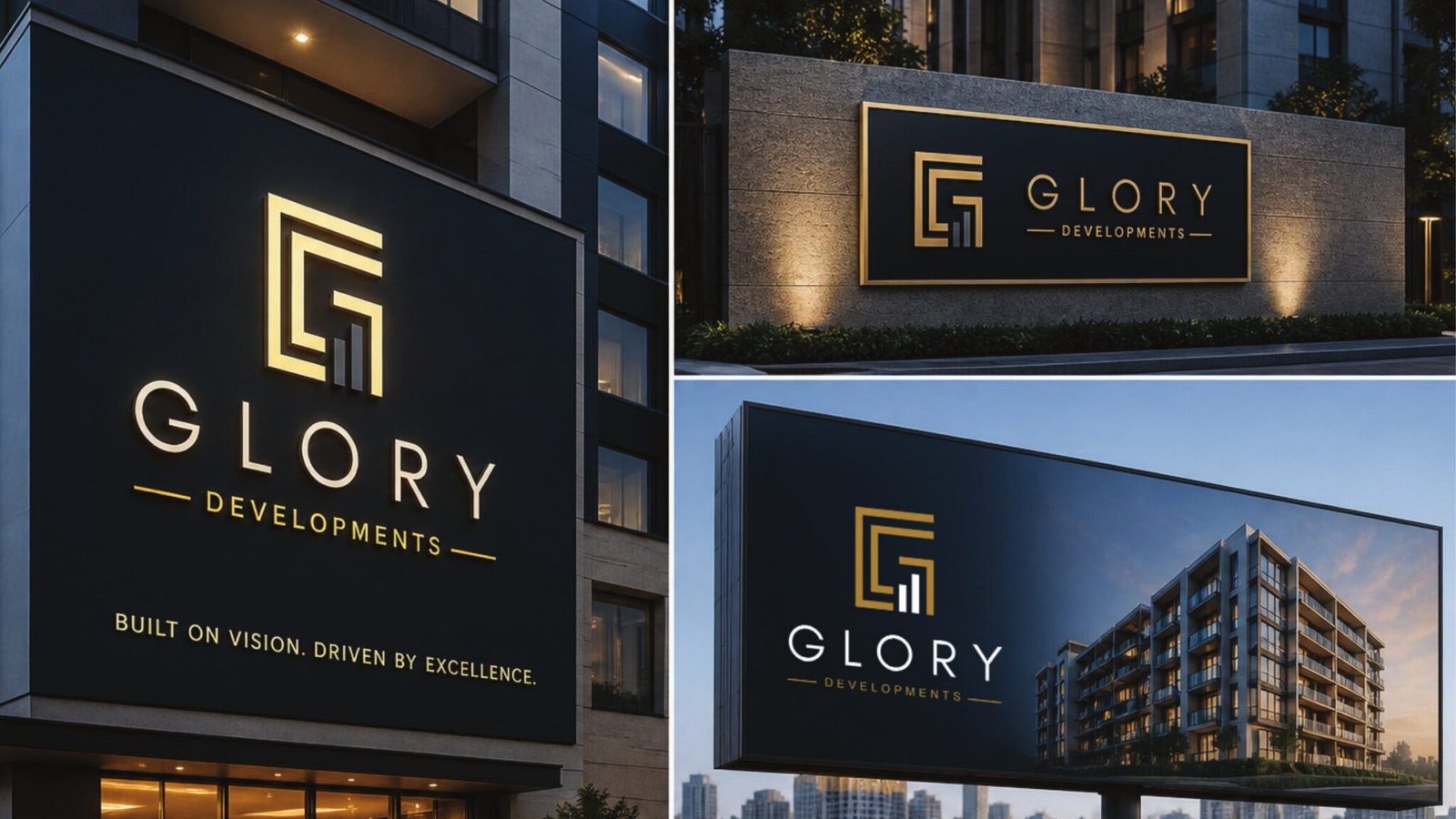
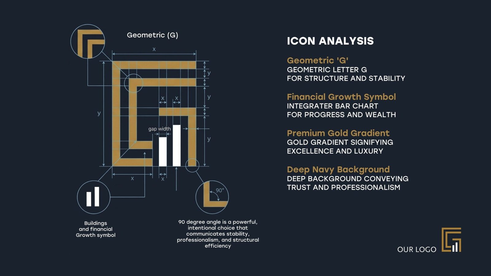
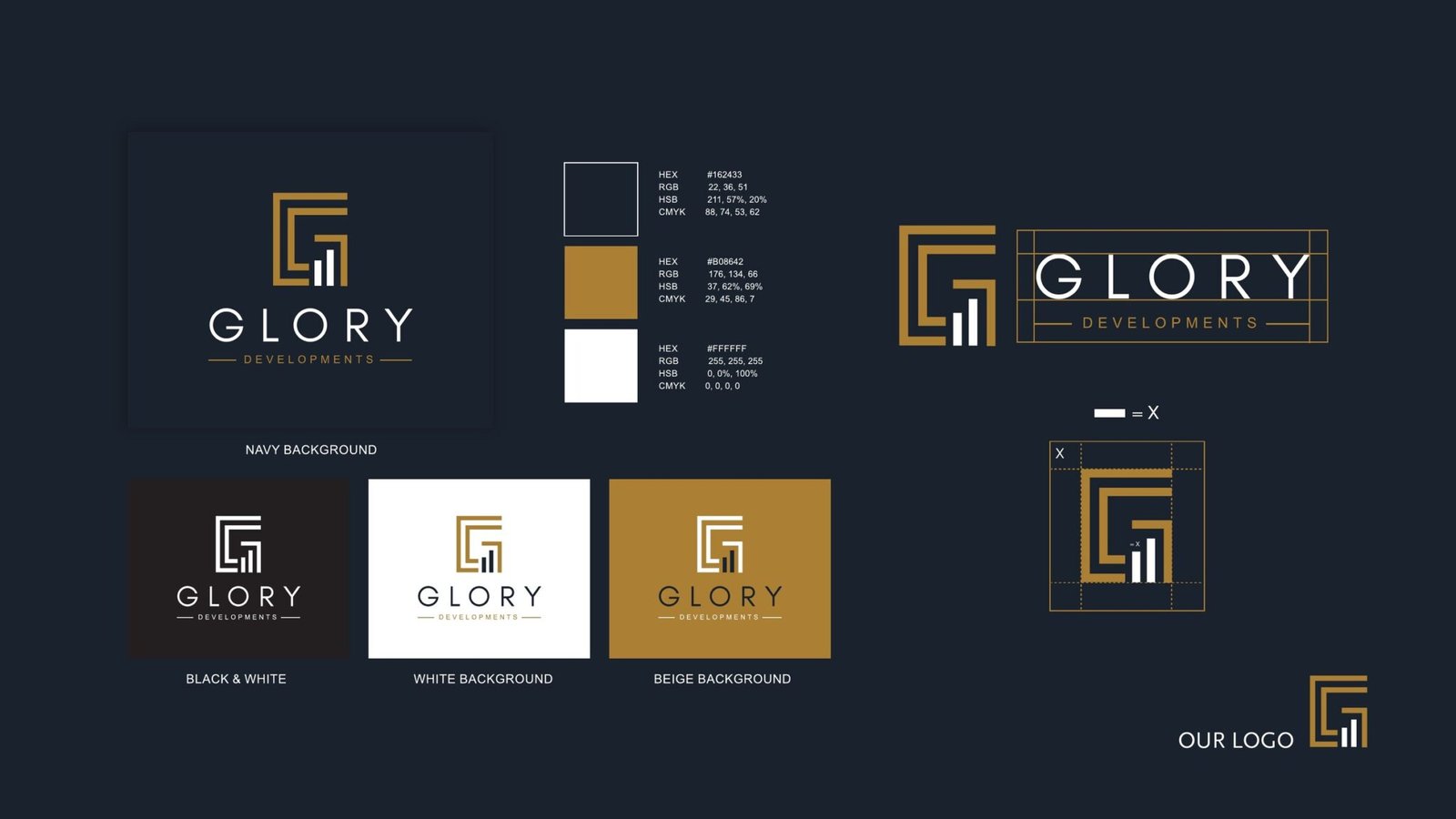
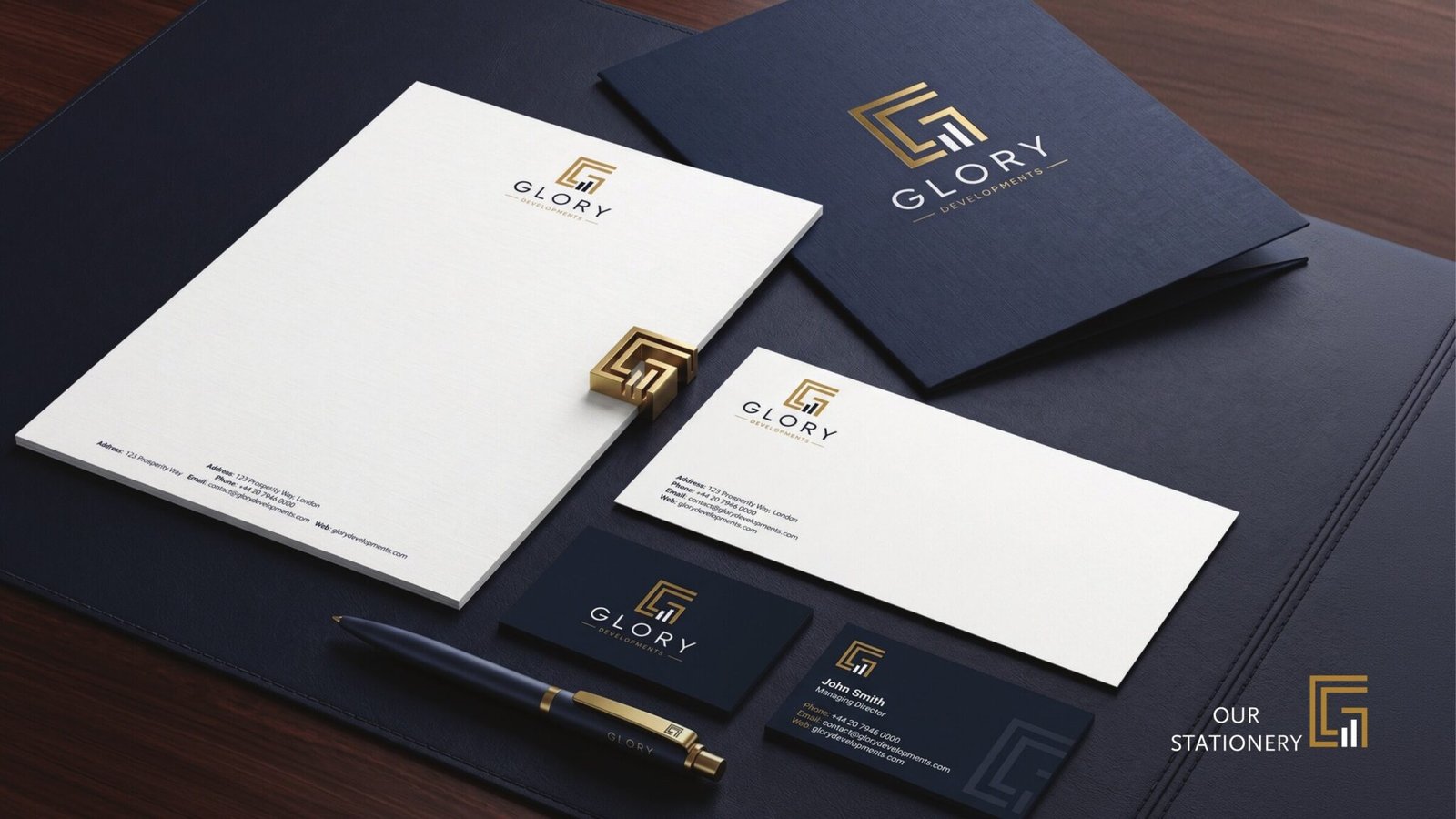
The monogram does both. A geometric G drawn as a continuous right angle reads as structure and stability, and inside it a rising bar chart carries progress and return. Gold on deep navy is the whole system: navy for the trust a buyer needs before signing, gold for the finish they are paying for. It holds from a building-front sign down to an embossed business card, and works in both English and Arabic.
- Client
- Glory Developments
- Year
- 2026
- Disciplines
- Branding
Branding
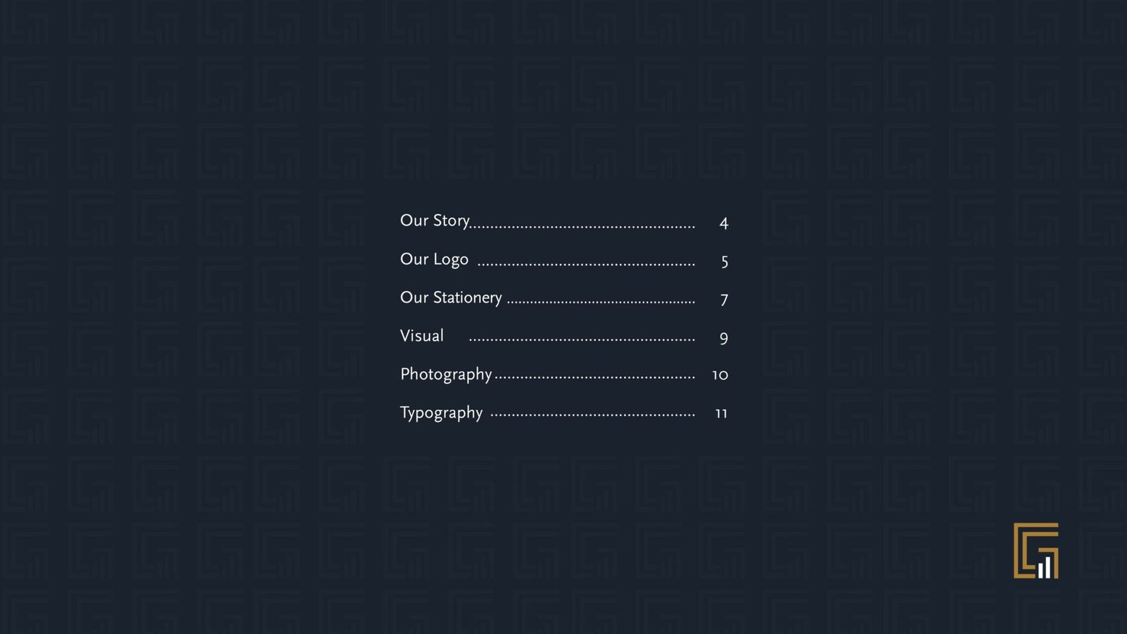
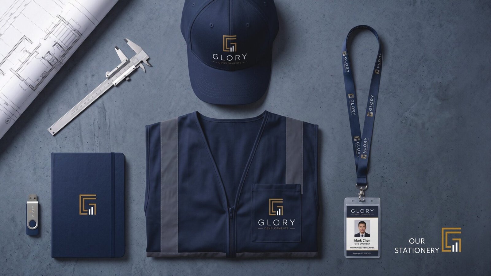
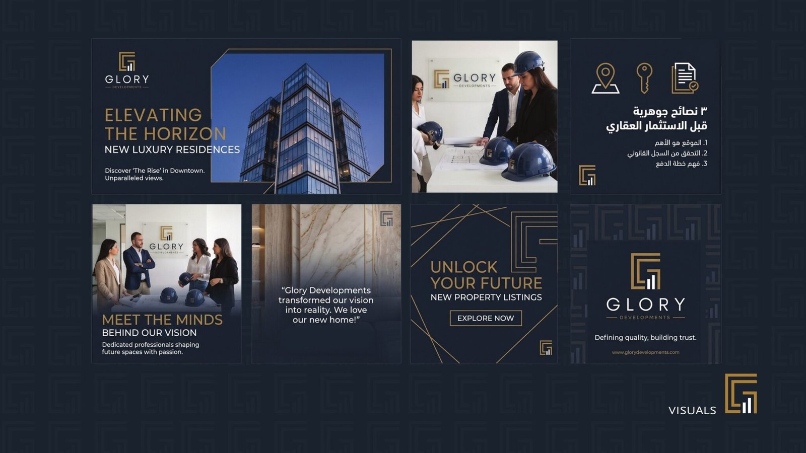
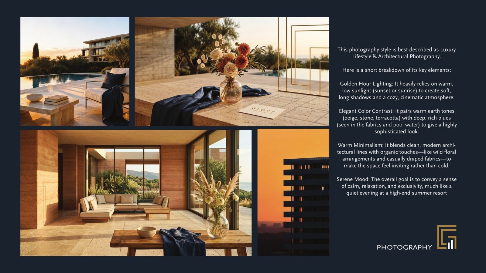
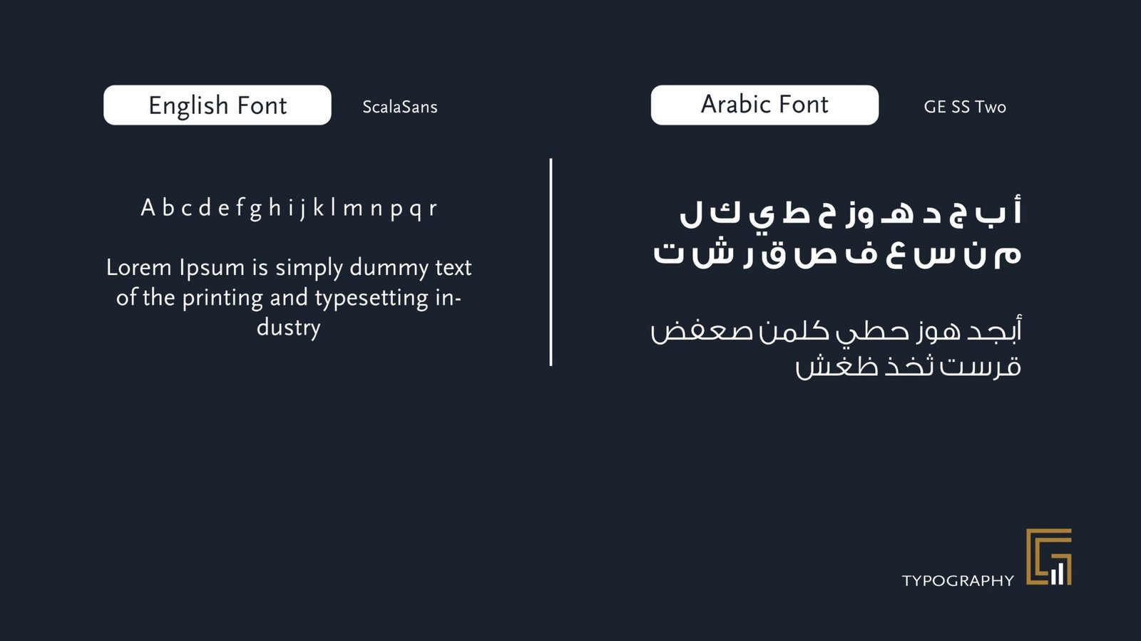
The branding kit: the story and positioning, the monogram broken down into its geometric G and growth-chart halves, the logo family across black, white and beige grounds, the navy and gold colour build, the stationery and merchandise, the social and photography direction, and the bilingual type system.

12 pages, stacked. Drag the top one aside to reach the next.